11

I have a chart with some data with a linear y-axis and a logarithmic x-axis. The question is about the logarithmic (x-)axis.

I want the logarithmic ticks on the x-axis to align with exact decades (powers of 10), but I don't want the axis to necessarily start at the exact decades; I want it to start where my data starts. So for instance, the axis could start at 3; but the first major tick should be at 10. How do I do this?

Currently when I set the axis to start at 3, the major gridline is at 3, which is no good.

When I set the following properties, the grid and ticks are fine, but that's because I force the axis to start at a decade (which I don't want to do).

.Chart.Axes(xlCategory).ScaleType = xlScaleLogarithmic
.Chart.Axes(xlCategory).HasMajorGridlines = True
.Chart.Axes(xlCategory).HasMinorGridlines = True
.Chart.Axes(xlCategory).MinimumScale = 10 ^ (Int(Application.Log10(Cells(DATA_START, 6))))
.Chart.Axes(xlCategory).MaximumScale = 10 ^ (Int(Application.Log10(Cells(DATA_START + n, 6)) - 0.00001) + 1)

This is how it looks: nice grid, but axis not starting at the right place.

enter image description here

Now, when I don't specifically round the min and max of my axis to a decade,

' ...
.Chart.Axes(xlCategory).MinimumScale = 0.9 * Cells(DATA_START, 6)
.Chart.Axes(xlCategory).MaximumScale = 1.1 * Cells(DATA_START + n, 6)

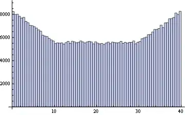
it looks like this, with the axis starting at the right place, but the grid/ticks looking silly:

enter image description here

In this example, I would expect the first tick to be at 100 and only minor ticks/gridlines before that.

I have already figured out, that I can set the multiplicative factor between two major ticks with .MajorUnit = 10.


I have a SSCCE for you: just run this macro on an empty sheet. It produces a chart that has the major ticks (and gridlines) at 18, 180, 1800, but I want them at 100, 1000.

Sub CreateDemoPlot()
    Range("A1:A6") = Application.Transpose(Split("20,40,100,1000,4500,10000", ","))
    Range("B1:B6") = Application.Transpose(Split("-30,-50,-90,-70,-75,-88", ","))
    With ActiveSheet.ChartObjects.Add(Left:=100, Width:=400, Top:=100, Height:=200)
        .Chart.SeriesCollection.NewSeries
        .Chart.ChartType = xlXYScatterLinesNoMarkers
        .Chart.Axes(xlValue).ScaleType = xlLinear
        .Chart.Axes(xlValue).CrossesAt = -1000
        .Chart.Axes(xlCategory).ScaleType = xlScaleLogarithmic
        .Chart.Axes(xlCategory).HasMajorGridlines = True
        .Chart.Axes(xlCategory).HasMinorGridlines = True
        .Chart.Axes(xlCategory).MinimumScale = 0.9 * Cells(1, 1)
        .Chart.Axes(xlCategory).MaximumScale = 1.1 * Cells(6, 1)
        .Chart.Axes(xlCategory).MajorUnit = 10
        .Chart.HasLegend = False

        .Chart.SeriesCollection.NewSeries
        .Chart.SeriesCollection(1).XValues = Range("A1:A6")
        .Chart.SeriesCollection(1).Values = Range("B1:B6")
    End With
End Sub
Community
  • 1
  • 1
brimborium
  • 9,362
  • 9
  • 48
  • 76
  • Getting an error running your SSCCE code (Excel 2010). – Andi Mohr Dec 10 '13 at 10:26
  • How about replacing `0.9 * Cells(1,1)` with `Int(Cells(1, 1) / 10) * 10`? – Andi Mohr Dec 10 '13 at 11:01
  • 1
    What's wrong with your first example, where you explicitly round the axis min and max to decades? Why don't you want to do that? That's more or less what I would do (though could be made more elegant). @AndiMohr: The SSCCE runs just fine in Excel 2010. Also have you tried your own suggestion?? `?Int(-188/10)*10` – Jean-François Corbett Dec 10 '13 at 11:46
  • Hmm, weird. OK, glad the SSCCE works for you. My error is error message 2 linked here, but I haven't protected the worksheet as the page suggests. Never mind! http://support.microsoft.com/kb/983119 – Andi Mohr Dec 10 '13 at 12:03
  • @Jean-FrançoisCorbett where are you getting -188 from? Doesn't `Cells(1,1)`=20? – Andi Mohr Dec 10 '13 at 12:09
  • 2
    @AndiMohr: Sure, but that's just dummy data! That won't work in the general case. Are you expecting the OP to edit his code every time the contents of the cell change? – Jean-François Corbett Dec 10 '13 at 12:12
  • @Jean-FrançoisCorbett Ah I see - because I couldn't run the SSCCE I misunderstood. Ran it on a different machine and see what you mean. It seems pnuts' suggestion may be the best workaround. – Andi Mohr Dec 10 '13 at 12:16
  • @pnuts no, replacing with `10` doesn't help. This is just dummy data, I want a general solution. – brimborium Dec 10 '13 at 20:20
  • 1
    @Jean-FrançoisCorbett Yeah, that's basically what I am currently doing. The problem is, that I don't want the axis to start at the exact decades, I only want the ticks and grids there. So for instance, the axis could start at `3` and the first tick label is `10` (which is also where the major gridline should be). But when I set the axis to start at `3`, the major gridline is at `3`... – brimborium Dec 10 '13 at 20:22
  • 1
    Aha, got it. I edited your question to clarify your requirement. – Jean-François Corbett Dec 10 '13 at 20:38
  • Beautiful question. This is one of Excel's many Great Annoyances, and only a hack (like the one given below) will get you even close. I have a hunch I can solve this... – Floris Dec 17 '13 at 03:28

2 Answers2

9

If you really want to do it, you can change the Vertical axis crosses to the value you want to start with. In this case, we will start with 18. 1

We want to get rid of the ugly axis on the left so you then create a copy of the chart and delete everything and remove all fill colors except for the axis such as the chart below. You then create a white box with no borders and cover the original chart Y axis. Please note that I forgot to set the line color to "No" and the ticks off for the top chart. 2

Next, you overlay the transparent chart and you get what you want. To use VBA to automatically update your chart, you can use ActiveChart.Axes(xlCategory).CrossesAt = 20 and have all scale changes be done for both the overlay chart and the underlying chart.

You may want to use another graphing program or just use the first chart you posted because it probably won't be worth your time to do this for complex charts. 3

Code to do so automatically:

Sub CreateDemoPlot()
    Dim chart2 As ChartObject
    Dim shape1 As shape

    Range("A1:A6") = Application.Transpose(Split("20,40,100,1000,4500,10000", ","))
    Range("B1:B6") = Application.Transpose(Split("-30,-50,-90,-70,-75,-88", ","))
    Range("D3:K15").Name = "ChartArea" 'Set Chart Area
    With ActiveSheet.ChartObjects.Add(Left:=100, Width:=400, Top:=100, Height:=200)
        .Chart.SeriesCollection.NewSeries
        .Chart.ChartType = xlXYScatterLinesNoMarkers
        .Chart.Axes(xlValue).ScaleType = xlLinear
        .Chart.Axes(xlValue).CrossesAt = -1000
        .Chart.Axes(xlCategory).ScaleType = xlScaleLogarithmic
        .Chart.Axes(xlCategory).HasMajorGridlines = True
        .Chart.Axes(xlCategory).HasMinorGridlines = True
        .Chart.Axes(xlCategory).MinimumScale = 0.9 * Cells(1, 1)
        .Chart.Axes(xlCategory).MaximumScale = 1.1 * Cells(6, 1)
        .Chart.Axes(xlCategory).MajorUnit = 10
        .Chart.HasLegend = False

        .Chart.SeriesCollection.NewSeries
        .Chart.SeriesCollection(1).XValues = Range("A1:A6")
        .Chart.SeriesCollection(1).Values = Range("B1:B6")

        .Chart.Axes(xlCategory).CrossesAt = 18 'Or where ever the actual data starts
        .Chart.Axes(xlCategory).MinimumScale = 10 'Set to 10 instead of the above code

        'position to chart area
        .Top = Range("ChartArea").Top
        .Left = Range("ChartArea").Left
        .Copy

        'create white box
        ActiveSheet.Shapes.AddShape msoShapeRectangle, 50, 50, 45, 200
        Set shape1 = ActiveSheet.Shapes(2)
        shape1.Fill.ForeColor.RGB = RGB(255, 255, 255)
        shape1.Line.ForeColor.RGB = RGB(255, 255, 255)

        'Position whitebox
        shape1.Left = Range("ChartArea").Left
        shape1.Top = Range("ChartArea").Top

        'Paste overlay chart
        ActiveSheet.Paste
        Set chart2 = ActiveSheet.ChartObjects("Chart 3")

        'Position overlay Chart
        chart2.Top = Range("ChartArea").Top
        chart2.Left = Range("ChartArea").Left

        'Clear out overlay chart
        chart2.Chart.Axes(xlValue).Format.Line.Visible = msoFalse
        chart2.Chart.SeriesCollection(1).Format.Line.Visible = msoFalse
        chart2.Chart.PlotArea.Format.Fill.Visible = msoFalse
        chart2.Chart.Axes(xlCategory).Delete
        chart2.Chart.SetElement (msoElementPrimaryValueGridLinesNone)
        chart2.Chart.SetElement (msoElementPrimaryCategoryGridLinesNone)
        chart2.Chart.ChartArea.Format.Fill.Visible = msoFalse

        'Adjust Y axis position from overlay chart
        chart2.Chart.PlotArea.Left = 10
        chart2.Chart.PlotArea.Top = 0
    End With
End Sub
user2370125
  • 191
  • 1
  • 5
  • The result is exactly what I want. Can you provide code for that? It needs to be done programmatically (best would be just to adapt my SSCCE and post the code in your answer at the bottom). – brimborium Dec 13 '13 at 07:57
  • 2
    Creative, if not quite orthodox. The OP needs to be careful when rendering this onto any non-traditional output devices that may treat rectangles and hidden text unexpectedly. – Pekka Dec 14 '13 at 21:35
  • 1
    Although I really don't like the way your answer works (just drawing a new axis over the old one), it's the best answer I got. I will not use it though. Instead I will go with starting the x axis at decades and properly curse Excel for not being able to do something like this. ;) – brimborium Dec 17 '13 at 08:06
  • Actually, it would never cross my mind to use Excel/VBA Macros to do **anything**, let alone graphs. Unfortunately, one can not always choose (especially if customers do not know anything other than VBA). I attest it to my sheer awesomenes that I was able to convince the customer that VBA might maybe perhaps possibly not be the best solution here. ;) – brimborium Dec 18 '13 at 08:08
1

I believe I was able to coax Excel into producing exactly the graph you were asking for using the following strange set of steps:

  1. Create the log plot with the limits you want
  2. Turn off the vertical grid lines
  3. create a new array with the values of the grid lines you would like (e.g. 70, 80 90, 100, 200, 300 etc)
  4. Plot a second series where the desired grid values are the X, and the negative limit of the graph is the Y (same value for all of them)
  5. Use no markers, and no line for this series
  6. Add error bars for Y - only in the positive direction, with a value equal to the total range of the Y axis (max - min)
  7. Add data labels to the series, with only the X value represented
  8. Move the label underneath the point

Result:

enter image description here

It's a log plot; the labels are correct; the "gridlines" are correct. It's beautiful.

Now for automating this… Unfortunately I don't have time right now to produce a "cleaned up" version of the code needed to do this (when you record the above as a macro it produces the usual Excel mess…), but if you follow the above instructions to do it manually you do indeed get exactly the plot shown.

Jean-François Corbett
  • 37,420
  • 30
  • 139
  • 188
Floris
  • 45,857
  • 6
  • 70
  • 122
  • 1
    Thanks for your effort. Although I like the idea, It will not distinguish between minor and major gridlines. Also, I don't like hacking it together, I was looking for a nice way out. Very dissapointing from Excel. – brimborium Dec 17 '13 at 08:04
  • You can create two series (one at minor and one at major grids) and set different styles for the error bars. But I agree that "properly cursing Microsoft" is the best solution. I might create a custom function some time to implement my idea more carefully... – Floris Dec 17 '13 at 12:03