12

I need to have 2 groups of controls on the screen: inputs and outputs (so they have 2 states: On or Off). Thus CheckBox seems to be a good choice. Checking any output will set it.

However, when displaying inputs there will be no user interaction with it. User is only allowed to see its value, not to change it.

Question: how to make checkbos visually appears as read-only ?

Could think about possible solutions:

  • Make CheckBox disabled. Bad: there will be no tooltip (possible to solve it? by fake panel on top?) and visually disabled CheckBox is not nice (and I don't want to make user think it is disabled).
  • Use different control. Which one? Label doesn't have nice placeholder for the On/Off value. RadioButton look differently, but they usually means there is a single choice out of many, while values of inputs are independent.
  • Making own component. Drawing the whole CheckBox is a bit overkill (and honestly, I don't know how to do it to have Win7 appearance). Would it be possible to add only ReadOnly appearance to the box part easily?

What do you guys think?

Sinatr
  • 20,892
  • 15
  • 90
  • 319
  • possible duplicate of [How to make a checkbox unselectable?](http://stackoverflow.com/questions/5961104/how-to-make-a-checkbox-unselectable) – CodeCaster Nov 11 '13 at 09:25
  • @CodeCaster, my question is different. I know how to prevent user from *using* the control, but it is still visually the same *ready to be clicked checkbox*. And this is my problem, to display to the user that *sorry, but I am read-only checkbox*. – Sinatr Nov 11 '13 at 09:36

8 Answers8

14

There is a solution that is combination of the existing answers.

checkBox.ForeColor = Color.Gray; // Read-only appearance
checkBox.AutoCheck = false;      // Read-only behavior

// Tooltip is possible because the checkbox is Enabled
var toolTip = new ToolTip();
toolTip.SetToolTip(checkBox, "This checkbox is read-only.");

The result is a CheckBox that

  • appears disabled with gray text
  • prevents the Checked value from changing when clicked
  • supports a Tooltip
Ed Chapel
  • 6,842
  • 3
  • 30
  • 44
  • Good catch with `AutoCheck`, disabling it for read-only `CheckBox` is a good idea. – Sinatr Jan 05 '15 at 08:11
  • This should be the correct and accepted answer. The solution by King King will make it look checked, but the underlying value can change. I believe the OP wanted a checkbox that it's state can not be changed. – Kraang Prime Nov 19 '16 at 00:40
3

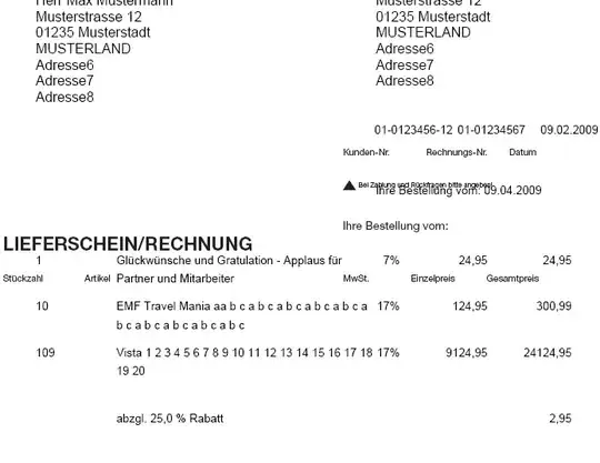
You have to draw everything yourself. I think you should use some controls with correct layout to mimic it. Here is the demo code for you, note that it does not support AutoSize correctly. Because the drawn stuff is always wider than the default stuff (which the AutoSize works with), implementing the AutoSize is not easy, If you don't care too much about AutoSize, this would be the great control for you:

public class XCheckBox : CheckBox
{        
    public XCheckBox()
    {            
        SetStyle(ControlStyles.Opaque, false);
        ReadOnlyCheckedColor = Color.Green;
        ReadOnlyUncheckedColor = Color.Gray;
    }        
    public bool ReadOnly { get; set; }
    public bool AlwaysShowCheck { get; set; }
    public Color ReadOnlyCheckedColor { get; set; }
    public Color ReadOnlyUncheckedColor { get; set; }
    protected override void OnPaint(PaintEventArgs pevent)
    {
        if (ReadOnly)
        {
            pevent.Graphics.SmoothingMode = SmoothingMode.HighQuality;
            pevent.Graphics.TextRenderingHint = System.Drawing.Text.TextRenderingHint.AntiAlias;
            if (AlwaysShowCheck || Checked)
            {
                RenderCheck(pevent.Graphics);
            }
            RenderText(pevent.Graphics);                
        }
        else base.OnPaint(pevent);                            
    }
    private void RenderCheck(Graphics g)
    {
        float fontScale = Font.Size / 8.25f;   
        Size glyphSize = CheckBoxRenderer.GetGlyphSize(g, System.Windows.Forms.VisualStyles.CheckBoxState.CheckedNormal);            
        glyphSize.Width = (int) (glyphSize.Width * fontScale);
        glyphSize.Height = (int)(glyphSize.Height * fontScale);            
        string checkAlign = CheckAlign.ToString();
        using (GraphicsPath gp = new GraphicsPath())
        using (Pen pen = new Pen(Checked ? ReadOnlyCheckedColor : ReadOnlyUncheckedColor, 1.5f)
        {
            LineJoin = LineJoin.Round,
            EndCap = LineCap.Round,
            StartCap = LineCap.Round
        })
        {
            gp.AddLine(new Point(3, 7), new Point(5, 10));
            gp.AddLine(new Point(5, 10), new Point(8, 3));
            float dx = checkAlign.EndsWith("Right") ? Math.Max(-4*fontScale, ClientSize.Width - glyphSize.Width - 4 * fontScale) :
                     checkAlign.EndsWith("Center") ? Math.Max(-4*fontScale, (ClientSize.Width - glyphSize.Width) / 2 - 4 * fontScale) : -4;
            float dy = checkAlign.StartsWith("Bottom") ? Math.Max(-4*fontScale, ClientSize.Height - glyphSize.Height - 4*fontScale) :
                     checkAlign.StartsWith("Middle") ? Math.Max(-4*fontScale, (ClientSize.Height - glyphSize.Height) / 2 - 4*fontScale) : 0;

            g.TranslateTransform(dx, dy);
            g.ScaleTransform(1.5f*fontScale, 1.5f*fontScale);
            g.DrawPath(pen, gp);
            g.ResetTransform();                
        }
    }
    private void RenderText(Graphics g)
    {
        Size glyphSize = CheckBoxRenderer.GetGlyphSize(g, System.Windows.Forms.VisualStyles.CheckBoxState.CheckedNormal);
        float fontScale = Font.Size / 8.25f;
        glyphSize.Width = (int)(glyphSize.Width * fontScale);
        glyphSize.Height = (int)(glyphSize.Height * fontScale);
        string checkAlign = CheckAlign.ToString();
        using (StringFormat sf = new StringFormat())
        {
            string alignment = TextAlign.ToString();
            sf.LineAlignment = alignment.StartsWith("Top") ? StringAlignment.Near :
                               alignment.StartsWith("Middle") ? StringAlignment.Center : StringAlignment.Far;
            sf.Alignment = alignment.EndsWith("Left") ? StringAlignment.Near :
                           alignment.EndsWith("Center") ? StringAlignment.Center : StringAlignment.Far;
            sf.FormatFlags = StringFormatFlags.NoWrap | StringFormatFlags.NoClip;
            Rectangle textRectangle = ClientRectangle;
            if (checkAlign.EndsWith("Left"))
            {
                textRectangle.Width -= glyphSize.Width;
                textRectangle.Offset(glyphSize.Width, 0);
            }
            else if (checkAlign.EndsWith("Right"))
            {
                textRectangle.Width -= glyphSize.Width;
                textRectangle.X = 0;
            }
            g.DrawString(Text, Font, new SolidBrush(ForeColor), textRectangle, sf);
        }
    }        
    bool suppressCheckedChanged;
    protected override void OnClick(EventArgs e)
    {
        if (ReadOnly) {
            suppressCheckedChanged = true;
            Checked = !Checked;
            suppressCheckedChanged = false;
        }
        base.OnClick(e);
    }
    protected override void OnCheckedChanged(EventArgs e)
    {
        if (suppressCheckedChanged) return;
        base.OnCheckedChanged(e);
    }        
}

NOTE: The code is not fully implemented, everything is kept as simple as possible. You can change the AlwaysShowCheck property to choose the ReadOnly unchecked state, it can be a gray tick mark or nothing. You can set the ReadOnly to true to make it Read-only visual.

AlwaysShowCheck is set to true (the ReadOnly unchecked state is indicated by a gray tick mark)

enter image description here

AlwaysShowCheck is set to false (the ReadOnly unchecked state is indicated by nothing)

enter image description here

King King
  • 61,710
  • 16
  • 105
  • 130
  • 1
    I have feeling, you just share one of your own used components. Thanks. Tested it, it works pretty fine. Tooltips are working, style can be tuned. `AutoSize` is [indeed](http://stackoverflow.com/questions/18308883/groupbox-autosize) [very](http://stackoverflow.com/questions/15088322/label-userpaint-drawn-text-doesnt-fit) [tricky](http://stackoverflow.com/questions/18337421/groupbox-autosize-and-groupbox-text-wrapping) – Sinatr Nov 12 '13 at 06:44
  • @Sinatr in fact it's not my own used component, I've just written it when attempting to answer your question. I want all the future projects of mine will use `WPF`, not `winforms`, the customization is much easier, however if the team use `winforms`, I still have to use it. – King King Nov 12 '13 at 06:49
1

This is an old post but still can be usefull so here is my solution.

In order to make a read-only behavior:

  • Disable highlight when the cursor is over the CheckBox
  • Disable reacting (logically or visibly) to a mouse click
  • Have tooltips enabled

We can inherit the CheckBox class and disable mouse and keyboard interaction:

public class ReadOnlyCheckBox : CheckBox
{
    [System.ComponentModel.Category("Behavior")]
    [System.ComponentModel.DefaultValue(false)]
    public bool ReadOnly { get; set; } = false;

    protected override void OnMouseEnter(EventArgs e)
    {
        // Disable highlight when the cursor is over the CheckBox
        if (!ReadOnly) base.OnMouseEnter(e);
    }

    protected override void OnMouseDown(MouseEventArgs e)
    {
        // Disable reacting (logically or visibly) to a mouse click
        if (!ReadOnly) base.OnMouseDown(e);
    }

    protected override void OnKeyDown(KeyEventArgs e)
    {
        // Suppress space key to disable checking/unchecking 
        if (!ReadOnly || e.KeyData != Keys.Space) base.OnKeyDown(e);
    }
}

In order to make it visually apparent that the CheckBox is read-only, we can change the ForColor according to the ReadOnly property.

Note: changing the ForColor only changes the text color, the colors of the checkmark can only be changed by overriding the OnPaint method and repainting the CheckBox (as far as I know).

Here is an extended version of the previous code that changes the ForColor according to the ReadOnly property:

public class ReadOnlyCheckBox : CheckBox
{
    private bool _readOnly = false;
    private Color _readOnlyForeColor = Color.Gray;
    private Color _normalForeColor = Color.Black;

    [System.ComponentModel.Category("Behavior")]
    [System.ComponentModel.DefaultValue(false)]
    public bool ReadOnly
    {
        get => _readOnly;
        set
        {
            if (_readOnly != value)
            {
                _readOnly = value;
                UpdateForColor();
            }
        }
    }

    [System.ComponentModel.Category("Appearance")]
    [System.ComponentModel.DefaultValue(typeof(Color), "Black")]
    public Color NormalForeColor
    {
        get => _normalForeColor;
        set
        {
            if (_normalForeColor != value)
            {
                _normalForeColor = value;
                UpdateForColor();
            }
        }
    }

    [System.ComponentModel.Category("Appearance")]
    [System.ComponentModel.DefaultValue(typeof(Color), "Gray")]
    public Color ReadOnlyForeColor
    {
        get => _readOnlyForeColor;
        set
        {
            if (_readOnlyForeColor != value)
            {
                _readOnlyForeColor = value;
                UpdateForColor();
            }
        }
    }

    // Hide ForeColor from the editor
    [System.ComponentModel.Browsable(false)]
    [System.ComponentModel.EditorBrowsable(
        System.ComponentModel.EditorBrowsableState.Never)]
    public override Color ForeColor
    {
        get => base.ForeColor;
        set => base.ForeColor = value;
    }

    public ReadOnlyCheckBox()
    {
        UpdateForColor();
    }

    private void UpdateForColor()
    {
        ForeColor = ReadOnly ? ReadOnlyForeColor : NormalForeColor;
    }

    protected override void OnMouseEnter(EventArgs e)
    {
        // Disable highlight when the cursor is over the CheckBox
        if (!ReadOnly) base.OnMouseEnter(e);
    }

    protected override void OnMouseDown(MouseEventArgs e)
    {
        // Disable reacting (logically or visibly) to a mouse click
        if (!ReadOnly) base.OnMouseDown(e);
    }

    protected override void OnKeyDown(KeyEventArgs e)
    {
        // Suppress space key to disable checking/unchecking 
        if (!ReadOnly || e.KeyData != Keys.Space) base.OnKeyDown(e);
    }
}
Eliahu Aaron
  • 4,103
  • 5
  • 27
  • 37
  • You are missing 4th point in your list: make it visually telling "I am read only". Solving "disabled Checkbox with tooltip" is worth upvote from other point. – Sinatr Jun 02 '20 at 07:19
  • I edited the answer and added an extended version of the code that makes the `CheckBox` look read-only by changing the text color to gray. – Eliahu Aaron Oct 21 '20 at 12:09
0

You may provide a listener for an event of clicking on CheckBox, as there's ability to cancel its usual flow at runtime.

Eliahu Aaron
  • 4,103
  • 5
  • 27
  • 37
  • 1
    I can easily achieve this by setting `AutoCheckbox = false`. Question is about the *visual appearance*, not events or actions. – Sinatr Nov 11 '13 at 09:25
  • 2
    @Sinatr you mean `AutoCheck`, but what's wrong with that? The visual appearance will be exactly the same and user won't be able to change the checkbox state, making it a read-only checkbox. Isn't this what you want? – Shadow The GPT Wizard Nov 11 '13 at 09:35
  • 1
    @ShadowWizard I think OP means to make it look like readonly. As TextBox does with little dull appearance – Sriram Sakthivel Nov 11 '13 at 09:37
  • @SriramSakthivel, yup. – Sinatr Nov 11 '13 at 09:37
  • 1
    @Sinatr just give it different background? Readonly textbox get the `SystemColors.Control` color, you can manually set it to your checkbox to get similar appearance. – Shadow The GPT Wizard Nov 11 '13 at 09:39
  • @ShadowWizard, interesting idea, thanks. Haven't considered this yet. The only problem is what form has gradient background and most of controls are transparent. Do you think what using `ForeColor` directly (instead of `BackColor`) and making color less *bright* (`Color.Gray`) - will this makes user think what it is *read-only* ? – Sinatr Nov 11 '13 at 10:23
0

So far the easiest solution (credits go to ShadowWizard) is to set ForeColor = Color.Gray, this makes user think, what CheckBox is disabled.

Compared to Enabled = false, pluses are:

  • ToolTip is working;
  • box part looks pretty (it react on mouse hovering and is very clearly seen whenever is checked or unchecked).

No minuses.

Sinatr
  • 20,892
  • 15
  • 90
  • 319
0

It is not necessary to write the entire control, just write a derivative of Checkbox.

A ReadOnly property is added to the control, this causes the control to handle when it can change its value.

public class CheckBoxReadOnly : CheckBox
{

    private bool _readOnly = false;
    [DefaultValue(false)]
    public bool ReadOnly
    {
        get { return _readOnly; }
        set
        {
            if (_readOnly != value)
            {
                _readOnly = value;
                OnReadOnlyChanged(new EventArgs());
            }
        }
    }

    int _flag = 0;

    public event EventHandler ReadOnlyChanged;

    protected void OnReadOnlyChanged(EventArgs e)
    {
        ReadOnlyChanged?.Invoke(this, e);
    }

    protected override void OnCheckedChanged(EventArgs e)
    {
        if (ReadOnly)
        {
            _flag++;
            if (_flag == 1)
                Checked = !Checked;
        }
        else
        {
            base.OnCheckedChanged(e);
        }
        _flag = 0;
    }
}
Eliahu Aaron
  • 4,103
  • 5
  • 27
  • 37
Thregarth
  • 51
  • 1
  • 4
-1

In the Property table just make selection mode to none.

Ryan
  • 1
-1

Visual studio has now it available under: Properties -> Properties -> ReadOnly :)