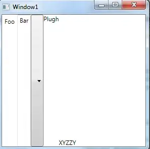
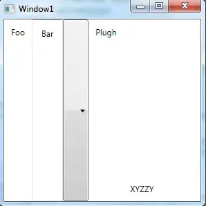
That works, except that the margin is in pixels, and not relative to the resolution of the display or the font size or any of the other things that are going to be variable.
Your assumptions are incorrect. (I know, because I used to have the same assumptions and the same concerns.)
Not actually pixels
First of all, the margin isn't in pixels. (You already think I'm crazy, right?) From the docs for FrameworkElement.Margin:
The default unit for a Thickness measure is device-independent unit (1/96th inch).
I think previous versions of the documentation tended to call this a "pixel" or, later, a "device-independent pixel". Over time, they've come to realize that this terminology was a huge mistake, because WPF doesn't actually do anything in terms of physical pixels -- they were using the term to mean something new, but their audience was assuming it meant what it always had. So now the docs tend to avoid the confusion by shying away from any reference to "pixels"; they now use "device-independent unit" instead.
If your computer's display settings are set to 96dpi (the default Windows setting), then these device-independent units will correspond one-to-one with pixels. But if you've set your display settings to 120dpi (called "large fonts" in previous versions of Windows), your WPF element with Height="96" will actually be 120 physical pixels high.
So your assumption that the margin will "not [be] relative to the resolution of the display" is incorrect. You can verify this yourself by writing your WPF app, then switching to 120dpi or 144dpi and running your app, and observing that everything still lines up. Your concern that the margin is "not relative to the resolution of the display" turns out to be a non-issue.
(In Windows Vista, you switch to 120dpi by right-clicking the desktop > Personalize, and clicking the "Adjust font size (DPI)" link in the sidebar. I believe it's something similar in Windows 7. Beware that this requires a reboot every time you change it.)
Font size doesn't matter
As for the font size, that's also a non-issue. Here's how you can prove it. Paste the following XAML into Kaxaml or any other WPF editor:
<StackPanel Orientation="Horizontal" VerticalAlignment="Top">
  <ComboBox SelectedIndex="0">
    <TextBlock Background="Blue">Foo</TextBlock>
  </ComboBox>
  <ComboBox SelectedIndex="0" FontSize="100pt">
    <TextBlock Background="Blue">Foo</TextBlock>
  </ComboBox>
</StackPanel>

Observe that the thickness of the ComboBox chrome is not affected by the font size. The distance from the top of the ComboBox to the top of the TextBlock is exactly the same, whether you're using the default font size or a totally extreme font size. The combobox's built-in margin is constant.
It doesn't even matter if you use different fonts, as long as you use the same font for both the label and the ComboBox content, and the same font size, font style, etc. The tops of the labels will line up, and if the tops line up, the baselines will too.
So yes, use margins
I know, it sounds sloppy. But WPF doesn't have built-in baseline alignment, and margins are the mechanism they gave us to deal with this sort of problem. And they made it so margins would work.
Here's a tip. When I was first testing this, I wasn't convinced that the combobox's chrome would correspond exactly to a 3-pixel top margin -- after all, many things in WPF, including and especially font sizes, are measured in exact, non-integral sizes and then snapped to device pixels -- how could I know that things wouldn't be misaligned at 120dpi or 144dpi screen settings due to rounding?
The answer turns out to be easy: you paste a mockup of your code into Kaxaml, and then you zoom in (there's a zoom slider bar in the lower left of the window). If everything still lines up even when you're zoomed in, then you're okay.
Paste the following code into Kaxaml, and then start zooming in, to prove to yourself that margins really are the way to go. If the red overlay lines up with the top of the blue labels at 100% zoom, and also at 125% zoom (120dpi) and 150% zoom (144dpi), then you can be pretty sure it'll work with anything. I've tried it, and in the case of ComboBox, I can tell you that they did use an integral size for the chrome. A top margin of 3 will get your label to line up with the ComboBox text every time.
(If you don't want to use Kaxaml, you can just add a temporary ScaleTransform to your XAML to scale it to 1.25 or 1.5, and make sure things still line up. That will work even if your preferred XAML editor doesn't have a zoom feature.)
<Grid>
  <StackPanel Orientation="Horizontal" VerticalAlignment="Top">
    <TextBlock Background="Blue" VerticalAlignment="Top" Margin="0 3 0 0">Label:</TextBlock>
    <ComboBox SelectedIndex="0">
      <TextBlock Background="Blue">Combobox</TextBlock>
    </ComboBox>
  </StackPanel>
  <Rectangle Fill="#6F00" Height="3" VerticalAlignment="Top"/>
</Grid>
- At 100%:

- At 125%:

- At 150%:

They always line up. Margins are the way to go.


