2

I have tooltipster setup to show my validation messages and by far they work well except for one case. I have a set of radio buttons and picking Yes from Yes/no is mandatory.So I have setup a jquery validation method for the same .When I debug through firebug I can see the validation happening but the message that gets flashed is next to the Yes option and it kind of masks the No option completely as it is on top of it.

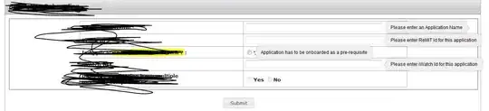
Here is how it looks

enter image description here

here is how my tooltipster config looks for the radio buttons

$('#iWatchEnabled').tooltipster({
    trigger: 'custom', // default is 'hover' which is no good here
    onlyOne: false,    // allow multiple tips to be open at a time
    position: 'right',  // display the tips to the right of the element
    theme: '.tooltipster-shadow',
    left:' 850px'

});

The last left:'850px' is an attempt to overwrite the position that I see via firebug.

Here is the firebug details for the tooltip for the radio button

<div class="tooltipster-base tooltipster-shadow tooltipster-fade tooltipster-fade-show" style="transition-duration: 350ms; animation-duration: 350ms; width: 298px; padding-left: 0px; padding-right: 0px; top: 125.5px; left: 675px;">
<div class="tooltipster-content">Application has to be onboarded as a pre-requisite</div>
<div class="tooltipster-arrow-right tooltipster-arrow" style="">
<span style="border-color:rgb(236, 236, 236);"></span>
</div>
</div>

Any help in resolving this would be great.It looks a seemingly trivial issue but I have quite some time in trying to get this right but nothing to show for it.

Chetya
  • 1,267
  • 1
  • 17
  • 31

1 Answers1

2

I finally found the answer

It appeared that my first setting was overriding my radio group setting too.

$('#onboardForm input').tooltipster({
    trigger: 'custom', // default is 'hover' which is no good here
    onlyOne: false,    // allow multiple tips to be open at a time
    position: 'right',  // display the tips to the right of the element
    theme: '.tooltipster-shadow'
});

$('#onboardForm input:radio').tooltipster({
    trigger: 'custom', // default is 'hover' which is no good here
    onlyOne: false,    // allow multiple tips to be open at a time
    position: 'right',  // display the tips to the right of the element
    theme: '.tooltipster-shadow',
    offsetX: 100
});

I added an offset however I had to set a seperate style for the other text fields I did so

$('#onboardForm input:text').tooltipster({
    trigger: 'custom', // default is 'hover' which is no good here
    onlyOne: false,    // allow multiple tips to be open at a time
    position: 'right',  // display the tips to the right of the element
    theme: '.tooltipster-shadow'
});

$('#onboardForm input:radio').tooltipster({
    trigger: 'custom', // default is 'hover' which is no good here
    onlyOne: false,    // allow multiple tips to be open at a time
    position: 'right',  // display the tips to the right of the element
    theme: '.tooltipster-shadow',
    offsetX: 100
});

Notice that I added a :text in my first config to suggest that the style holds good only for input type="text" elements and in the second config (for my radio button) I added a offsetX and shifted it away by about 100 px

Chetya
  • 1,267
  • 1
  • 17
  • 31