I'm a real beginner and trying to analyze some data on the material loss on some metal tubes for my master thesis. I want to compare the standard deviation of the material loss over an interval for different tubes. I created some sub matrices and did a tapply to calculate the standard deviation.
I have the following script:
myfunctionSD <- function(mydata) { return(sd(mydata,na.rm=TRUE))}

Alltubes <- tapply(datIn$Material.loss.interval,
                   list(as.factor(datIn$Measurement.location),
                        as.factor(datIn$Tube.number)),
                   myfunctionSD)
of which the output is a table with on column header the Tube.number and the row title Measurement.location.
dput(head(Alltubes))

structure(c(0.871073958553372, NA, 0.697795091282526, NA, 0.838624866472886,
NA, 0.726992791242471, 0.807567484588899, NA, 0.598675787394729,
NA, 0.510990323891863, 0.81510216193526, NA, 1.09844645540173,
NA, 0.839816448199645, NA, 0.63972340253115, NA, 1.11485875917537,
NA, 0.883318358663128, NA, 0.86706340125676, NA, 1.21565055332783,
NA, 1.24692213662875, NA, 0.704210691776757, NA, 0.962002980998362,
NA, 1.00703215272093, NA), .Dim = c(6L, 6L), .Dimnames = list(
    c("1", "10", "11", "12", "13", "14"), c("1", "2", "3", "4",
    "5", "6")))
Just to be clear: the 1,2,3,4,5,6 are the tube numbers and header of the columns and the 1, 10, 11...are the measurement locations and header of the rows.
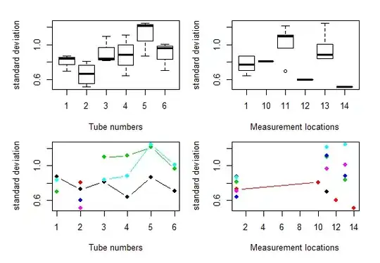
I would like to make different plots of the data, one of them is: Boxplot with on the x-axis the tube number and the y-axis the spread of the derived standard deviation.
I have searched everywhere and have tried lots of different things, but I cant get a graph to appear.
Hope someone can help me, will be much appreciated!