2

I have a dataset which looks like this

ProjectName         MonthsThisYear    CompletionDate
ProjectA                  5               5/1/2013
ProjectB                  7               7/15/2013
ProjectC                 10              10/21/2013

I want to bar plot a graph where Y axis is project Name and X axis is January 2013, February 2013 ... December 2013.

Now the bar against projectA must be 5 units long, ProjectB is 7 units long and the bar for Project C should be 10 units long.

so that people can see that ProjectA is completed in May, ProjectB is completed in July and project C in October.

How can I plot this graph?

currently I can plot this correctly... but the X-Asix has 0, 2, 4, 6, 8, 10, 12 on it rather than month names.

I am on SSRS 2008 R2.

This is what I see right now

enter image description here

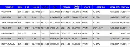
I just want to see month names and year on X axis.

Knows Not Much
  • 30,395
  • 60
  • 197
  • 373
  • 1
    Will the date range always be for a particular year? If so, is there any chance you could this year as a field to the dataset, i.e. each row has a year field with 2013? – Ian Preston Oct 08 '13 at 22:10
  • 1
    Also, what should the label at *0* be? – Ian Preston Oct 08 '13 at 22:18
  • You can use `DateName(month , DateAdd(month , @MonthNumber , -1))` to convert your x-axis into month-name. function taken from http://stackoverflow.com/questions/185520/convert-month-number-to-month-name-function-in-sql – Anup Agrawal Oct 08 '13 at 22:22
  • Edit your dataset and create a new field `monthName` using the above function. Then use `MonthsThisYear` as your category but in the label show the `monthName` instead of `monthsThisYear`. You can mask the 0 to show as blank. HTH – Anup Agrawal Oct 08 '13 at 22:36

1 Answers1

2

Maybe some more question detail would be useful, but here's one way that works with your data:

enter image description here

The main issue we're facing is that typically a date is the category, but in this case it's actually the Data value, which gives us less control over the labels compared to a category group.

First, set up a chart with a Category Group based on ProjectName, and a Data expression like:

=DateSerial(Year(Fields!CompletionDate.Value), Month(Fields!CompletionDate.Value), 1)

i.e. the first of the month of each CompletionDate value, otherwise your bars will be between months.

enter image description here

Next, we need to sort out the X axis:

enter image description here

In my example I set Minimum to:

=DateAdd(DateInterval.Month
  , -1
  , DateSerial(Year(Min(Fields!CompletionDate.Value)), 1, 1))

i.e. December for the last year. Set Maximum to:

=DateSerial(Year(Max(Fields!CompletionDate.Value)), 12, 31)

i.e. the end of the year.

Set Interval to 1 and Interval Type to Months.

Format the X Axis to MMM yyyy.

Looks OK:

enter image description here

If you can actually add a Year column with a value 2013 or whatever, pretty much all of the expressions above can be simplified. For example, I've ignored MonthsThisYear, but if you have a Year column you can build the start of the month value based on MonthsThisYear and Year.

Ian Preston
  • 38,816
  • 8
  • 95
  • 92