1

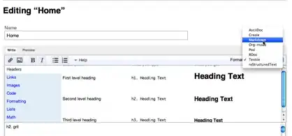
I don't like the new iOS7 3D select box when it shows you the select options (image attached). Its fine on the iPad with a flat look. It makes the mobile view of the webpage look broken and confusing for the user. Its hard to move away from the box after, blends in with the background of the page etc...

Is there anyway to override this horrible looking, unusable feature? default to the old?

mobile screenshot

Tom Rudge
  • 3,188
  • 8
  • 52
  • 94
  • 2
    If only! I'm also not a fan. Here's an interesting article for you to read about the new picker http://blog.ittybittyapps.com/blog/2013/09/20/lifting-the-lid-on-ios-7s-uipicker/ – Guy Kogus Sep 30 '13 at 08:59
  • Thanks, I struggled to find anything on this. – Tom Rudge Sep 30 '13 at 09:00

1 Answers1

3

select inputs will behave like that in iOS browser. You can not avoid it using a select box.

What you can do instead is using some HTML markup and with jQuery and CSS make it look like a select box. Kind of like an open menu.

I wouldn't recommend it though.

Alvaro
  • 40,778
  • 30
  • 164
  • 336