I'm trying to figure out a possible solution on how to create a radar scanner effect using jQuery and CSS. Essentially, a semi-transparent triangle beam would rotate around the middle point of a div. Is this possible with jQuery or should I resort to some other means?
I prefer to not use animated gifs.
Asked
Active
Viewed 1.3k times
5
Roko C. Buljan
- 196,159
- 39
- 305
- 313
Johann
- 27,536
- 39
- 165
- 279
-
1is CSS3 an option? This can't be done in IE8 and should be fairly easy in pure CSS in other browsers. – John Dvorak Aug 21 '13 at 09:01
-
2You should explain what you already tried to do... it is possible using a combination of jQuery/SVG animation techniques... this might help: http://stackoverflow.com/questions/2995643/animate-rotating-svg-element-on-webpage – Joum Aug 21 '13 at 09:03
-
And yeah, jQuery can control CSS3 transformations if you really want to. – John Dvorak Aug 21 '13 at 09:03
-
Anything is an option. – Johann Aug 21 '13 at 09:05
2 Answers
28
You don't need jQuery in order to achieve a radar scanner
- For the infinite radar beam rotation use just CSS
animationand CSSrotateone full turn1turnaslinearandinfinitetiming. - Inside JavaScript, handle the dots opacity with requestAnimationFrame to continually get the current beam rotation angle, convert the dots x, y to angle, and calculate the opacity delta given the normalized differences in the two angles
const getCSSVal = (e, v) => e.style.getPropertyValue(v);
const mod = (n, m) => ((n % m) + m) % m; // Fix negative Modulo
const PI = Math.PI;
const TAU = PI * 2;

const radar = (elRadar) => {

  const elBeam = elRadar.querySelector(".beam");
  const elsDot = elRadar.querySelectorAll(".dot");

  const update = () => {
    const beamAngle = parseFloat(getComputedStyle(elBeam).getPropertyValue("rotate")) * PI / 180 || 0;

    elsDot.forEach(elDot => {
      const x = getCSSVal(elDot, "--x") - 0.5;
      const y = getCSSVal(elDot, "--y") - 0.5;
      const dotAngle = mod(Math.atan2(y, x), TAU);
      const opacity = mod(dotAngle - beamAngle, TAU) / TAU;
      elDot.style.opacity = opacity;
    });

    requestAnimationFrame(update);
  };

  update();
};

document.querySelectorAll(".radar").forEach(radar);
.radar {
position: relative;
overflow: hidden;
width: 300px;
aspect-ratio: 1;
background: #000 url(https://i.stack.imgur.com/vY6Tl.png) center / cover;
border-radius: 50%;
}
.beam {
position: absolute;
top: 0;
left: 0;
width: inherit;
aspect-ratio: inherit;
background: url(https://i.stack.imgur.com/GCbf1.png) center / cover;
animation: 5s rotate linear infinite;
}
@keyframes rotate {
100% {
rotate: 1turn;
}
}
.dot {
position: absolute;
left: calc(var(--x) * 100%);
top: calc(var(--y) * 100%);
border-radius: 50%;
width: 4px;
height: 4px;
margin: -2px;
background: #cf5;
box-shadow: 0 0 10px 5px rgba(100, 255, 0, 0.5);
opacity: 0;
}<div class="radar">
<div class="beam"></div>
<div class="dot" style="--x:0.7; --y:0.2"></div>
<div class="dot" style="--x:0.2; --y:0.3"></div>
<div class="dot" style="--x:0.6; --y:0.1"></div>
<div class="dot" style="--x:0.4; --y:0.6"></div>
<div class="dot" style="--x:0.9; --y:0.7"></div>
</div>
Roko C. Buljan
- 196,159
- 39
- 305
- 313
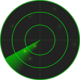
7
HTML:
<div id="radar">
    <div class="beacon" id="beacon"></div>
    <div class="beacon" id="beacon-75"></div>
    <div class="beacon" id="beacon-50"></div>
    <div class="beacon" id="beacon-25"></div>
    <div class="circle" id="circle-big"></div>
    <div class="circle" id="circle-medium"></div>
    <div class="circle" id="circle-small"></div>
    <div class="circle" id="dot"></div>
    <div id="vertical"></div>
    <div id="horizontal"></div>
</div>
CSS:
#radar {
    position:relative;
    width:400px;
    height:400px;
    margin:20px auto;
    border:3px solid #0c0;
    background-color:#020;
    border-radius:50%;
}
#radar>* {position:absolute}
.beacon {
    left:50%;
    top:50%;
    border-style:solid;
    border-width:8px 200px 8px 0;
    border-color:transparent;
    margin-top:-8px;
    transform-origin:0 50%;
}
#beacon {border-right-color:#0c0;animation:spin 2s 0s linear infinite}
#beacon-75 {border-right-color:rgba(0,204,0,0.75);animation:spin 2s 0.03s linear infinite}
#beacon-50 {border-right-color:rgba(0,204,0,0.5);animation:spin 2s 0.06s linear infinite}
#beacon-25 {border-right-color:rgba(0,204,0,0.25);animation:spin 2s 0.09s linear infinite}
.circle {
    left:50%;
    top:50%;
    border:1px solid #0c0;
    border-radius:50%;
}
#circle-big {
    width:300px;
    height:300px;
    margin:-150px;
}
#circle-medium {
    width:200px;
    height:200px;
    margin:-100px;
}
#circle-small {
    width:100px;
    height:100px;
    margin:-50px;
}
#dot {
    width:8px;
    height:8px;
    margin:-4px;
    background-color:#0c0;
}
#vertical {
    left:50%;
    top:0;
    bottom:0;
    border-left:1px solid #0c0;
}
#horizontal {
    top:50%;
    left:0;
    right:0;
    border-top:1px solid #0c0;
}

@keyframes spin {
    from {transform:rotate(0)}
    to {transform:rotate(360deg)}
}
Please note that to support some browsers you will need to add vendor prefixes, but this by itself works in IE10 and Firefox.
Niet the Dark Absol
- 320,036
- 81
- 464
- 592
-
[Added Webkit prefix](http://jsfiddle.net/f9CtG/1/) although it doesn't seem quite right. There's an unusually large gap between the first and second "beacon" elements, despite the delays being linearly spaced... – Niet the Dark Absol Aug 21 '13 at 09:20
-
Weird. Must be my version of Chrome, I don't think I've updated in a while XD – Niet the Dark Absol Aug 21 '13 at 09:23
-
-
1Revisiting much later, here's an updated version using gradients instead of extra HTML elements, and also shows randomly placed dots being "pinged" by the sweeper. http://jsfiddle.net/f9CtG/83/ – Niet the Dark Absol Apr 06 '17 at 12:44