2

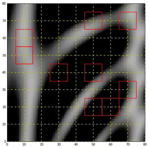
I am trying to get something like this (image the image is fully populated with the red squares (I only drew a few)): enter image description here. Expanding on what I want: I want the RED squares to be centred int the YELLOW squares as shown in the picture (but with RED squares in ALL the YELLOW squares).

What is happening there is the bigger windows (yellow grid) are overlapped between each other by half their size, where the smaller windows in this case, half the size of the big window, (red square) are centred on the centre of the big window. The furthest I could get was using this Multiple grids on matplotlib I am basically using their code, but to make things absolutely clear, I include the code:

EDIT: Thanks to Rutgers I got what I wanted. Here is a slightly edited and shortened version. This code gives the first centre of the four yellow grid intersection where I want.

import matplotlib.pyplot as plt
from matplotlib.pyplot import subplot
from scipy.misc import imread
import numpy as np
import matplotlib.cm as cmps
import matplotlib.collections as collections


i = 1
initial_frame = 1


ax = subplot(111)


bg = imread("./png/frame_" + str("%05d" % (i + initial_frame) ) + ".png").astype(np.float64)

# define the normal (yellow) grid
ytcks = np.arange(16,bg.shape[0],32)
xtcks = np.arange(16,bg.shape[1],32)

# plot the sample data
ax.imshow(bg, cmap=plt.cm.Greys_r, interpolation='none')

ax.set_xticks(xtcks)
ax.set_xticks(xtcks+16, minor=True)

ax.set_yticks(ytcks)
ax.set_yticks(ytcks+16, minor=True)

ax.xaxis.grid(True,'minor', linestyle='--', lw=1., color='y')
ax.yaxis.grid(True,'minor', linestyle='--', lw=1., color='y')

ax.xaxis.grid(True,'major', linestyle='--', lw=0.5, color='g')
ax.yaxis.grid(True,'major', linestyle='--', lw=0.5, color='g')

plt.show()
Community
  • 1
  • 1
leb
  • 544
  • 1
  • 6
  • 17
  • What code have you used to make the image? If you dont want to use the standard grid options perhaps a polygoncollection would work. Its a bit more work but very flexible. – Rutger Kassies Aug 06 '13 at 13:49
  • To me it is not clear what you want to achieve. You should write clearer, so it is easier to understand what you mean. Also, you should include the code you have so far, even if it is not giving you the desired output. Right now you are asking others to do all the work for you (as you haven't included any code) - you are much more likely to get good answers if you show that you have put some effort into trying to solve the problem yourself. – sodd Aug 06 '13 at 13:54
  • @nordev. Sorry, I always assume it is clear enough, and since I linked what I am using I did not want to spam the question with code. I tried to be as explicit with what I want as possible (it is really simple, just centre the smaller squares in the middle of the big squares). Is that a clearer question now :) ? Not really sure how to make it better... – leb Aug 06 '13 at 14:20
  • @Rutger Kassies. Do you mean this http://stackoverflow.com/questions/15968762/shapefile-and-matplotlib-plot-polygon-collection-of-shapefile-coordinates ? – leb Aug 06 '13 at 14:23

2 Answers2

1

Mentioning bigger and smaller grid is a little bit confusing, since to me they seem of equal size, but i assume you mean the 'major' and 'minor' grid.

Well, to sort of mimic your picture with what i had in mind, see if this makes any sense:

import matplotlib.collections as collections
import numpy as np
import matplotlib.pyplot as plt

# generate some fake data, after:
# http://matplotlib.org/examples/images_contours_and_fields/pcolormesh_levels.html
dx, dy = 0.05, 0.05
y, x = np.mgrid[slice(1, 5, dy), slice(1, 5, dx)]
z = np.sin(x) ** 10 + np.cos(10 + y * x) * np.cos(x)

# define the normal (yellow) grid
tcks = np.arange(0,90,10)

fig, ax = plt.subplots(figsize=(8,8), subplot_kw={'xticks': tcks, 'yticks': tcks})

# plot the sample data
ax.imshow(z, cmap=plt.cm.Greys_r, interpolation='none', vmin=0.4, vmax=1.5, extent=[0,z.shape[0],0,z.shape[1]])

# plot the yellow grid
ax.grid(True, linestyle='--', color='y', lw=1.5, alpha=1.0)

# define some random 'red' grid cells
custom_grid = []

for i in range(10):   
    x = np.random.randint(0,7) * 10 + 5
    y = np.random.randint(0,7) * 10 + 5

    polygon = plt.Rectangle((x, y), 10, 10)
    custom_grid.append(polygon)

p = collections.PatchCollection(custom_grid, facecolor='none', edgecolor='r', lw=1.5)
ax.add_collection(p)

enter image description here

Its stil a bit unclear for example when you want to show the 'red' grid cells and when not.

Rutger Kassies
  • 61,630
  • 17
  • 112
  • 97
  • Yes, sorry, I do not have the vocabulary for it and in what I am doing the grid represents a window of interest. The size of the big window, is 64x64 in this case, and they overlap by half size in both horizontal and vertical (that is, the 4 small yellow squares make up one big window (which I confusingly called "grid", thanks for pointing that out). What I want: to populate the whole image with red squares in the centres of the big windows (where the 4 yellow grids intersect, as you have done for some examples). I am pretty sure what you have done will work for me, but let me check. Thanks! – leb Aug 06 '13 at 14:45
  • OK, so I have read through your code carefully and yes, I do not see any reason why it would not work. I just need to find a way to maybe replace the for loop for speed (I am plotting thousands of images). Thanks again! – leb Aug 06 '13 at 14:48
  • Let the confusion continu :). I figured you wanted some 'red' grid cells plotted since you mentioned 'but I get all the unnecessary grids'. I think i see what you mean now, the `Ticklocators` dont allow an offset, so you should simply set the ticks manually, once for the major and once for the minor ticks. Thats the way to go if you do want 'all' grid cells to be plotted. I'll answer in a new respons to keep it separated. – Rutger Kassies Aug 06 '13 at 15:02
  • Just to clarify on that bit again. Simple grid would have lines outside the centres (well, this is confusing :) ). I mean that I do not need a grid appearing in the first (in this case) 16 px on all sides of the image. Does that make sense ? – leb Aug 06 '13 at 15:07
1

Given the sample data z from my other answer:

# define the normal (yellow) grid
tcks = np.arange(0,90,10)

fig, ax = plt.subplots(figsize=(8,8))

# plot the sample data
ax.imshow(z, cmap=plt.cm.Greys_r, interpolation='none', vmin=0.4, vmax=1.5, extent=[0,z.shape[0],0,z.shape[1]])

ax.set_xticks(tcks)
ax.set_xticks(tcks+5, minor=True)

ax.set_yticks(tcks)
ax.set_yticks(tcks+5, minor=True)

ax.xaxis.grid(True,'minor', linestyle='--', lw=1., color='y')
ax.yaxis.grid(True,'minor', linestyle='--', lw=1., color='y')

ax.xaxis.grid(True,'major', linestyle='-', lw=1., color='r')
ax.yaxis.grid(True,'major', linestyle='-', lw=1., color='r')

ax.set_xlim(0,80)
ax.set_ylim(0,80)

enter image description here

I expect this to be much faster than drawing with polygons.

Rutger Kassies
  • 61,630
  • 17
  • 112
  • 97
  • Yep, this will do the trick (even though I do not need the red lines in the first (in your image) 10 px of the image (but I am not asking this as you have helped a lot already!). Thank you Rutger ! – leb Aug 06 '13 at 15:10
  • Glad it works for you. The edges can be removed by slicing the tcks variable when setting the minor ticks: 'ax.set_yticks(tcks[1:-1]+5, minor=True)' – Rutger Kassies Aug 06 '13 at 16:04