EDIT: I agree with Roland that I didn't need to spend all that text on the Shiny-specific stuff. Removed and added the gist of what the data frame should look like after thinking about it more.
EDIT_2: While the shiny stuff wasn't really relevant to the question, I created an example using Roland's solution below if passer-bys are interested to see what I was doing with this. Have patience with the graphic loading; it can be a bit slow.
I'm trying to plot a set of predicted modeling data in R and shiny. I have four variables whose interactions I'd like to show in contour plots. For each variable, I have the user define a range as well as a hold value. There are two cases for each variable:
- Used as one of the axis variables: The range determines over what values I predict new responses in my model for that variable
- Not featured directly in the plot: The hold values are used to set non-featured variables at a constant value so that my prediction for the other two variables yields only one unique/single surfaced
zvalue for eachxandycombionation
I'm running into issues with handling the data in a way that's friendly to producing a grid of contour plots. I'd ideally like a screen showing the 6 interactions between the other four variables (4C2).
I essentially need two sets of data:
- One in the original form of the input data set used to train the model (so that I can do
predict(model, newData)to obtain the output column to be used forzvalues - A subset/rearranged form of the previous for plotting/facetting
For the facet-friendly version, this is what I'd need (in my mind; perhaps there is a better way):
| x        | y        | z | col | row |
|----------+----------+---+-----+-----|
| var1_min | var2_min | z |   1 |   1 |
| var1_min | ...      | z |   1 |   1 |
| var1_min | var2_max | z |   1 |   1 |
| ...      | ...      | z |   1 |   1 |
| var1_max | var2_min | z |   1 |   1 |
| var1_max | ...      | z |   1 |   1 |
| var1_max | var2_max | z |   1 |   1 |
|----------+----------+---+-----+-----|
| var1_min | var3_min | z |   1 |   2 |
| var1_min | ...      | z |   1 |   2 |
| var1_min | var3_max | z |   1 |   2 |
| ...      | ...      | z |   1 |   2 |
| var1_max | var3_min | z |   1 |   2 |
| var1_max | ...      | z |   1 |   2 |
| var1_max | var3_max | z |   1 |   2 |
|----------+----------+---+-----+-----|
| ...      | ...      | z |     |     |
|----------+----------+---+-----+-----|
| var3_min | var4_min | z |   3 |   2 |
| var3_min | ...      | z |   3 |   2 |
| var3_min | var4_max | z |   3 |   2 |
| ...      | ...      | z |   3 |   2 |
| var3_max | var4_min | z |   3 |   2 |
| var3_max | ...      | z |   3 |   2 |
| var3_max | var4_max | z |   3 |   2 |
|----------+----------+---+-----+-----|
In this way, I have my x and y values, the column of the corresponding predicted response from the model, and something to create a facet_grid with (either a 2x3 or 3x2) facet.
For the prediction data frame, the form would have to match my initial prediction data and would be almost like a cast/wide form version of the above:
| var1      | var2      | var3      | var4      |
|-----------+-----------+-----------+-----------|
| var1_min  | var2_min  | var3_hold | var4_hold |
| var1_min  | ...       | var3_hold | var4_hold |
| var1_min  | var2_max  | var3_hold | var4_hold |
| ...       | ...       | var3_hold | var4_hold |
| var1_max  | var2_min  | var3_hold | var4_hold |
| var1_max  | ...       | var3_hold | var4_hold |
| var1_max  | var2_max  | var3_hold | var4_hold |
| ...       | ...       | ...       | ...       |
| var1_hold | var2_hold | var3_max  | var4_min  |
| var1_hold | var2_hold | var3_max  | ...       |
| var1_hold | var2_hold | var3_max  | var4_max  |
I feed that into the model to obtain the predicted response to be used as z in the contour plot.
It also gets tricky as I don't always want the variables in their natural ith order, as I need to arrange them to have one common axis scale across facet rows or down facet columns (could be either, does not need to be both). I'd arrange the combinations something like this:
| x    | y    | row | column |
|------+------+-----+--------|
| var1 | var2 |   1 |      1 |
| var1 | var3 |   2 |      1 |
| var2 | var3 |   1 |      2 |
| var2 | var4 |   2 |      2 |
| var4 | var3 |   1 |      3 |
| var4 | var1 |   2 |      3 |
Now I can have three columns and two rows of facets with column 1 having the shared var1 axis, column two with var2, and column 3 with var4.
I was wondering about using expand.grid manually to six unique combinations of variables. Once that's done, I realized that every row will feature two variables set at their hold values, so perhaps I could create a list of these six combinations and then extract the non-hold-value variables into two new columns for the plotting data frame?
Any suggestions?
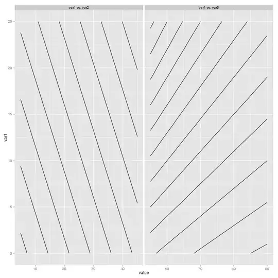
Here's a hackish example I tried with three variables, trying to focus on just the interaction between var1 and c(var2, var3):
# the min/max arguments to `seq()` are like the user-defined range
# take the second argument to `c()` is to be user-defined hold value

library(ggplot2)

var1 <- seq(0, 25, length.out = 10) # hold value = 11.1
var2 <- seq(5, 45, length.out = 10) # hold value = 17
var3 <- seq(55, 90, length.out = 10) # hold value = 72

# create combinations between var1 and var2, with var3 held
test_data <- expand.grid(var1 = var1, var2 = var2, var3 = 72)

# same, but for var1 vs. var3, with var2 held
test_data <- rbind(test_data,
    expand.grid(var1 = var1, var2 = 17, var3 = var3))

# create response; analog to using predict() in real life
test_data$resp <- (test_data$var1 + test_data$var2) / test_data$var3

# facet variable placeholder and filling in
test_data$facet <- rep("", nrow(test_data))
test_data[test_data$var2 == 17, "facet"] <- "var1 vs. var3"
test_data[test_data$var3 == 72, "facet"] <- "var1 vs. var2"

# now I melted
test_data2 <- melt(test_data, id.vars = c("var1", "resp", "facet"))
Unfortunately, this left me with a bunch of cases where value was filled in with all of the hold values from var2 and var3, so I had to remove them:
test_data2 <- test_data2[test_data2$value != 72 & test_data2$value != 17, ]
Now, I was able to do this:
ggplot(test_data2, aes(x = var1, y = value, z = resp)) +
    stat_contour() + facet_grid(~ facet)
Got the ballpark I was looking for. Now I guess I need an elegant way to do my combinations and hold values without having ugly results.

Here's an updated version now that I get how to plot on the same axes with rows/columns (since I have two columns and one row, I need the y axis to be the same for both facets which in this case is var1):
ggplot(test_data2, aes(x = value, y = var1, z = resp)) +
    stat_contour() + facet_grid(~ facet, scales = "free_x")