I'm designing a responsive website and right now i have bit of a problem. Basically logo is set in the middle of the navigation but when i tried viewing it in mobile or set my browser for mobile it looks like this.
http://i255.photobucket.com/albums/hh140/testament1234/responsive_zps3a22ab61.jpg
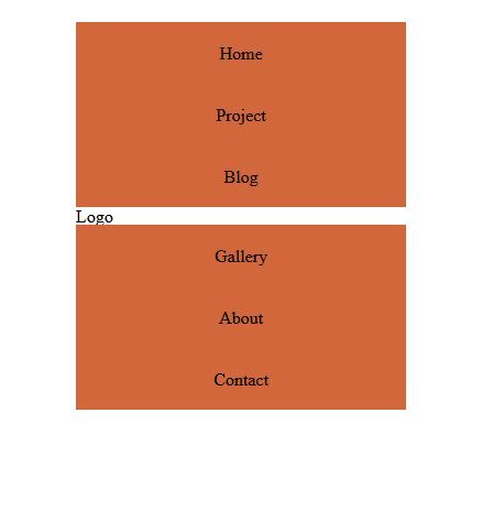
This is what it looks like in full screen.
http://s255.photobucket.com/user/testament1234/media/desktop_zps4c60a09c.jpg.html
How do I set the logo on top of the navigation when viewed in a mobile device.
This is my code for the markup or HTML.
<div class="container">
 <div id="nav-container">
     <div class="six columns navigation">
     <ul>
         <li><a href="#" title="Home">Home</a></li>
         <li><a href="#" title="Home">Project</a></li>
         <li><a href="#" title="Home">Blog</a></li>

     </ul>
     </div>
     <div class="four columns">
         <h1>Logo</h1>
     </div>
     <div class="six columns navigation">
         <ul>
             <li><a href="#" title="Gallery">Gallery</a></li>
             <li><a href="#" title="Gallery">About</a></li>
             <li><a href="#" title="Gallery">Contact</a></li>
         </ul>
     </div>
 </div>
</div>
And this is my code for my CSS
#nav-container{margin-top:20px;}
.navigation{text-align:center; background-color:#D1673A;}
.navigation li{display:inline; }
.navigation a{text-decoration:none; color:black; display:inline-block; padding:20px 20px 20px}
.navigation a:hover{color:white; background-color:black}
My using skeleton framework in building my responsive website. Regarding my question do i set some styling in the media queries or change my markup?