60

Tooltips are an incredibly useful interface paradigm to know an application. They are the mapping between the visual control and the application specific action associated to that control. The user can explore the action without invoking it just by hovering the mouse pointer.

The touch devices make this paradigm basically impossible. This limits the usability of the app, which becomes in some cases pretty mysterious.

Do you know if a substitute for the tooltip concept exists for touch devices? They effectively lack one degree of freedom in ui interaction: the pointer position. How to regain this communication channel effectively?

chue x
  • 18,573
  • 7
  • 56
  • 70
Stefano Borini
  • 138,652
  • 96
  • 297
  • 431
  • 1
    Here is a question with a similar goal: http://stackoverflow.com/questions/1660536/ux-design-for-disabled-controls-w-the-touch-interface. Maybe the answers there have some pointers as well. – Joey Nov 15 '09 at 15:47
  • 1
    I wouldn't say it necessarily "limits the usability" but rather than it _changes_ it. Perhaps it will force UI designers to come up with better designs that don't need tooltips. – Bryan Oakley Nov 15 '09 at 15:57
  • That's the basic idea :-). The current UI paradigm is *very* centered around a graphical pointing device which allows for near-pixel-perfect positioning and pretty precise movements as well as (usually) 7 to 31 different button states. Also the device itself doesn't obscure the display. All those things are very different for touch input which necessarily means that either the input method doesn't suit the interface paradigm *or* the interface paradigm doesn't suit the input method. Whichever way you look at it, you have to think of other solutions instead of sticking to the old one. – Joey Nov 15 '09 at 16:23
  • 1
    Note that you can choose to register the touch on release, in that cause a `press down` (i.e. MouseDown) event does not yet consitute a click and that's when you can do a tooltip. Also you can get creative and let a swipe across a control (think `fruit ninja` here) to constitute a `need help` action. – Johan May 19 '11 at 19:11
  • Note stylus-based touch devices (such as Wacom's products and [Samsung's Galaxy Note II](http://www.youtube.com/watch?v=sZxGQ-vHGKE)) still support hover. – bobobobo Jun 12 '13 at 23:50

12 Answers12

42

Depending on who you ask, they might even tell you that an interface that needs tool tips to be understandable needs to be redesigned, badly (cf. Jef Raskin: The Humane Interface).

In fact, tool tips are a solution to a very specific problem: Iconic buttons with no labels, such as seen on toolbars. Whenever you have labels, use them. No need to provide a tooltip because you already have text to tell what a particular control is going to do.

What's more is that touch interfaces map not very well to today's WIMP interface model. Many controls are good to handle with a mouse pointers but are frustrating to use with a finger. Menus, checkboxes, radio buttons spring to mind. So the interface paradigm for touch interfaces has to look rather differently to today's mouse- and keyboard-driven interfaces.

So I think it's not so much a lack of tool tips that's the problem here but rather that we didn't explore many new ways of interacting with a computer in the past 30 years (basically not since the research done by Doug Engelbart and Xerox PARC in the 60s and 70s).

Touch input is just similar enough that it kinda works for most purposes. But it not only lacks a location-without-touch component but also precision. Basically all touch input is good for is touching something and dragging something. Even double-tap is difficult so what we really need is some fundamental change in how to design and craft UI specifically for a touch interface.

You'll see some of this in dedicated devices, such as the iPhone simply because that's a platform that neither has a mouse pointer nor a keyboard and only touch. This means you don't have to build a UI which has to be usable with all possible methods of interaction (a problem with plagues Windows currently; I do have a multi-touch laptop but for many many tasks touch just doesn't work) but only with one. But a general-purpose solution for "normal" software and computers is pretty far off at the moment, I think.

So I'd advise you to just think a little different about how you design your UI. As said before (and can be read in Alan Cooper's About Face), tool tips are for labeling controls that don't have labels or where space wouldn't suffice to place them. Key usage scenario here are tool bars. But an interface designed for touch would make all controls larger anyway. Many small icons, closely grouped together are a pain to use with touch input even if you had tool tips, simply because it lacks precision.

Joey
  • 344,408
  • 85
  • 689
  • 683
  • I like the better UI design thought. The simpler and more error-prone your tools (e.g. a large fingertip on a small space), the more well-tested your UI needs to be. – Kzqai Nov 15 '09 at 15:44
  • I really liked your answer as so many other people. You describe the point very well. – Stefano Borini Nov 16 '09 at 03:23
  • 15
    It’s true that tooltips are primarily used today to compensate for the sad lack of text labels on toolbar items, but there is more tooltips are (or should be) used for. Examples: to show full text of an item that is cropped off (e.g., a list box), to expound on non-interactive graphics (e.g., value of a bar on a graph), to enlarge a text label for accessibility. Just like mouse-pointer UIs, touch interfaces would also benefit from having a pre-execution idiom to display supplemental information. If we can’t come up with something, then it’s yet another disadvantage of touch interfaces. – Michael Zuschlag Nov 17 '09 at 13:29
  • 1
    Actually, most of your examples don't actually *require* the use of a GID that allows for positioning without click. You can just as well click (touch) a list box item to let a tooltip appear, similar for bar charts. But the real answer lies somewhere else. You may want to read up on Zooming UI (http://en.wikipedia.org/wiki/Zooming_user_interface). Jef Raskin had some great points on that in his book *The Humane Interface*. I agree, a pre-execution idiom would be nice to have but with a proper UI I don't really think it'd would look like tool tips at all. – Joey Nov 17 '09 at 13:39
  • As for a zooming UI: You can easily display more information (which would "overflow" into a tooltip for textless (bar chart) or small items (short labels, button descriptions)) by zooming in on them. A one-word button title would evolve into a short phrase describing what it does to maybe a complete paragraph documenting in detail what happens. At least on paper it sounds pretty nice and as long as the UI is consistent and easy to handle I don't think those options are inferior to tooltips. It's just maybe that we aren't that used to those so far. – Joey Nov 17 '09 at 13:41
  • 1
    "we didn't explore many new ways of interacting with a computer in the past 30 years" -- this is _not true_. _We did_ create [Graffiti](http://en.wikipedia.org/wiki/Graffiti_(Palm_OS)), voice recognition, gesture based UIs, [little spheres that control things](http://www.gosphero.com/), [wearables](http://en.wikipedia.org/wiki/Wearable_computer) and much more. It seems to me that most of these ideas just didn't catch on, are more tedious than what they try to replace, or just aren't accurate enough to be usable. __Cost__ may also a major factor for why alternative HCI isn't as popular. – bobobobo Jun 12 '13 at 23:59
  • @bobobobo: Granted, I was coming mostly from WIMP here, although I still think it holds true. Main input methods to general-purpose computers (smartphones and tablets are mostly that, too) are still a keyboard or (in the logical sense) a pointing device. Whether you replace the keyboard with a on-screen one or by gestures (Graffiti still uses a pointing device) doesn't make too much of a difference. Voice recognition made great progress but still is mostly delegated to either blind people, some niche applications or gimmicks (Siri works so well because the phrases are rather limited). – Joey Jun 13 '13 at 06:16
  • @bobobobo: As for gesture-based interaction, you're probably aiming at John Underkoffler's research and, more recently, Kinect, etc. It's a very recent development and one that we're still figuring out to use properly; currently I'd say no one would use such a thing for extended periods and cannot perform many tasks with that. With wearables we have the same problem that there isn't a so overwhelmingly good way to interact with them ... which probably comes back to the point you were making regarding tediousness and accuracy. – Joey Jun 13 '13 at 06:21
10

Reading here got me thinking. Tooltips are generally used for giving a label to textless buttons, but are also a great way of giving more information in the reduced space available in an interface. Sometimes, it's used to provide context sensitive help, or a detailed explanation of a single widget.

Tchalvak's idea of giving all GUI elements a single click common behaviour, and providing a tooltip on double click has its merits, and can even be somewhat discoverable, as many people are used to double clicking on everything they see, regardless of the element.

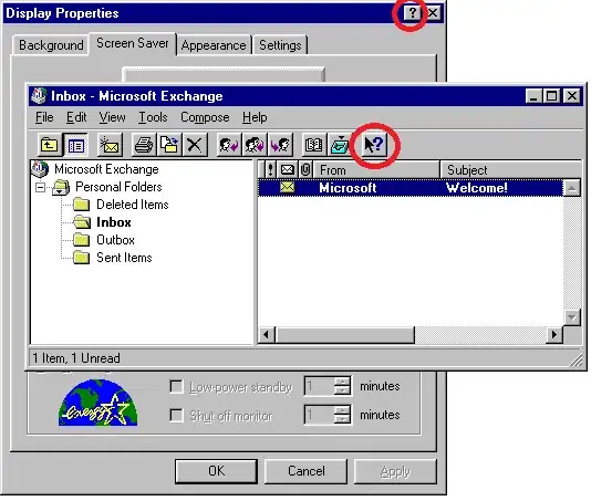
But I recalled the old ? button that was so popular years back, wich once clicked would transform the cursor into a question mark. Once you clicked a widget, you would see a small tooltip or information balloon. I believe that something like that could be easely used on a touch interface. Because of the lack of a cursor, another visual cue should be given to the user telling him that he is in provide help mode. May be change the tint of the screen and give a small text. It could be also done through multitouch by requiring the ? button to be pressed while pressing another widget to get the tooltip (which should be shown in a slightly separated place in order not to be too obscured by the finger).

Those ? buttons were popular in the Win 95 days, but have largely dissapeared now.

But even if it's possible to keep the same technical functionality for us programmers to have tooltips, we should be thinking about the intent, what we'll be using it for.

I would use it only to give extended help when you are faced with a small screen, otherwise, make a help area visible at all times on the bottom of the "window" (refferring to any kind of square-shaped-io-interface), that changes its contents to provide a detailes explanation and/or help for the selected widget, as is done in some preferences windows on hover.

In conclusion, even if we are able to provide easy to use tooltips, we should be thinking of what would you put in it. In a touch interface, I would not put a labeless ambiguous button that needs a tooltip to be understood, but would use it to give context sensitive advanced help and troubleshooting.

Community
  • 1
  • 1
Esteban Küber
  • 36,388
  • 15
  • 79
  • 97
  • the tooltip button was redundant in wimp interfaces, and in touch interfaces it's difficult to add another button. – Stefano Borini Nov 16 '09 at 03:25
  • 1
    @Stefano Borini: It's hard to add a button? How's so? – Esteban Küber Nov 16 '09 at 03:29
  • @voyager: Most touch interfaces have quite little space compared to WIMP. This is in part because most touch interfaces are on small-screen devices and also because touch targets have to be larger than click targets. There's only so much you can add before cluttering the UI. And on the other hand, tool bars are a WIMP mechanism that probably makes it too easy to add buttons and thereby increasing clutter almost automatically. – Joey Apr 17 '13 at 05:10
  • 2
    No, no, no, how about _you drag_ the question mark onto the icon you need help with? That'll make everyone happy! – bobobobo Jun 12 '13 at 23:39
  • Thats was absolutely horrible, you not only had to learn how to use the functionality but also that you could get help by clicking a cryptic button that changes position depending on app. – max Dec 16 '13 at 22:24
7

I can think of a couple of solutions to this problem

1) Design your app to not need tooltips. Put text on buttons (however small), use straightforward icons, or show a "help bubble" on "first use of a button" (with option to "not show this again" once user has learned what a button is for)

2) Respond to events on touch up, not touch down. Respond to touches that have been held for 0.5-1 second by displaying a "help" bubble. If the help bubble shows, the button's normal event does not fire on touch up (so users looking for help don't end up triggering actions).

3) Use the "question mark" drag & drop paradigm that @voyager suggested. Or, have the user "tap" the question mark first, then tap the item he needs help with.

Community
  • 1
  • 1
bobobobo
  • 64,917
  • 62
  • 258
  • 363
6

I find tooltips very helpful and I think everybody arguing they are not needed on a good UI design thinks very limited.

Just to give you some idea ...

Generally a good UI design (as a lot of other things in life) is one that is effective and efficient over a certain period of usage time. Effective means, you can do what you expect you could do (e.g. making a call with a mobile). Efficient means, it is doable with minimal user effort (e.g. just typing the numbers and pushin some "dial" button, not having to navigate through some menus first). Over a certain period of time means, that it may not be optimal on first usage or, the other way around, after you got to know it and everything in between (e.g. an airport terminal screen maybe needs to be more focused on one-time-user "dummies" than a video editing software for professionals like Adobe Premiere).

This said I find tooltips extremly helpful in situations, where

  • as a designer you do not want/cannot explain every detail about some GUI functionality within some given UI area
    • due to usability, available overall space etc.
    • e.g. taking the above examples it may be helpful even on a simple mobile call scenario for elderly people.
      • That may be not familiar with a lot of things we "freaks" ;-) find trivial.
      • And they should be encouraged to click around without the fear to accidentially call some shopping hotline and beeing finally convinced that they cannot live without the 1000 EUR vacuum cleaner.
      • so in this case a one-click tooltip paradigm could make sense
        • generally I wouldn't recommend it though
  • as a user you are not sure about the meaning of some provided action/button etc.
    • again sticking to the previous examples, even an experienced Adobe Premiere user may not remember all the details about a certain functional area of all the available modules/plugins
      • e.g. if most of the time you cut videos and seldomly adjust audio settings
      • whereas others may have the problem vice versa

Now back to the limitations and possibilities of a touch interface...

  • :-) Hover: I recently saw somewhere, that some devices can recognize the finger before it actually touches the touchpad or it differentiates between the touch intensity (e.g. only very soft touch). This would seem the perfect pendant to the established tooltip functionality on WIMP interfaces to me
    • of course it would be dependent on the touch hardware capabilities
  • :-) Zooming UI: I actually like the Zooming UI concept mentioned by Joey as well
    • the concept of using only two fingers is already quite common for zooming and the idea is quite intuitive, e.g. showing more details, like typical tooltip infos, on zooming on a button
    • but it admittedly introduces the problem of differentiating between I like to have a tooltip for this button and I like to zoom the whole area in/out, not having the button tooltip near my fingers in mind
      • although I would think that typical tooltip-enabled areas are quite different from zoomable areas in general
        • e.g. some PDF readers content area is generally visually quite separated from e.g. some toolbar (button)
      • tooltips for non-action areas, like some text area are again not trivial to handle or would require some more "gesture differentiation agreement"
    • from the development perspective it seems also quite robust
  • :-) QM: the question mark click or drag'n drop feature solution could be a good alternative too
    • having a lot of these everywhere on the screen seems stupid, especially when they have to aquire a certain space to be clickable/draggable
    • having one to drag everywhere seems better, but again would require the space for it on the screen
    • from a development perspective I would find it at least a little difficult as a general solution because the drag'n drop is a common feature and differentiating in a UI between here comes some tooltip drop I have to handle and here comes some file drop I have to handle (e.g. on a file upload area) may not be easy or at least common ground to existing frameworks
  • :-| Hold: the idea to trigger the tooltip if the user does not release the push after a certain period of time, e.g. 1s, seems to be a 2nd best solution to me
    • it is already a common feature in some scenarios, as the mentioned on-screen keyboard popups (e.g. resting on an "o" and getting a list of choosable alternatives like oóòô)
    • again it requires some trust from the user, that it won't execute the areas action on the release
    • on some buttons it may be difficult to differentiate what the user wants to do, e.g. clicking on a "+" sign/button to increase some number and holding it down to increase more or faster may contradict this tooltip functionality
    • for non-action areas a push-hold action may not seem intuitive
    • from a development perspective it could be rather easy although some behaviour contradictions like mentioned may exist
  • :-| SCT/DCA: the solution single-click showing tooltip, double-click executing action I could imagine to be useful in limited scenarios
    • e.g. the mobile call for some elderly or dummy people mentioned above or where the action should be kind of protected from unconcious or unsure usage
    • again the development perspective looks robust again here
  • :-/ SCA/DCT: the solution single-click executes action, double-click shows tooltip seems very strange to me
    • if you are not sure about some functionality you would hesitate to click a button at all, and surely not twice, especially if you cannot be sure if you can expect this behaviour
    • the development perspective could be problematic here:
      • after which time is a double-click two single-clicks?
      • what if the second click is not recognized or cannot be recognized, e.g. because some other popup comes up, the UI layout changes suddenly, the user did not carefully aim, ...
  • :-/ Other Gestures: using other gestures mentioned or I could think of, like drawing a question mark over the to-be-tooltipped-area, swiping over the area in some way etc.
    • because this seems no common ground I wouldn't like it because it also may block other functionality otherwise available
Andreas Covidiot
  • 4,286
  • 5
  • 51
  • 96
6

The tooltips on onscreen keyboards - echo the letter being touched - is evidence enough for me that tooltips are very useful on a touch interface. I came to this article to see how I could implement that on a mobile web page.

John laPlante
  • 61
  • 1
  • 1
4

Perhaps persistent labels giving short descriptions of each more or less "obscure" functionality available on the interface, combined with contextual notification messages when actions are performed -e.g: the user modifies data => notification appears reminding him not to forget to save by using a button that would briefly highlight during this notification.

luvieere
  • 37,065
  • 18
  • 127
  • 179
2

Well, the benefit of the tooltip is that it adds an overlying stage of (very minor) information before an action occurs. So it seems to me that adding that layer back in via a "double click" to perform the action with a "single click" to display information would be an equivalent idea.

I think that we've all seen the movies with the future screen interfaces where someone touches the screen and it splays out a geometric shape of information around that touch. Why not use that concept, have the first touch expand the information about the action as a useful in-page tooltip, and then the second click on the same spot would confirm/perform the action.

If not "click-on-item-shows-tooltip-second-click-performs-action" how about proximity? If you want information about a UI widget, with enough spacing, you could touch next to the widget and receive information on it, touch -on- the widget and perform the action.

Tooltips provide so little information, generally (pointer vs. hand, text-tool-tip, hover bolding) that I think that you could also just duplicate the tooltip information by paying close attention to user action history. If they've been clicking on two thing more frequently than another thing recently, have the default tooltip & added value & emphasis appear for those few more frequently clicked things instead of others.

Edit: Also, thinking about it more, drag in a space that doesn't need scrolling or the like seems like an alright trigger for tooltip information. Take the iphone's keyboard, for example. Each letter has a tooltip while you drag it, whereas the letter itself is actually activated when you release. Aids in repositioning precision.

Beyond that, I think that specifics come into play. Are you talking laptop tablet? phone touch interface with very limited space? I think available space plays a large part in how you have to do things with a touch interface.

Kzqai
  • 22,588
  • 25
  • 105
  • 137
  • Having a two-click process adds a *cost* that wasn't previously there. Something like a drastically simplified radial menu might make sense -- when you press your finger down, information is displayed, and if you slide in a particular direction it'll cancel the action? – starwed Jul 18 '12 at 12:15
1

What about touch and hold? I think that would be a fairly simple interface rule in terms of both usability and implementation. Like a lot of things to do with usability though it will be hard to say until any one idea has been around for a bit of time to see it used in a bunch of different contexts...

hgh
  • 71
  • 8
1

My answer isn't perhaps so practical, but...

The problem would be solved if apps all supported undo functionality, and people got used to knowing that they could ALWAYS reverse any action.

As Andreas says, "if you are not sure about some functionality you would hesitate to click a button at all".

But with undo as the safety net, there can be more "doing", and less "hesitate, worry, find out what will happen before I tap... tap".

This is one of the reasons why the Back button is so popular, and Android even made it operating system-wide.

Unfortunately (here are the impracticalities...)

  • building reliable pervasive undo is far harder than tooltips
  • enough apps need to support it to change the mindset of all users (ha!)
poshest
  • 4,157
  • 2
  • 26
  • 37
1

This may be helpful:

Google Material Tooltips

They say tooltips are

Summoned by:

  • Hovering over an element with a cursor
  • Focusing on an element with a keyboard (usually the tab key)
  • Upon touch

It doesn't have a lot of information about mobile only. About the only one you can meet is the on touch, which is frustrating if your button does something, you don't want to touch it before you know what it does. Long press may work but some apps require long press for other functions, it's a used UX path and a user would not expect long press tool tips unless you tell them.

I am thinking that tooltips may just not work the wonders on mobile that they do on desktop. Without hover, you need another reserved way to quickly remind or show a user what an icon or button does.

The best thing I can think of is the help mode. Pressing settings then 'help', displaying short card on the bottom saying something like 'click an element for help' and a 'dismiss' button. Then hitting tool tipped elements will show you a the extra information for them.

I see above this mentioned but another modern use case for this are games. They are often designed with a joystick in mind, which means they have roughly 14 buttons to work with, yet most are taken up by game functions.

In RPGs they typically have complex stat screens that are guaranteed to be unknown by the player (often they invent new systems for each game) full of numbers that are important, but players don't know. Many of them let you hit the select button to get into a tooltip/explanation mode.

This may well work in an app that is complex enough to require tooltips on mobile and is the only pattern I can see right now that isn't so far outside common ux designs.

James DeRagon
  • 364
  • 1
  • 4
  • 11
0

To paraphrase Einstein, a touch should be as simple as it needs to be, but no simpler.

The underlying problem here is not touch, but state. What state is the object in when you touch it? Does touch change its state? How is the change in state reflected to the user?

From the design perspective, trying to encompass all actions in a single touch will work only in the simplest cases. For any more useful application, a first touch may change state, and that state can be reflected by changes in an object's image, by tooltops (even transient tooltips that go away after a set time), or by other means. Touching a selected object should have different meaning than touching a non-selected object. This needs to be a discoverable aspect of the interface.

Cylon Cat
  • 7,111
  • 2
  • 25
  • 33
0

Keeping in mind that hover tooltips are terrific help for beginners and they need no action to learn for them because beginners are always slow and they pop up while insecure moving the cursor. On the other hand, they are excellent because they do not slow down the power users.

For tablets I would pick up the idea of the question mark but add some more complexity:

1) When you tap on the question mark, it switches on the "Help" mode. 2) you can then tap on the control in question and it shows the tooltip. 3) if you then tap on the same control again, it terminates the help mode and executes what ever the control should do. 4) if you tap on any other control, it shows the his tooltip and the help mode keeps switched on. 5) one can terminate the help mode by tapping the question mark again.

fanThomas
  • 127
  • 2
  • 6