6

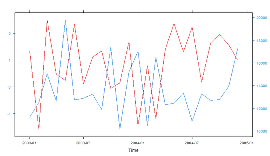
I want to plot a trading strategy against a currency pair. Of course the trading strategy has large values (>10'000, since 10'000 is the initial capital) and the currency pair hovers around 1.5. So I want to overlay the strategy over the same chart as the currency pair, but I need two different Y-scales.

How can I do that?
Like this both are in the same chart, however the strategy (Investment) isn't visible since it's way above the highest high of the currency pair.

And bonus question :-)
How can I subset the data from a specific date until today? like 2008 until now or something?

FXTimeSeries <- zoo(MergedSet$FXCloseRate,MergedSet$Date)
InvestmentTimeSeries <- zoo(matrix[,"Investment"], MergedSet$Date)
chartSeries(FXTimeSeries, theme="white", subset='2011-04::2013-06')
addTA(InvestmentTimeSeries,legend="Strategy", on=1)
gpalex
  • 826
  • 1
  • 11
  • 27
MichiZH
  • 5,587
  • 12
  • 41
  • 81
  • answer to bonus question: `subset="2008/"` in your `chartSeries` call, or if you've already called `chartSeries`, `zoomChart("2008/")`. Seealso: `zooom()` (with 3 o's) – GSee Jun 19 '13 at 19:31
  • I bet xtsextra can do this, but couldn't find an example. All I found was examples of doing even more complicated stuff (e.g. http://timelyportfolio.blogspot.jp/2012/08/plotxts-with-moving-average-panel.html ) – Darren Cook Jun 20 '13 at 00:59

1 Answers1

1

You can use xyplot.lattice and doubleYScale from latticeExtra.

library(latticeExtra)
library(zoo)
x.Date <- as.Date(paste(rep(2003:2004, each = 12), rep(1:12, 2), 1, sep = "-"))
x <- zoo(rnorm(24), x.Date)
obj1 <- xyplot(x)
y <- zoo(sample(10000:20000, 24),x.Date)
obj2 <- xyplot(y,col='red')
doubleYScale(obj1, obj2, add.axis = TRUE,style1 = 1, style2 = 1)

enter image description here

agstudy
  • 119,832
  • 17
  • 199
  • 261
  • 2
    Come on!! Why the downvote here ? I think the minimum when you are not able to give a solution is at least to give us a reason to this downvote... – agstudy Jun 20 '13 at 13:10