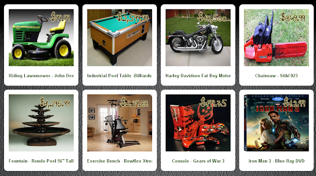
I have a total of 8 boxes with images inside. I have 4 boxes across (4 columns) in each row (2 rows total). They are set to float: left and display: inline. The columns and rows all align perfectly when the height is fixed.
Like so: (http://4.bp.blogspot.com/-o_rRBylW7Gk/UbOnL-IHSTI/AAAAAAAAFFw/udM5_Bhhz7k/s640/post-sized.PNG)
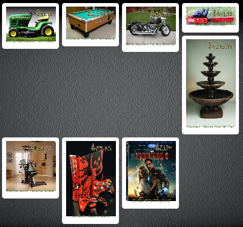
But when I add height:auto... the 2nd row stacks at the 3rd column.
Like so: (http://3.bp.blogspot.com/-J3dkWTM2OCw/UbOnQutKSBI/AAAAAAAAFF4/qTsBLn84ukE/s1600/post-auto.PNG)
The desired result is for all rows and columns to align without the images being skewed and stretched. As long as the desire result is achieved, I don't have a preference on how this is done (jQuery or otherwise).
I tired clear both, vertical align to top, the clearfix after, display table-cell instead of display inline, etc.. I tried everything I could find online.
Here is the CSS:
.post{
    float:left;
    display:inline-block;
    list-style: none;
    width: 200px;
    height: auto;
    overflow:hidden;
    margin-right: 12px;
    margin-bottom: 12px;
    padding: 10px;
    background-color: white !important;
}

.post-body {
    width: 100% !important;
    height: auto;
    overflow: hidden;
    padding: 0px !important;
    margin: 0px !important;
}

.post img {
    width: 100% !important;
    height:auto;
    padding: 0px;
    margin: 0px;
}
It's in the Blogger.com (blogspot) platform.
It's difficult to add the whole HTML, you would have to understand the Blogger format or at least XML codes but here are the main sections:
<b:section class='main' id='main' maxwidgets='3' showaddelement='yes'>
<b:widget id='Blog1' locked='true' title='Blog Posts' type='Blog'>
<b:includable id='main' var='top'>
<b:includable id='post' var='post'>
<div class='post-body entry-content' expr:id='"post-body-" + data:post.id' itemprop='description articleBody'>
<data:post.body/>
<div style='clear: both;'/>
</div>
</div>
</b:includable>
</b:includable>
</b:widget>
</<b:section>