112

Example buttons

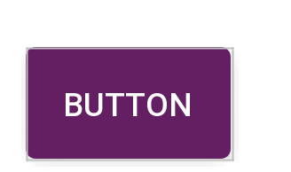
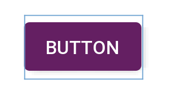
So, at the moment I have a button which looks like the first image above. How do I reduce the padding around the text inside the button itself (To look more like the second image)?

Layout width and height is set as:

android:layout_width="match_parent"
android:layout_height="wrap_content"

The custom style shape has parameters"

<shape xmlns:android="http://schemas.android.com/apk/res/android"
android:shape="rectangle" android:padding="10dp">

With the rest just being color attributes and radii values.

Just to make it clear, I want the frame of the button to hug the "Login" text closer.

All help and feedback is greatly appreciated. Thanks.

Imran NZ
  • 1,327
  • 2
  • 12
  • 22
  • 1
    android:padding="10dp reduce 10 dp to 5dp – Raghunandan May 06 '13 at 07:46
  • That relates to the outer padding of the Button. I'm referring to the internal padding of "login" and its container. Thanks though. – Imran NZ May 06 '13 at 08:48
  • overriding the padding works for me. textView.setPadding(0,0,0,0); – M. Usman Khan May 09 '16 at 10:30
  • 4
    Put android:minHeight="0dp" android:minWidth="0dp" in the button. This should work.. – viper Oct 05 '17 at 04:08
  • This helped me - https://stackoverflow.com/a/19227057/3325759 (author - @StinePike) From the answer - Add `android:includeFontPadding="false"` – Mikelis Kaneps Oct 14 '15 at 11:13
  • Right question, wrong answer. This does not work. android:minHeight="0dp" android:minWidth="0dp" works. That said your answer does remove a tiny tiny sliver, but the min height/width is the clear winner. – StarWind0 Jun 01 '18 at 20:05

6 Answers6

259

It took me forever to find this but the "padding" around the text in a button isn't really padding at all. The default Widget.Button style includes a minHeight property. Changing minHeight on the button will allow you to adjust padding as expected.

<Button
        android:id="@+id/header"
        android:layout_width="fill_parent"
        android:layout_height="wrap_content"
        android:text="@string/test"
        android:textColor="@color/black"
        android:minHeight="40dip"/>


<style name="Widget.Holo.Button" parent="Widget.Button">
    <item name="android:background">@android:drawable/btn_default_holo_dark</item>
    <item name="android:textAppearance">?android:attr/textAppearanceMedium</item>
    <item name="android:textColor">@android:color/primary_text_holo_dark</item>
    <item name="android:minHeight">48dip</item>
    <item name="android:minWidth">64dip</item>
</style>
Boken
  • 4,825
  • 10
  • 32
  • 42
Steven
  • 3,200
  • 1
  • 17
  • 16
  • 7
    I was facing a similar problem with the width. Setting android:minWidth="0dp" worked, but then on buttons with long text, I required android:paddingRight and android:paddingLeft to be set to prevent poor layout. – Simon Featherstone Jun 22 '16 at 09:28
  • My Widget.Button has no minHeight (sdk28) – ror Apr 24 '19 at 19:32
  • The property is on the theme button, not the parent "Widget.Button". If you are using a different theme than "holo" it may be in a different location. Here are the styles for "holo" https://android.googlesource.com/platform/frameworks/base/+/master/core/res/res/values/styles_holo.xml – Steven Apr 26 '19 at 17:58
  • 1
    it still has padding with `MaterialButton`, height has nothing to do, if you set `height` 48dp and `minHeight` 48dp you still will see padding, button background height will be smaller than 48dp – user924 Dec 30 '20 at 12:32
  • 1
    it's insets `android:insetTop="0dp" android:insetBottom="0dp"`, then it will finally remove padding and background button height will be 48dp – user924 Dec 30 '20 at 12:34
22

In the Material Components Library, the MaterialButton has a default style with insetBottom and insetTop with a value of 6dp.

You can change them in the layout:

  <com.google.android.material.button.MaterialButton
      android:insetTop="0dp"
      android:insetBottom="0dp"
      ../>

or in a style:

 <style name="Button_no_insets" parent="Widget.MaterialComponents.Button"..>
    <item name="android:insetTop">0dp</item>
    <item name="android:insetBottom">0dp</item>
 </style>

enter image description hereenter image description here

Gabriele Mariotti
  • 320,139
  • 94
  • 887
  • 841
5

try this in your custom shape.xml file

<shape xmlns:android="http://schemas.android.com/apk/res/android"
android:shape="rectangle"
android:paddingLeft="10dp"
android:paddingRight="10dp"
android:paddingTop="1dp"
android:padding="1dp">

also you can make change in your button's xml

android:layout_width="wrap_content"
android:layout_height="wrap_content"
Qadir Hussain
  • 8,721
  • 13
  • 89
  • 124
3

If you want a smaller top and bottom padding, use this:

 android:paddingTop="2dp"
 android:paddingBottom="2dp"
Neoh
  • 15,906
  • 14
  • 66
  • 78
  • That's for the padding outside the button. The effect I'm after is to get the Button frame to hug the "Login" text closer. Thanks. – Imran NZ May 06 '13 at 08:50
  • 1
    That is already the inner padding of the button. You may need to check if you have added lines like `android:padding` or `android:layout_margin"` in the parent views of ``. – Neoh May 06 '13 at 09:24
1

For me, need to set all below for the button property

minWidth 
minHeight
paddingHorizontal
paddingVertical
layout wrap_content


  android:paddingVertical="0dp"
  android:paddingHorizontal="0dp"
  android:minHeight="0dp"
  android:minWidth="0dp"
  android:layout_width="wrap_content"

this will remove all spaces between text and border of button and border(if used) will be around the text without any space.

mrr7997
  • 11
  • 3
  • 1
    As it’s currently written, your answer is unclear. Please [edit] to add additional details that will help others understand how this addresses the question asked. You can find more information on how to write good answers [in the help center](/help/how-to-answer). – Community Apr 01 '22 at 17:38
0

Update: If you want to use Material Button: >

You can use style="@style/Widget.MaterialComponents.Button.TextButton" attribute, set insetTop & insetBottom to 0dp. Also set app:cornerRadius="0dp" to get same result of my given picture.

  <com.google.android.material.button.MaterialButton
        android:id="@+id/btnAddMorePassenger"
        style="@style/Widget.MaterialComponents.Button.TextButton"
        android:layout_width="match_parent"
        android:layout_height="wrap_content"
        android:backgroundTint="@color/primary_variant"
        android:insetTop="0dp"
        android:insetBottom="0dp"
        android:text="@string/add_passenger"
        android:textColor="@color/light"
        android:visibility="visible"
        app:cornerRadius="0dp"
        app:icon="@drawable/ic_profile_24dp"
        app:iconGravity="textStart"
        app:iconTint="@color/light"
        app:layout_constraintEnd_toEndOf="parent"
        app:layout_constraintStart_toStartOf="parent"
        app:layout_constraintTop_toBottomOf="@id/toolbar"
        tools:visibility="visible" />

You can use Borderless style in AppCompatButton like below. Also use background color your preferred.

Widget.AppCompat.Button.Borderless.Colored

Button code

<androidx.appcompat.widget.AppCompatButton
        android:id="@+id/button_visa_next"
        android:background="@color/colorPrimary"
        style="@style/Widget.AppCompat.Button.Borderless.Colored"
        android:layout_width="0dp"
        android:layout_height="wrap_content"
        android:layout_marginTop="@dimen/spacing_normal"
        android:text="@string/next"
        android:textColor="@color/white"
        app:layout_constraintBottom_toBottomOf="parent"
        app:layout_constraintEnd_toEndOf="parent"
        app:layout_constraintStart_toStartOf="parent" />

Output:

enter image description here

Shihab Uddin
  • 6,699
  • 2
  • 59
  • 74