I would like to put together a more publication-worthy (and more easily produced) version of the diagram that I've hacked together below:
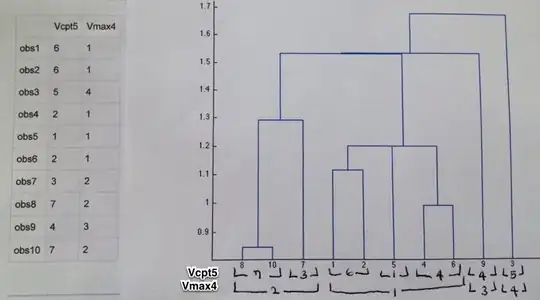
Basically, it's a two part illustration with an HTML table on the left (showing different cluster assignments from varying parameters) and a modified dengrogram plot on the right.
I'm guessing it's apparent from the snapshot what I'm trying to add to the plot… Basically it could be a set of horizontal, stacked bars that show how the different parameters grouped the observations into different clusters. I used brackets with the cluster numbers when drawing these by hand, but anything that underlines the right observation numbers would be acceptable.
I realize there are two parts to this question: How to get the two-up layout when one of the panels is HTML instead of a figure, and how to modify the plot. [If only one part gets answered here, I can ask for the other in a separate question.]