0

I'm trying to get a jqplot chart to display a bunch of data in different colored bars with a key on the right, but the scaling doesn't seem to work properly. My data looks like this:

data:[[1.03],[1.02],[1.05],[1.02],[1.011]],
labels:["Imperial Stout","Lager","Porter","Etc","etc"],

I can try to let it auto scale, and it cuts off half of the bars like this: Bars cut off on the left(jsfiddle)

I tried setting the axis scale from 0.8 to 1.2, but it clusters all of the bars in the center leaving a ton of empty space on the chart like this:
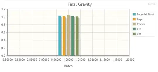
Bars clustered in center (jsfiddle)

Is there a way to get this to display correctly?

I can't put them in one series because the legend just labels that as "Series 1".

Tim
  • 248
  • 3
  • 14
  • The jsfiddles that you provided do not work - at all - for me, I get 'NetworkError: 403 Forbidden' when trying to load the various libraries. – lmsteffan Mar 18 '13 at 18:53
  • Ok, I updated it to point to the versions from bitbucket. These must be a different version because they broke the legend, but that's not directly related to the problem. – Tim Mar 18 '13 at 19:31

2 Answers2

1

You can add the following option to xaxis :

renderer: $.jqplot.CategoryAxisRenderer,

and tickOptions could be set to show: false if you don't want an extraneous tickmark under the diagram.

lmsteffan
  • 840
  • 4
  • 13
0

What worked for me was configuring the xaxis as follows:

xaxis: {
    label: input.xaxis,
    renderer: $.jqplot.CategoryAxisRenderer,
    ticks: ['']
},

By default, the axis rendered is a $.jqplot.LinearAxisRenderer, which tries to render a numeric axis, hence the problems you were having.

Interestingly, I also had to set ticks as I did because without it I was getting a single tick value of 1 displayed on the x-axis and I couldn't otherwise get rid of it.

nick_w
  • 14,758
  • 3
  • 51
  • 71