10

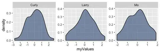
I've got a nice facet_wrap density plot that I have created with ggplot2. I would like for each panel to have x and y axis labels instead of only having the y axis labels along the left side and the x labels along the bottom. What I have right now looks like this:

library(ggplot2)
myGroups <- sample(c("Mo", "Larry", "Curly"), 100, replace=T)
myValues <- rnorm(300)
df <- data.frame(myGroups, myValues)


p <- ggplot(df)  + 
  geom_density(aes(myValues), fill = alpha("#335785", .6)) + 
  facet_wrap(~ myGroups)
p

Which returns:

alt text
(source: cerebralmastication.com)

It seems like this should be simple, but my Google Fu has been too poor to find an answer.
Community
  • 1
  • 1
JD Long
  • 59,675
  • 58
  • 202
  • 294

2 Answers2

13

You can do this by including the scales="free" option in your facet_wrap call:

myGroups <- sample(c("Mo", "Larry", "Curly"), 100, replace=T)
myValues <- rnorm(300)
df <- data.frame(myGroups, myValues)


p <- ggplot(df)  + 
  geom_density(aes(myValues), fill = alpha("#335785", .6)) + 
  facet_wrap(~ myGroups, scales="free")
p

enter image description here

JD Long
  • 59,675
  • 58
  • 202
  • 294
robert
  • 146
  • 1
  • 2
8

Short answer: You can't do that. It might make sense with 3 graphs, but what if you had a big lattice of 32 graphs? That would look noisy and bad. GGplot's philosophy is about doing the right thing with a minimum of customization, which means, naturally, that you can't customize things as much as other packages.

Long answer: You could fake it by constructing three separate ggplot objects and combining them. But it's not a very general solution. Here's some code from Hadley's book that assumes you've created ggplot objects a, b, and c. It puts a in the top row, with b and c in the bottom row.

grid.newpage()
pushViewport(viewport(layout=grid.layout(2,2)))
vplayout<-function(x,y)
    viewport(layout.pos.row=x,layout.pos.col=y)
print(a,vp=vplayout(1,1:2))
print(b,vp=vplayout(2,1))
print(c,vp=vplayout(2,2))
Harlan
  • 18,883
  • 8
  • 47
  • 56
  • Yeah I was getting the "you're not supposed to do that" vibe from ggplot. I'm going to try to implement the example you gave. That seems reasonable. – JD Long Oct 07 '09 at 16:41
  • 2
    Another thing you might try, if you need publication-quality images, is to save the graph to PDF or SVG (if you're not on Windows) format, using ggsave(), and then edit the resulting image using something like Inkscape. You could easily shift the bottom image down and copy the axis up... – Harlan Oct 07 '09 at 16:59