5

I'm trying to plot four scatter plots in 2 x 2 arrangement in R (I'm actually plotting via rpy2). I'd like each to have an aspect ratio of 1 but also be on the same scale, so identical X and Y ticks for all the subplots so that they can be compared. I tried to do this with par:

par(mfrow=c(2,2))
# scatter 1
plot(x, y, "p", asp=1)
# scatter 2
plot(a, b, "p", asp=1)
# ...

Edit:

Here's a direct example of what I have now:
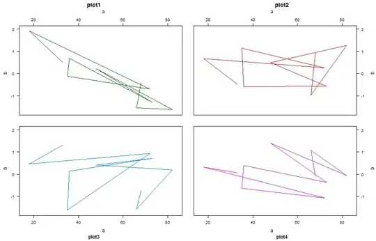
> par(mfrow=c(2,2))
> for (n in 1:4) { plot(iris$Petal.Width, rnorm(length(iris$Petal.Width)), "p", asp=1) }

which creates the right type of scatter but with different scales. Setting ylim and xlim to be the same in each call to plot above does not fix the problem. You still get very different tick marks and tick numbers on each axis, which makes the scatter unnecessarily difficult to interpret. I want the X and Y axes to be identical. For example, this:

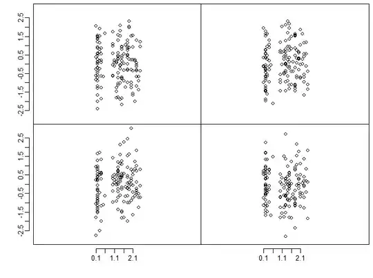
for (n in 1:4) { plot(iris$Petal.Width, rnorm(length(iris$Petal.Width)), "p", asp=1, xlim=c(-4, 6), ylim=c(-2, 4)) }

Generates the wrong result:

enter image description here

What's the best way to ensure that the same axes are used in all subplots?

All I was looking for is a parameter like axis=same or something like that to par(mfrow=...), which sounds like the default behavior for lattice, to make the axes shared and identical in every subplot.

lgautier gave nice code with ggplot, but it requires the axes to be known in advance. I want to clarify that I wanted to avoid iterating through the data in each subplot and computing myself the correct ticks to be plotted. If that has to be known in advance, then the ggplot solution is much more complex than just plotting with plot and explicitly

agstudy gave a solution with lattice. This looks closest to what I what I want in that you don't have to explicitly precompute the tick positions for each scatter, but as a new user I'm unable to figure out how to make lattice look like an ordinary plot. The closest I've gotten is this:

> xyplot(y~x|group, data =dat, type='p',
        between =list(y=2,x=2),
        layout=c(2,2), aspect=1,
               scales =list(y = list(relation='same'), alternating=FALSE))

which yields:

enter image description here

How can I make this look like the R base? I don't want these group subtitles on the top of each subplot, or ticks hanging unlabeled on the top and right hand side of each scatter, I just want each x and y of the scatter to be labeled. I'm also not looking for a shared label for the X and Y -- each subplot gets its own X and Y labels. And the axis labels have to be the same in each scatter although with the data chosen here it doesn't make sense.

Unless there's an easy way to make trellis look like the R base, it sounds like the answer is that there's no way to do what I'm trying to do in R (surprisingly), without precomputing the exact places of each tick in each subplot, which requires iterating through the data in advance.

  • 3
    If you want common scales it will be much easier to use **ggplot2** or **lattice** and faceting or trellising (respectively). – joran Feb 15 '13 at 23:16
  • I'd be very interested in pointers on doing this with either, especially lattice, since ggplot2 might be too complex for me. –  Feb 15 '13 at 23:19
  • Well, computing the tick marks and ranges for the axes is what lattice or ggplot2 are doing without the hood. It seems that you are after a solution that would update previous plots as new one are made so the tick marks and ranges are identical. This could be implemented with grid but computing tick marks and ranges ahead seems to be a much smaller effort. – lgautier Feb 16 '13 at 17:31
  • @lgautier: so what's the canonical way to do it with precomputing in R base? As I wrote in my edit setting xlim/ylim is not sufficient. Also, it doesn't have to be real time update - I'm happy to put all the data for all the scatters in a matrix or a DataFrame first –  Feb 16 '13 at 17:35
  • When looking at the figure you provide with R base graphics, to me the tick marks look very much the same across the plots. I am also generally confused about the requirements the ideal solution should have. May be a mockup would be more helpful. – lgautier Feb 16 '13 at 18:09

3 Answers3

3

With lattice and ggplot2 You need to reshape the data. For example:

  1. create 4 data.frame(x=x1,y=y1)...
  2. add a group column for each data.frame, group=1,2,...
  3. rbind the 4 data.frame in once

Here an example using lattice

dat <- data.frame(x = rep(sample(1:100,size=10),4),
                  y = rep(rnorm(40)),
                  group = rep(1:4,each =10))

xyplot(y~x|group,       ## conditional formula to get 4 panels
       data =dat,       ## data
       type='l',        ## line type for plot
       groups=group,     ## group ti get differents colors
       layout=c(2,2))   ## equivalent to par or layout

enter image description here

PS : no need to set the sacles. In xyplot the default sacles settings is same (same sacles for all panels). You can modify it for example :

xyplot(y~x|group, data =dat, type='l',groups=group,
       layout=c(2,2), scales =list(y = list(relation='free')))

EDIT

There are a large number of arguments to lattice plotting functions to allow control over many details of a plot, here for example I customize :

  1. The text to use for labels and titles for strips
  2. The size and placement of axis tick labels,
  3. The size of the gaps between columns and rows of panels.

    xyplot(y~x|group, data =dat, type='l',groups=group,
          between =list(y=2,x=2),
          layout=c(2,2), 
          strip = myStrip,
          scales =list(y = list(relation='same',alternating= c(3,3))))
    

where

myStrip <- function(var.name,which.panel, which.given,...) {
  var.name <- paste(var.name ,which.panel)
  strip.default(which.given,which.panel,var.name,...)
  }

enter image description here

EDIT In order to get a lattice plot base-graphics plots, you can try this :

xyplot(y~x|group, data =dat, type='l',groups=group,
       between=list(y=2,x=2),
       layout=c(2,2), 
       strip =FALSE,
       xlab=c('a','a'),
       xlab.top=c('a','a'),
       ylab=c('b','b'),
       ylab.right = c('b','b'),
       main=c('plot1','plot2'),
       sub=c('plot3','plot4'),
       scales =list(y = list(alternating= c(3,3)),
                    x = list(alternating= c(3,3))))

enter image description here

agstudy
  • 119,832
  • 17
  • 199
  • 261
  • Thanks, but this layout obscures my data because there are no separate axes, it's all bunched up together and far more complex. I'd like to get four distinct scatter plots, that each happen to be on same scale. Just like my call in the post makes. There has to be a way to force R to use the same scale for all subplots? –  Feb 16 '13 at 02:13
3

ggplot2 might be have the highest pretty / easy ratio if beginning.

Example with rpy2:

from rpy2.robjects.lib import ggplot2
from rpy2.robjects import r, Formula

iris = r('iris')

p = ggplot2.ggplot(iris) + \
    ggplot2.geom_point(ggplot2.aes_string(x="Sepal.Length", y="Sepal.Width")) + \
    ggplot2.facet_wrap(Formula('~ Species'), ncol=2, nrow = 2) + \
    ggplot2.GBaseObject(r('ggplot2::coord_fixed')()) # aspect ratio
# coord_fixed() missing from the interface, 
# therefore the hack. This should be fixed in rpy2-2.3.3

p.plot()

Reading the comments to a previous answer I see that you might mean completely separate plots. With the default plotting system for R, par(mfrow(c(2,2)) or par(mfcol(c(2,2))) would the easiest way to go, and keep aspect ratio, ranges for the axes, and tickmarks consistent through the usual way those are fixed.

The most flexible system to plot in R might be grid. It is not as bad as it seems, think of is as a scene graph. With rpy2, ggplot2, and grid:

from rpy2.robjects.vectors import FloatVector

from rpy2.robjects.lib import grid
grid.newpage()
lt = grid.layout(2,2) # 2x2 layout
vp = grid.viewport(layout = lt)
vp.push()


# limits for axes and tickmarks have to be known or computed beforehand
xlims = FloatVector((4, 9))
xbreaks = FloatVector((4,6,8))
ylims = FloatVector((-3, 3))
ybreaks = FloatVector((-2, 0, 2))

# first panel
vp_p = grid.viewport(**{'layout.pos.col':1, 'layout.pos.row': 1})
p = ggplot2.ggplot(iris) + \
    ggplot2.geom_point(ggplot2.aes_string(x="Sepal.Length",
                                          y="rnorm(nrow(iris))")) + \
    ggplot2.GBaseObject(r('ggplot2::coord_fixed')()) + \
    ggplot2.scale_x_continuous(limits = xlims, breaks = xbreaks) + \
    ggplot2.scale_y_continuous(limits = ylims, breaks = ybreaks)
p.plot(vp = vp_p)
# third panel
vp_p = grid.viewport(**{'layout.pos.col':2, 'layout.pos.row': 2})
p = ggplot2.ggplot(iris) + \
    ggplot2.geom_point(ggplot2.aes_string(x="Sepal.Length",
                                          y="rnorm(nrow(iris))")) + \
    ggplot2.GBaseObject(r('ggplot2::coord_fixed')()) + \
    ggplot2.scale_x_continuous(limits = xlims, breaks = xbreaks) + \
    ggplot2.scale_y_continuous(limits = ylims, breaks = ybreaks)
p.plot(vp = vp_p)

More documentation in the rpy2 documentation about graphics, and after in the ggplot2 and grid documentations.

lgautier
  • 11,363
  • 29
  • 42
  • thank you. Your ggplot example from rpy will be very helpful in future to me though I still cannot get these grid/ggplot solutions to do what I want (I'm looking for a very very simple plot, that looks like the R base.) See my edits. –  Feb 16 '13 at 16:30
  • final question on this, in your first solution you use a dataframe that has an additional column describing which sample each x/y value belongs to, which can be used to make the multiplot in ggplot with one call, since ggplot reads this label. In the second solution, you make each subplot explicitly using grid. Which solution do you recommend to use in general? Is it better to make the plots individually, or do always reshape the (Python datastructures, in my case) to have the extra label and then have ggplot read this label? –  Feb 17 '13 at 03:44
  • @user248237 : The generally recommended solution is the one that uses high-level functionalities. Here that'd be `ggplot2` (or `lattice`) and one `data.frame` (and you let the battle-tested code in those packages take care of the layout). `grid` is a lower-level interface to plotting and should only be used when unusual needs (e.g., the "plot in plot" example in the rpy2 documentation). For the record, `lattice` and `ggplot2` are implemented on the top of `grid`. – lgautier Feb 17 '13 at 06:27
2

Although an answer has been selected already, that answer uses ggplot rather than base R, which is what the OP wanted. Although ggplot is really nice for quick plotting, for publication you often want finer control over the plots than ggplot offers. That is where base plot excels.

I would suggest reading Sean Anderson's explanation of the magic that can be worked with clever use of par, as well as a few other nice tricks like using layout() and split.screen().

Using his explanation, I came up with this:

# Assume that you are starting with some data, 
# rather than generating it on the fly
data_mat <- matrix(rnorm(600), nrow=4, ncol=150)
x_val <- iris$Petal.Width

Ylim <- c(-3, 3)
Xlim <- c(0, 2.5)

# You'll need to make the ylimits the same if you want to share axes


par(mfrow=c(2,2))
par(mar=c(0,0,0,0), oma=c(4,4,0.5,0.5))
par(mgp=c(1, 0.6, 0.5))
for (n in 1:4) { 
  plot(x_val, data_mat[n,], "p", asp=1, axes=FALSE, ylim=Ylim, xlim=Xlim)
  box()
  if(n %in% c(1,3)){
    axis(2, at=seq(Ylim[1]+0.5, Ylim[2]-0.5, by=0.5))
  }
  if(n %in% c(3,4)){
    axis(1, at=seq(min(x_val), max(x_val), by=0.1))
  }
}

Plot with shared margins

There is still some work to do here. Just as in the OP, the data appear squashed in the middle. It would, of course, be good to adjust things so the full plotting area is used.

Community
  • 1
  • 1
Daniel Watkins
  • 1,631
  • 14
  • 16