29

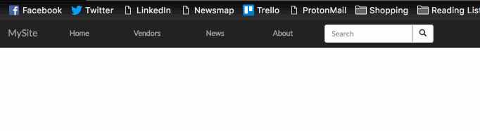
I use the default Twitter Bootstrap responsive navbar (without the logo and search), but I want the menu items to be spanned, occupying the full width of the menu bar.

Here is what I have now default Bootstrap navbar (see --- as spaces):

[home | menu item 1 | menu item 2 | menu item 3 | contact------------------------]

and the result I like to have (menu items occupying the full width):

[--home-- | ---menu item 1--- | ---menu item 2--- | ---menu item 3--- | -contact-]

I hope someone can help.

Damjan Pavlica
  • 31,277
  • 10
  • 71
  • 76
user2024774
  • 291
  • 1
  • 3
  • 3

6 Answers6

32

Have a look at Bootstrap's official example:

/* Customize the navbar links to be fill the entire space of the .navbar */
.navbar .navbar-inner {
    padding: 0;
}

.navbar .nav {
    margin: 0;
    display: table;
    width: 100%;
}

.navbar .nav li {
    display: table-cell;
    width: 1%;
    float: none;
}

.navbar .nav li a {
    font-weight: bold;
    text-align: center;
    border-left: 1px solid rgba(255, 255, 255, .75);
    border-right: 1px solid rgba(0, 0, 0, .1);
}

.navbar .nav li:first-child a {
    border-left: 0;
    border-radius: 3px 0 0 3px;
}

.navbar .nav li:last-child a {
    border-right: 0;
    border-radius: 0 3px 3px 0;
}
Trojan
  • 2,256
  • 28
  • 40
sgrodzicki
  • 1,064
  • 8
  • 6
8

The official example works perfectly until you want to use those menu items with the native drop down calls. The drop down becomes the width of all of your drop down items combined.

*note the ">", it will make the style stop from bleeding over into the .dropdown-menu subset.

/* Customize the navbar links to be fill the entire space of the .navbar */

.navbar .navbar-inner {
    padding: 0;
}

.navbar .nav {
    margin: 0;
    display: table;
    width: 100%;
}

.navbar .nav > li {
    display: table-cell;
    width: 1%;
    float: none;
    text-align: center;
}


.navbar .nav li:first-child a {
    border-left: 0;
    border-radius: 3px 0 0 3px;
}

.navbar .nav li:last-child a {
    border-right: 0;
    border-radius: 0 3px 3px 0;
}
7
.nav {
  display:table;
}
.nav > li{
  width: auto;
  display:table-cell;
}

"width: auto;" solved the problem for me

Veikko Karsikko
  • 3,671
  • 1
  • 20
  • 15
4

Another solution: Media Queries that adjust menu padding for each item:

@media (max-width: 1200px) {

  .navbar .nav > li {
      padding: 0 4px 0 3px;
  }

}

@media (min-width: 1200px) {

  .navbar .nav > li {
      padding: 0 20px 0 20px;
  }

}
Jonathan James
  • 219
  • 2
  • 7
1

this last example here, doesn't work for me either, the dropdownmenu always appears at the first li element.

setting the width of the main li elements with jquery is the only thing that worked for me, along the lines of

setNavWidth: function(){
    var wi = parseInt(($('#navcontainer').width()-48)*.25);
    for( var i = 0 ; i < 4; i++){
        $('#carvernavli_'+i).width(wi);
    }

}

so i have 4 main li elements and gave them an id, the "navcontainer" ist the container wrapping the navigation directly underneath "navbar-inner". you also have to call this function on window resize, than it works !

Ray
  • 49
  • 2
0

I ended up using a slight variant, I didn't like the use of display:table and wanted to use flexbox instead.

CSS:

.navbar .nav {
    margin: 0;
    display: flex;
    flex-direction: row;
    width: 85%;
}

.navbar .nav li {
    flex: 1;
}

.navbar .nav li a {
    font-weight: bold;
    text-align: center;
    flex: 1;
}

Html:

<nav class="navbar navbar-inverse navbar-fixed-top" role="navigation">
    <div class="container-fluid">
      {% block header %}
      <div class="navbar-header">
        <button type="button" class="navbar-toggle collapsed" data-toggle="collapse" data-target="#navbar" aria-expanded="false" aria-controls="navbar">
          <span class="sr-only">Toggle navigation</span>
          <span class="icon-bar"></span>
          <span class="icon-bar"></span>
          <span class="icon-bar"></span>
        </button>
        <a class="navbar-brand" href="/">MySite</a>
      </div>
      <div id="navbar" class="collapse navbar-collapse">
        <ul class="nav navbar-nav">
          <li><a href="/">Home</a></li>
          <!-- <li><a href="/submit">Submit</a></li> -->
          <li><a href="/vendors">Vendors</a></li>
          <li><a href="/news">News</a></li>
          <li><a href="/about">About</a></li>
          <form class="navbar-form navbar-left" action="/action_page.php">
            <div class="input-group">
              <input type="text" class="form-control" placeholder="Search">
              <div class="input-group-btn">
                <button class="btn btn-default" type="submit">
                  <i class="glyphicon glyphicon-search"></i>
                </button>
              </div>
            </div>
          </form>
        </ul>
      </div><!--/.nav-collapse -->
      {% endblock %}
    </div>
  </nav>

Result: result.gif

Tim P
  • 415
  • 3
  • 11