13

Is anyone aware of a way to change one layer of a multi-layered background using CSS?

I've been searching around but can't find any mention of current, or even proposed future specification. My thinking says there probably wont be, but the net is so vast now I'm sure someone, somewhere, has information or links to discussions along these lines.

The following example would obviously have problems with regard to the order of precedence when applied to different elements:

.building-texture {
  background: transparent, url(image/building-side.png);
}

.shade-dark {
  background: url(image/shade-dark.png), unchanged;
}

.shade-mid {
  background: url(image/shade-mid.png), unchanged;
}

.shade-light {
  background: url(image/shade-light.png), unchanged;
}
<div class="building-texture shade-dark"></div>

Obviously there are a number of workarounds for the above, but none are ideal, especially when you start talking about a lot of different 'layer states' and a number of different 'textures':

Initial solutions

combined classes

This is the most optimal of the fallbacks, but gets ridiculous when you start to take vendor prefixes into account and when dealing with more than two layers.

.building-texture-shade-dark {
  background: url(image/shade-dark.png), url(image/building-side.png);
}

.building-texture-shade-mid {
  background: url(image/shade-mid.png), url(image/building-side.png);
}

.building-texture-shade-light {
  background: url(image/shade-light.png), url(image/building-side.png);
}

separate elements

When running through some tests locally, I found that multi-layered backgrounds performed faster than using sub-elements. In fact for most modern browsers, even introducing a simple child (with no background applied) slowed the rendering down quite a bit.

<div class="building-texture">
  <div class="shade-dark"></div>
</div>

JavaScript generation

To get over the pain of hand-typing the first option (combined classes), JavaScript could be used to generate the stylesheet. But you still have the awkwardness of the long class names. Plus when you want to change one applied effect of the combined class (e.g. remove shading), you have to script an ability to work out how to do so based on naming convention.

Style property via JavaScript

The other option is to dynamically rewrite the entire background via .style on each element. I haven't tested this, but my head tells me that this will be rather inefficient, as I'm sure the browsers are able to do quite a few optimisations when dealing with preset classes (i.e. by grouping element rendering by classification). Although I could be wrong.

Why...

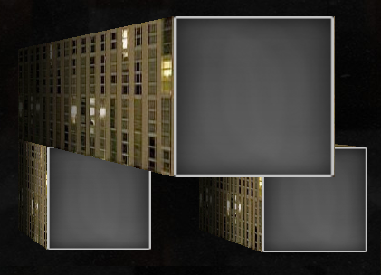
I'm playing around with CSS 3D transforms (with perspective enabled) and how best to texture/light such structures in a simple and fast manner (example code):

http://pebbl.co.uk/wote/

example image
(source: pebbl.co.uk)

After failing at producing a CSS solution I was happy with, I'm currently heading toward a Canvas-based solution that would pre-build all the textures I may want—along with their different shaded states—which would then generate a cached data URI to be attached as a single layer background. My tests have shown this to be optimal. However, I'd really like to use as many native browser-based solutions as possible, because with canvas there is a lot more code involved, and, because today's browsers are improving so quickly, it seems foolish to reinvent any wheels, engines, or road networks.

Even if it might be deemed that what I'm doing is not a 'proper' use of CSS, in my opinion, each background item is it's own unit—and to me it makes sense that there should be some specified way to modify each unit separately... even if it's way off in the future.

I'd be interested in any answers with links to discussions along these lines.

TylerH
  • 20,799
  • 66
  • 75
  • 101
Pebbl
  • 34,937
  • 6
  • 62
  • 64
  • I'm sure somebody has kvetched about this in the [mailing lists](http://lists.w3.org/Archives/Public/www-style). – BoltClock Jan 21 '13 at 14:25
  • as far as I know, there are no vendor prefixes required for background. I'd go with "combined classes" – nice ass Jan 21 '13 at 14:26
  • @One Trick Pony: I think he's referring to gradient prefixes. – BoltClock Jan 21 '13 at 14:27
  • @OneTrickPony good point, I'm refering to applying gradients. neglected to mention that. apologies. – Pebbl Jan 21 '13 at 14:27
  • ok, but still that woudn't increase too much the CSS code (a few extra bytes). And if you use a preprocessor like SASS or Less, you'll still have a compact source. – nice ass Jan 21 '13 at 14:29
  • @OneTrickPony yep. is a good point. I could generate the css using a Less-like system - but then I still start needing a system to manage and change class names depending on what is being applied to element (I no longer have separate class names, instead I have an amalgamation). having separate classes lends itself well to, for example, finding all elements that have dark shading applied. or easily just removing an existing shading class. – Pebbl Jan 21 '13 at 14:37

2 Answers2

4

Unfortunately there is no way to do that in regular CSS. You can only change an entire property, not part of it. Which is why we have separate properties like background-image, background-color to start with. But nothing more fine-grained than that.

As ScottS suggested, pseudo-elements could be a way to go but you will probably have the same problems as multiple separate div elements.

If your main goal is to avoid typing code over and over, a good solution would be to use a CSS preprocessor like SASS. Your SCSS would then be something like this:

$img-side:  url("image/building-side.png");
$img-dark:  url("image/shade-dark.png");
$img-mid:   url("image/shade-mid.png");
$img-light: url("image/shade-light.png");

.building-texture {
  background: transparent, $img-side;
}    
.shade-dark {
  background: $img-dark, $img-side;
}    
.shade-mid {
  background: $img-mid, $img-side;
}    
.shade-light {
  background: $img-light, $img-side;
}

It would compile down to the more bulky CSS (with full URL definitions) but you certainly save a lot on development time. SASS can also help you generate the vendor prefixes using mixins (there is also Compass which adds that to SASS).

In fact, there is an upcoming CSS variables spec which you may be able to use in future, however I don't think any browsers support it yet.

DisgruntledGoat
  • 70,219
  • 68
  • 205
  • 290
  • Yeah, I did not mention it, but I would use SASS or LESS no matter the case to do this on any "grand scale" like what the OP is desiring. Your solution is definitely a possible way to go, and one I had thought of offering too, but went with the pseudo element idea instead. +1 for the contribution. – ScottS Jan 21 '13 at 15:52
3

Abstract it with Pseudo Elements

I am not aware of any way to "swap" a single background yet. One workaround is based off the "separate elements" technique, but the inner element is a pseudo-element instead. I have no idea about rendering speed. It also has the drawback that it will not work for IE8, as you cannot apply filter to pseudo-elements. However, since you are using the idea in conjunction with CSS3 perspective and such, the IE8 caveat is not an issue for you.

This achieves the abstraction of the texture from the shading. It could even add another layer through an :after pseudo-element, and it still could use multiple backgrounds in each of the three if needed/desired.

Here is the fiddle.

Sample Code:

HTML

<div class="texture"></div>
<div class="texture light"></div>
<div class="texture medium"></div>
<div class="texture dark"></div>

CSS (core)

.texture {
    position: relative;
    background: url(http://www.dummyimage.com/12x16/ff0000/ffffff.png&text=X++) top left repeat;
}

.light:before,
.medium:before,
.dark:before {
    content: '';
    position: absolute;
    top:0;
    right: 0;
    bottom:0;
    left: 0;
}
.light:before {
    background: -moz-linear-gradient(left,  rgba(0,0,0,0.3) 0%, rgba(0,0,0,0.1) 100%);
    background: -webkit-gradient(linear, left top, right top, color-stop(0%,rgba(0,0,0,0.3)), color-stop(100%,rgba(0,0,0,0.1)));
    background: -webkit-linear-gradient(left,  rgba(0,0,0,0.3) 0%,rgba(0,0,0,0.1) 100%);
    background: -o-linear-gradient(left,  rgba(0,0,0,0.3) 0%,rgba(0,0,0,0.1) 100%);
    background: -ms-linear-gradient(left,  rgba(0,0,0,0.3) 0%,rgba(0,0,0,0.1) 100%);
    background: linear-gradient(to right,  rgba(0,0,0,0.3) 0%,rgba(0,0,0,0.1) 100%);
}
.medium:before {
    background: -moz-linear-gradient(left,  rgba(0,0,0,0.6) 0%, rgba(0,0,0,0.2) 100%);
    background: -webkit-gradient(linear, left top, right top, color-stop(0%,rgba(0,0,0,0.6)), color-stop(100%,rgba(0,0,0,0.2)));
    background: -webkit-linear-gradient(left,  rgba(0,0,0,0.6) 0%,rgba(0,0,0,0.2) 100%);
    background: -o-linear-gradient(left,  rgba(0,0,0,0.6) 0%,rgba(0,0,0,0.2) 100%);
    background: -ms-linear-gradient(left,  rgba(0,0,0,0.6) 0%,rgba(0,0,0,0.2) 100%);
    background: linear-gradient(to right,  rgba(0,0,0,0.6) 0%,rgba(0,0,0,0.2) 100%);
}
.dark:before {
    background: -moz-linear-gradient(left,  rgba(0,0,0,0.8) 0%, rgba(0,0,0,0.3) 100%);
    background: -webkit-gradient(linear, left top, right top, color-stop(0%,rgba(0,0,0,0.8)), color-stop(100%,rgba(0,0,0,0.3)));
    background: -webkit-linear-gradient(left,  rgba(0,0,0,0.8) 0%,rgba(0,0,0,0.3) 100%);
    background: -o-linear-gradient(left,  rgba(0,0,0,0.8) 0%,rgba(0,0,0,0.3) 100%);
    background: -ms-linear-gradient(left,  rgba(0,0,0,0.8) 0%,rgba(0,0,0,0.3) 100%);
    background: linear-gradient(to right,  rgba(0,0,0,0.8) 0%,rgba(0,0,0,0.3) 100%);
}
Community
  • 1
  • 1
ScottS
  • 71,703
  • 13
  • 126
  • 146
  • Unfortunately this approach does suffer a performance hit, it's a good idea though and the browsers may improve their support over time so I'll keep my eye on it and mark this as the best answer for my needs, SASS however is a good suggestion too @DisgruntledGoat (+1). thanks both. – Pebbl Mar 10 '13 at 16:06