9

This is Android bug 41913 now. Thanks to whomever opened it!


This is, I think, pretty much the same as this older question, though the screenshot there looks oddly different than what I see.

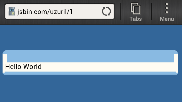
What I'm trying to do is create a box with a thick top border and rounded corners, as in this JSBIN example. That works fine on desktop browsers (well, ones with border-radius support) and on iOS Safari and Android with Chrome, but the old Android browser shows this:

android
(source: gutfullofbeer.net)

The border is rendered such that the thicker part beyond the curve doesn't make it to the edge. Does anybody know if there's a way to get the browser to do this properly? This seems to be a consistent bug going back at least to Android 2.3; the screenshot is from a 4.0.3 phone.

Here's the HTML from the JSBIN:

<body class=single>
  <div class=dialog-bound>
    Hello World
  </div>
</body>

and the CSS (class names yanked from the actual project):

body.single {
  background-color: #336699;
  font-size: 16px;
}

body.single .dialog-bound {
  background-color: #FFFCF2/*#mainBackground*/;
  margin: 50px auto;
  max-width: 32em;
  border-width: 28px 0 8px 0;
  border-style: solid;
  border-color: #89BAE2;
  -webkit-border-radius: 10px 10px 5px 5px;
  border-radius: 10px 10px 5px 5px;
  padding: 0 5px 2px 5px;
}

edit — Here's another thing of note: on my HTC One X phone and on my Nexus 7, the above CSS works perfectly in Chrome and Firefox. It also works on my Atrix under Android 2.3 in Firefox. Thus, I really doubt it's a virtual pixel vs. actual pixel issue, since all the browsers on those devices agree on the viewport size.

Glorfindel
  • 21,988
  • 13
  • 81
  • 109
Pointy
  • 405,095
  • 59
  • 585
  • 614

3 Answers3

3

It's a problem of the android browser, it draws the rounded corner and if the border-width is higher than the radius the area of the radius it's no filled.

neither with a border widht smaller than the radius the browser don't draw it well (you can see in http://jsbin.com/uxawuf/1 )

I don't see any related issue at the bug tracker of android, there's one about using the border radius to make shadows that I think it's the same problem , maybe it's a good idea open one (i'm on it :P)

I know this will not count as an good answer :P but If you want this effect you can add 2 divs, one for the border top and other for the border bottom, and do the trick with radius and background: ( here the example: http://jsbin.com/exexol/9 )

<body class=single>
  <div class=dialog-bound>
    <div class="bordertop"></div>
    <div class="content">Hello World</div>
    <div class="borderbottom"></div>
  </div>
</body>

and the css:

body.single {
  background-color: #336699;
  font-size: 16px;
}

body.single .dialog-bound{
  margin: 50px auto;
  max-width: 32em;
  background: transparent;
}
body.single .dialog-bound .content{
  padding: 0 5px 2px 5px;
  background-color: #FFFCF2;

}
body.single .dialog-bound .bordertop{
  border-radius: 10px 10px 0px 0px;
  background:#89BAE2;
  height:28px;
  -webkit-border-radius: 10px 10px 0 0;
}
body.single .dialog-bound .borderbottom{
  border-radius: 0 0 5px 5px;
  background:#89BAE2;
  height:8px;
  -webkit-border-radius: 0 0 5px 5px;
}

My tests are in a galaxy Nexus fully updated.

Pablo Martinez
  • 2,172
  • 1
  • 23
  • 27
  • Yes, I think I'm doomed to doing this, but I'm going to see if I can get it to work with `:before` and `:after`. Thanks for the effort; I'll wait a day or two and then award the bounty. – Pointy Dec 29 '12 at 15:54
1

This is indeed Android bug http://jsbin.com/uzuril/17, but it could be cheated with pseudo elements like this http://jsbin.com/uzuril/15

HTML code is the same, CSS in LESS like this tested in default browser for Android 4.0.3 on Sony Ericsson Xperia and in latest Chrome mobile for same phone.

body.single {
  background-color: #336699;
  font-size: 16px;
}

body.single .dialog-bound {
  background-color: #FFFCF2/*#mainBackground*/;
  padding: 2px 5px 4px 5px;
  position: relative;
  margin: 50px auto;
  max-width: 32em;

  &::after,
  &::before {
    border-style: solid;
    border-color: #89BAE2;
    content: '';
    left: 0; right: 0;
    position: absolute;
  }

  &::after {
    border-width: 1.8em 1.8em 0 1.8em;
    top: 2px; margin-top: -1.8em;
    border-radius: .6em .6em 0 0;
  }

  &::before {
    border-width: 0 0.6em 0.6em 0.6em;
    bottom: 2px; margin-bottom: -0.6em;
    border-radius: 0 0 .3em .3em;
  }
}
dmi3y
  • 3,482
  • 2
  • 21
  • 32
  • Yes that's almost exactly what I ended up doing. I had to also use some negative margin tricks to get around some padding issues and also a weird tendency for the browser to leave faint white lines between the added element and the border, but otherwise it works. – Pointy Dec 30 '12 at 16:37
  • yeah, and these gaps appear only for desktop Chrome in my case, and everything fine for Android browser so had to add 2px to bottom and top respectfully and to compensate it added plus 2px for padding – dmi3y Dec 30 '12 at 16:47
  • Well I added a browser sniffer to Modernizr so that I could add the rules only for the native Android browser, so other clients get just the regular border. (It's not pleasant to do browser sniffing, but this is one of the rare cases where I'll choose it.) – Pointy Dec 30 '12 at 16:50
  • possibly feature detection will works better, but it is whole challenge to find out distinctive behavior to this, may be someone already did it – dmi3y Dec 31 '12 at 12:48
  • well yes feature detection is way better, but in my experience "bug detection" can be pretty hard, especially rendering bugs like this one :-) – Pointy Dec 31 '12 at 14:37
0

you can show your property is max-width: 32em; so you should notice your border that..when font are coming "Hello World" border become larger and after or before font border is smaller..

actually max-width: http://reference.sitepoint.com/css/max-width property is working adjustable of fontsize.

so you should fix this problem property use Width=% used

QuokMoon
  • 4,387
  • 4
  • 26
  • 50
  • I'm sorry, but I don't understand what you're saying. The problem has nothing to do with the use of the `max-width` property in any case; the incorrect rendering happens whether that's there or not. The `max-width` property has nothing to do with the width of the borders. – Pointy Dec 20 '12 at 16:56