Adding more than one child to a WPF StatusBar results in poor layout with little option to customize. For example, this code:
<Window x:Class="StatusBar.MainWindow"
        xmlns="http://schemas.microsoft.com/winfx/2006/xaml/presentation"
        xmlns:x="http://schemas.microsoft.com/winfx/2006/xaml"
        Title="MainWindow" Height="350" Width="525">
    <DockPanel>
        <StatusBar DockPanel.Dock="Bottom">
            <StatusBarItem>
                <TextBlock>Ready</TextBlock>
            </StatusBarItem>
            <StatusBarItem>
                <TextBlock>Set</TextBlock>
            </StatusBarItem>
        </StatusBar>

        <Label>Main Content</Label>
    </DockPanel>
</Window>
Results in:
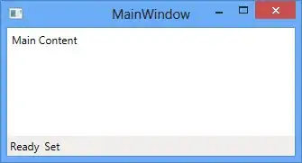
This is not the ideal layout, since the "Set" is squeezed right up against the "Ready".
How do I gain full control over the layout of the WPF StatusBar control?