150

I'm rather new to both python/matplotlib and using it through the ipython notebook. I'm trying to add some annotation lines to an existing graph and I can't figure out how to render the lines on a graph. So, for example, if I plot the following:

import numpy as np
np.random.seed(5)
x = arange(1, 101)
y = 20 + 3 * x + np.random.normal(0, 60, 100)
p =  plot(x, y, "o")

I get the following graph:

beautiful scatter plot

So how would I add a vertical line from (70,100) up to (70,250)? What about a diagonal line from (70,100) to (90,200)?

I've tried a few things with Line2D() resulting in nothing but confusion on my part. In R I would simply use the segments() function which would add line segments. Is there an equivalent in matplotlib?

lofidevops
  • 15,528
  • 14
  • 79
  • 119
JD Long
  • 59,675
  • 58
  • 202
  • 294

5 Answers5

226

You can directly plot the lines you want by feeding the plot command with the corresponding data (boundaries of the segments):

plot([x1, x2], [y1, y2], color='k', linestyle='-', linewidth=2)

(of course you can choose the color, line width, line style, etc.)

From your example:

import numpy as np
import matplotlib.pyplot as plt

np.random.seed(5)
x = np.arange(1, 101)
y = 20 + 3 * x + np.random.normal(0, 60, 100)
plt.plot(x, y, "o")


# draw vertical line from (70,100) to (70, 250)
plt.plot([70, 70], [100, 250], 'k-', lw=2)

# draw diagonal line from (70, 90) to (90, 200)
plt.plot([70, 90], [90, 200], 'k-')

plt.show()

new chart

Paul Roub
  • 36,322
  • 27
  • 84
  • 93
gcalmettes
  • 8,474
  • 1
  • 32
  • 28
  • 2
    Minor correction, the code above should read `x = np.arange(1, 101)`. – W.P. McNeill Aug 17 '13 at 18:37
  • This will not draw a line, but only a segment. The question how to draw a line throw two given points remains unanswered. – Alexey Apr 06 '16 at 19:57
  • The problem I see that these segments will be accounted as plots, disrupting legends.... – Rmano Oct 17 '16 at 06:51
  • 6
    @Rmano you can avoid the segments to be taken in account in the legend by adding a label argument starting with "_". Ex: `plt.plot([70, 70], [100, 250], 'k-', lw=2, label="_not in legend")` – gcalmettes Oct 29 '16 at 05:40
  • how to do this when the xvalue is a date? – suku Jun 24 '17 at 17:54
  • 8
    The fact that `90` is used both as `x2` and and `y1` leads to a lot of ambiguity. For anyone viewing this, note that `[70, 90]` does not refer to a single point at location `x1,y1`. For reference, here are the meanings of the values: `[x1: 70, x2: 90], [y1: 90, y2: 200]` – pookie Dec 14 '18 at 10:21
  • Works on images too – Nathan majicvr.com Feb 01 '19 at 16:55
  • @pookie I agree. This confused me for a while. Someone please approve my edit for clarification. – Benjamin Wang Jan 01 '21 at 12:47
85

It's not too late for the newcomers.

plt.axvline(x, color='r') # vertical
plt.axhline(x, color='r') # horizontal

It takes the range of y as well, using ymin and ymax.

Curious Watcher
  • 580
  • 6
  • 12
Fanglin
  • 2,132
  • 1
  • 21
  • 26
  • 1
    The min/max parameters of axhline and axvline are scalar values between 0 and 1 that plot lines in reference to the plot's edge. Although a good tool, it's probably not a the best solution to the author's problem statement of drawing annotation lines. – Michelle Welcks Dec 26 '14 at 20:06
  • 3
    This is perfect for wanting to add an annotation line in the background that spans the whole graph. If I use the chosen solution above to draw a vertical line at x=1, I have to specify the min and max y, and then the plot resizes automatically with a buffer, so the line doesn't stretch across the entire plot, and that's a hassle. This is more elegant and doesn't resize the plot. – Bonnie Apr 03 '16 at 22:02
  • This is amazing, thank you – Clef. Jun 22 '23 at 09:20
42

Using vlines:

import numpy as np
np.random.seed(5)
x = arange(1, 101)
y = 20 + 3 * x + np.random.normal(0, 60, 100)
p =  plot(x, y, "o")
vlines(70,100,250)

The basic call signatures are:

vlines(x, ymin, ymax)
hlines(y, xmin, xmax)
Austin Richardson
  • 8,078
  • 13
  • 43
  • 49
  • 3
    that's excellent. I had not seen the `vline()` or `hline()` functions. What about diagonal lines? I edited the question to add the diagonal bit now that you've shown me the h & v lines. – JD Long Oct 12 '12 at 17:51
  • Try making a `DataFrame` containing the x,y coordinates and plotting them with `style='k-'` – Austin Richardson Oct 12 '12 at 18:00
11

Rather than abusing plot or annotate, which will be inefficient for many lines, you can use matplotlib.collections.LineCollection:

import numpy as np
import matplotlib.pyplot as plt
from matplotlib.collections import LineCollection

np.random.seed(5)
x = np.arange(1, 101)
y = 20 + 3 * x + np.random.normal(0, 60, 100)
plt.plot(x, y, "o")

# Takes list of lines, where each line is a sequence of coordinates
l1 = [(70, 100), (70, 250)]
l2 = [(70, 90), (90, 200)]
lc = LineCollection([l1, l2], color=["k","blue"], lw=2)

plt.gca().add_collection(lc)

plt.show()

Figure with two lines plotted via LineCollection

It takes a list of lines [l1, l2, ...], where each line is a sequence of N coordinates (N can be more than two).

The standard formatting keywords are available, accepting either a single value, in which case the value applies to every line, or a sequence of M values, in which case the value for the ith line is values[i % M].

Qualia
  • 700
  • 8
  • 15
10

Matplolib now allows for 'annotation lines' as the OP was seeking. The annotate() function allows several forms of connecting paths and a headless and tailess arrow, i.e., a simple line, is one of them.

ax.annotate("",
            xy=(0.2, 0.2), xycoords='data',
            xytext=(0.8, 0.8), textcoords='data',
            arrowprops=dict(arrowstyle="-",
                      connectionstyle="arc3, rad=0"),
            )

In the documentation it says you can draw only an arrow with an empty string as the first argument.

From the OP's example:

%matplotlib notebook
import numpy as np
import matplotlib.pyplot as plt

np.random.seed(5)
x = np.arange(1, 101)
y = 20 + 3 * x + np.random.normal(0, 60, 100)
plt.plot(x, y, "o")


# draw vertical line from (70,100) to (70, 250)
plt.annotate("",
              xy=(70, 100), xycoords='data',
              xytext=(70, 250), textcoords='data',
              arrowprops=dict(arrowstyle="-",
                              connectionstyle="arc3,rad=0."), 
              )

# draw diagonal line from (70, 90) to (90, 200)
plt.annotate("",
              xy=(70, 90), xycoords='data',
              xytext=(90, 200), textcoords='data',
              arrowprops=dict(arrowstyle="-",
                              connectionstyle="arc3,rad=0."), 
              )

plt.show()
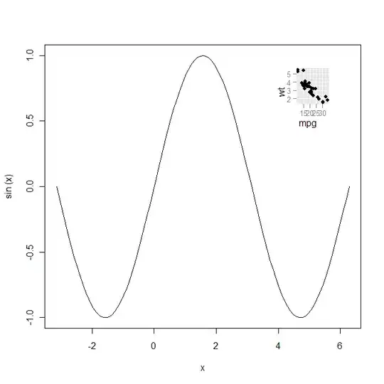
Example inline image

Just as in the approach in gcalmettes's answer, you can choose the color, line width, line style, etc..

Here is an alteration to a portion of the code that would make one of the two example lines red, wider, and not 100% opaque.

# draw vertical line from (70,100) to (70, 250)
plt.annotate("",
              xy=(70, 100), xycoords='data',
              xytext=(70, 250), textcoords='data',
              arrowprops=dict(arrowstyle="-",
                              edgecolor = "red",
                              linewidth=5,
                              alpha=0.65,
                              connectionstyle="arc3,rad=0."), 
              )

You can also add curve to the connecting line by adjusting the connectionstyle.
zarak
  • 2,933
  • 3
  • 23
  • 29
Wayne
  • 6,607
  • 8
  • 36
  • 93