I'm trying to setup Twitter Bootstrap carousel with multiple items while maintaining the responsiveness.
I have a jsfiddle for testing setup http://jsfiddle.net/Va8Un/
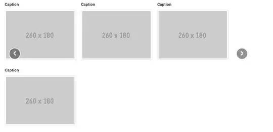
What I would like to happen is to display 4 images each with caption to hold item titles and so forth within a carousel pane and they should be resized to fit the screen to stay on the same row at all times. Right now it's completely ignoring any attempts I make to adjust the image size to the screen, I figured setting the img max-width:100%; would do the trick but it doesn't seem to effect it. Moreover, the 4th image is being pushed to a second row because the images aren't resizing:
Any way to fix this with pure CSS or should I look for options beyond Twitter Bootstrap?
You can view the result here: http://jsfiddle.net/Va8Un/embedded/result/
Here is the HTML:
<div class="container">
    <div class="carousel slide" id="myCarousel">
        <div class="carousel-inner">
          <div class="item active">
                <ul class="thumbnails span12">
                    <li>
                        <div class="caption">
                            <h5>Caption</h5>
                        </div>
                        <div class="thumbnail">
                            <img src="http://placehold.it/260x180" alt="">
                        </div>
                    </li>
                </ul>
          </div>
          <div class="item">
               ...
          </div>
          <div class="item">
               ...
          </div>

        </div>
        <a data-slide="prev" href="#myCarousel" class="left carousel-control">‹</a>
        <a data-slide="next" href="#myCarousel" class="right carousel-control">›</a>
    </div>
</diV>