10

If you guys were at the starting point of designing a new enterprise/business app, would you consider Metro style (WinRT) user interface for that?

We need:

  • a sophisticated desktop app (WPF/MVVM) for editing multiple complex forms with hundreds fields, some forms/windows/pages can be quite hefty, so free space on the screen has to be utilised wisely. Access to all controls by mouse and keyboard. Using touchscreens is possible in the future (but I believe <5% of customers will use it).
  • a web app for viewing data (much simpler than the desktop app)
  • mobile apps for iPhone/Android with basic functions for offline tasks in the field.

UI should be consistent among all the apps. And I'm sure it wouldn't be a problem to design mobile apps with Metro (and probably the web app). But the desktop app might be too complex for Metro (due to big forms and lists).

Have anybody seen samples of enterprise/business apps with Metro UI?

P.S. I've read many articles from MS (like Designing great productivity apps for Windows) and some sober views of things (like How suitable is Windows 8 Metro for business developers?) and still can't find a good approach for big forms and lists with Metro UI.

Would like to get something like Zune (on the picture below), but tend to think that it's impossible. enter image description here
Alex Klaus
  • 8,168
  • 8
  • 71
  • 87
  • Review WinRT and be sure it has what you need for the Desktop (e.g. there is no System.Data). It is kind of sand-boxed which can be a good thing of a bad thing. A consistent UI from desktop to mobile is a limiting design premise. – paparazzo Jun 26 '12 at 13:46
  • 1
    I found an example of CRM app in Metro UI on DevExpress video (http://youtu.be/kgzvyBfuMkc?t=5m28s). Not bad, if know that it was built with WinForms – Alex Klaus Jun 27 '12 at 07:34

3 Answers3

7

One or two years ago, our team was supported by professional UI designers to redesign a large forms-based application that we are developing (based on WPF). We had the same issues: customers want to display forms with sometimes hundreds of form fields, and ideally they want to see all fields on a single page.

The suggestion by the professionals was: convince your customers that this is a bad idea. Limit the number of fields per screen to maybe a dozen. Only then you will have a user interface that looks good and that is easy to handle.

Therefore, I think it is possible to have an enterprise app with complex forms in Metro, by splitting the complex forms into simpler parts. There are other criteria, however, you need to consider:

  • How willing are enterprise customers to upgrade to Windows 8? Considering that a large number of enterprise customers still use Windows XP (and sometimes even IE6), I expect them to upgrade only very slowly to Windows 8.

  • Will enterprise customers prefer Windows Phone 8 over iOS or Android? I am not sure about Android, but my current experience is that decision makers in companies think mainly of iOS when searching for a mobile enterprise application, simply because a lot of them already own iPad/iPhone devices. I think it might take quite some time until Windows Phone 8 comes into their focus.

  • 1
    Definitely a bad idea to display hundreds of fields on a single page. Employ such usability design concepts as Progressive Disclosure to design these forms that have a lot of input fields. – Klaus Nji Jun 26 '12 at 14:24
  • Also given that Windows 8 is still in its infancy and will probably not mature for another year or so, I will stick to WPF for Windows 7 and XP, especially for conservative enterprise. As I understand it, these applications can still run on Windows 8 in destkop model – Klaus Nji Jun 26 '12 at 14:27
  • @fmunkert, could you please provide a screenshot or detailed description for one of heavy forms with many fields? I'm sticking with DevExpress components what allow me to create a WPF app with Metro UI without WinRT or other Win8-related API. So even WinXP SP3 users can work with it – Alex Klaus Jun 27 '12 at 00:57
  • @Klaus: That's maybe a misunderstanding: we did not develop those forms with Metro; we used WPF. Futhermore, my suggestion was that you avoid complex forms when using Metro and take any effort necessary to convince your customers to split complex forms into simpler parts. As for DevExpress: I looked at their web site and it seems to me that they only have a Metro *skin*; that is not the same as a real Metro application which runs as an app inside the start screen. –  Jun 27 '12 at 04:24
  • @fmunkert, thanks for the clarification. So you split one form into several pages with addings navigation buttons? Have you got rid of dialogues forms at all and display all forms/pages in one window with navigation buttons? Avoiding dialogue windows is one of my concerns of using Metro. Yes, you're right, DevExp provide just skins and 1 tile control, so all other controls will be on developers. – Alex Klaus Jun 27 '12 at 05:19
  • 1
    @Klaus: JFYI: As for DevExpress - please, take a look at the new [MetroUIView](http://help.devexpress.com/#WindowsForms/CustomDocument11358) of the [DocumentManager](http://help.devexpress.com/#WindowsForms/CustomDocument11359) component. I believe this is good addition to several Metro skins (Metropolis, Metropolis Dark and MetroBlack) and TileControl. – DmitryG Jul 16 '12 at 03:59
  • @DmitryG, MetroUIView is a WinForms control. But anyway, it's a good reason to stick with old WinForms technology and put off jumping at WPF till better time. – Alex Klaus Jul 26 '12 at 02:00
4

The big difference between Metro and Classic Windows is that Metro is optimised for touch screen, and consequently the base controls for developing windows 8 are larger and are primarily designed for touch interaction (although they have reasonable mouse support).

Cluttered Forms will be problematic in Windows 8 as the Metro style favours uncluttered user interfaces. This will be especially evident on a tablet where the popup soft keyboard will cover part of the screen, and the window will perform scrolling gymnastics in order to put the currently focussed text box (for example) into view.

All Metro controls could be re-templated to mimic their legacy counterparts (so you could create a Zune-like screen as you describe), but then you would need to ask yourself what would be the benefit of creating the App in Windows 8 if you're not going to utilise the new touch support ?

Howver, there is a big benefit of writing your app in Metro, and that is portability. If you can get the UI design of the App to remain as a Standard Metro app (whilst facilitate your requirements), then your App should run on the Windows Desktop, Windows Tablet, and Windows Phone with minimal extra development effort.

With Windows 8 Mertro you also have the advantage of launching apps through the corporations own pivate 'App Store', but this may also be seen as a hinderance, depending on the security policies of your firm (although Apps can be deployed outisde of tha app store using powershell).

Dean Chalk
  • 20,076
  • 6
  • 59
  • 90
  • I understand the concept Metro design, but I also understand that there are many areas where designers/developers have to step back from the rules. Such apps like Photoshop will never 100% follow Metro rules. I suspect non-entertainment apps have many places with workarounds of the rules. So far, we don't have experienced Metro designers and we need teach them. That's why I'm looking for samples of good compromises and workarounds atleast for common issues in heavy business/enterprise apps with Metro UI. – Alex Klaus Jun 27 '12 at 01:22
3

The Metro design philosophy is certainly an interesting one. There's no doubt it can be used to make pretty stunning applications, but it's most certainly not for every application.

Ignoring Windows Store Apps (or whatever Microsoft is calling them this week), the more unique aspects of Metro are:

  • Chrome-less
  • No gradients
  • No rounded corners on borders or containers
  • No sub-pixel rendering/anti-aliasing - everything is crisp and sharp
  • No shadows, transparency or glass effects *
  • Context sensitivity
  • Strong use of typography
  • Strict usage of colour

* Microsoft actually breaks this one a couple of times - particularly with drop down lists.

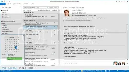
A good example of Metro done well in a traditional data-heavy application is Outlook 2013:

Outlook 2013 Preview

It sticks to the core principles of Metro where data is king and UI distractions should be kept to a minimum. It also lets you see how the same data can be presented via outlook.com:

Outlook.com

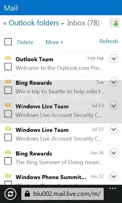
And here's the same site on the mobile site which demonstrates the consistency of the look and feel while making the data manageable for a completely different form factor:

Outlook.com

Disclaimer: I personally don't consider touch to be an implicit aspect of Metro design - touch requires additional consideration for things like gesture control, graphical feedback and control spacing. People will no doubt disagree on that one, but then no one ever agrees when it comes to design :)

Community
  • 1
  • 1
CatBusStop
  • 3,347
  • 7
  • 42
  • 54