57

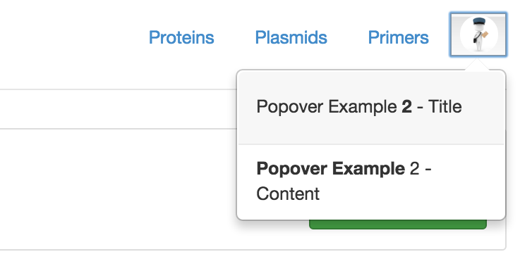
I'm trying to position a Bootstrap popover for a trigger that sits on the far top-right corner of a 960px wide web page.

Ideally, I'd position it on the bottom and move the arrow with CSS (so the arrow is on the top-right of the popover). Unfortunately the 'placement':'bottom' positioning is not enough, since it will center it below the trigger.

I'm looking for solution that will place the popover statically below and on the left of the trigger.

TylerH
  • 20,799
  • 66
  • 75
  • 101
koichirose
  • 1,815
  • 4
  • 22
  • 30
  • It would be helpful to better clarify your question with example code and perhaps an image the represents how you'd like the popover to position relative to the trigger. – Josh Metcalfe Jun 01 '12 at 19:34
  • I'm also looking for better control of the popover element. Have not found anything yet. – Dustin Graham Jun 06 '12 at 19:17

10 Answers10

33

This works. Tested.

.popover {
    top: 71px !important;
    left: 379px !important;
}
rboarman
  • 8,248
  • 8
  • 57
  • 87
  • 62
    This is not the solution 'cause there could be plenty of popovers on a page. – Rootical V. May 02 '13 at 10:34
  • 23
    Then all you need to do is change your selector – rboarman Aug 12 '13 at 19:43
  • 36
    That's an aweful solution - you're hard-coding position values in a popover whose dimensions and position are dynamic. I just tried adding that style in dev tools on http://getbootstrap.com/javascript/#popovers, and unsurprisingly, it didn't work. – jbyrd Jun 26 '15 at 14:25
  • i like that we can set the styles with jquery and works jsut fine in my case and i jsst added more to the selector to narrow the selection – CMS Mar 13 '16 at 18:27
  • A poster below actually has the answer that should probably be the accepted one. He calls out that `viewport` is how to get this properly positioned. This allows the container to be bound to a constraint without the need of manually overriding the position (especially to a fixed/set position) – Jonathon Hibbard Dec 18 '17 at 17:41
  • One more thing for those who try this out; one might want to add data-boundary="window" for the popover element as otherwise the re-positioning is limited by the element's dimensions. – Majte Jan 19 '21 at 19:48
21

Simply add an attribute to your popover! See my JSFiddle if you're in a hurry.

We want to add an ID or a class to a particular popover so that we may customize it the way we want via CSS.

Please note that we don't want to customize all popovers! This is terrible idea.

Here is a simple example - display the popover like this:

enter image description here

// We add the id 'my-popover'
$("#my-button").popover({
    html : true,
    placement: 'bottom'
}).data('bs.popover').tip().attr('id', 'my-popover');
#my-popover {
    left: -169px!important;
}
#my-popover .arrow {
    left: 90%
}
<script src="https://cdnjs.cloudflare.com/ajax/libs/jquery/3.3.1/jquery.min.js"></script>
<link href="https://netdna.bootstrapcdn.com/bootstrap/3.0.0/css/bootstrap.min.css" rel="stylesheet"/>
<script src="https://netdna.bootstrapcdn.com/bootstrap/3.0.0/js/bootstrap.min.js"></script>

<button id="my-button" data-toggle="popover">My Button</button>
TylerH
  • 20,799
  • 66
  • 75
  • 101
Mick
  • 30,759
  • 16
  • 111
  • 130
13

I've created a jQuery plugin that provides 4 additonal placements: topLeft, topRight, bottomLeft, bottomRight

You just include either the minified js or unminified js and have the matching css (minified vs unminified) in the same folder.

https://github.com/dkleehammer/bootstrap-popover-extra-placements

dkleehammer
  • 431
  • 5
  • 17
  • 7
    You plugin destroys for MVVM libs like knockout because it detaches the element from tbe body – Anders May 08 '13 at 20:58
  • @Pantera61 : What part of the code should I hack to detect collision between 2 popovers? i.e. when 2 nearby popovers are partially overlapping, I want to change their placement dynamically to be away from each other. – user May 28 '14 at 09:24
12

Popover's Viewport (Bootstrap v3)

The best solution that will work for you in all occassions, especially if your website has a fluid width, is to use the viewport option of the Bootstrap Popover.

This will make the popover take width inside a selector you have assigned. So if the trigger button is on the right of that container, the bootstrap arrow will also appear on the right while the popover is inside that area. See jsfiddle.net

You can also use padding if you want some space from the edge of container. If you want no padding just use viewport: '.container'

$('#popoverButton').popover({
   container: 'body',
   placement: "bottom",
   html: true,   
   viewport: { selector: '.container', padding: 5 },
   content: '<strong>Hello Wooooooooooooooooooooooorld</strong>'
 });

in the following html example:

<div class="container">
   <button type="button" id="popoverButton">Click Me!</button>
</div>

and with CSS:

.container {
  text-align:right;
  width: 100px;
  padding: 20px;
  background: blue;
}

Popover's Boundary (Bootstrap v4)

Similar to viewport, in Bootstrap version 4, popover introduced the new option boundary

https://getbootstrap.com/docs/4.1/components/popovers/#options

Datsos
  • 528
  • 1
  • 8
  • 13
  • 2
    This is definitely the best answer. Setting `viewport` is the key to solving this issue. The additional css is personal preference – Jonathon Hibbard Dec 18 '17 at 17:38
  • 1
    do u know how to move the tooltip to the left or right in bootstrap popover using the above code, if so can u please share a js fiddle – agent47 Apr 13 '18 at 17:56
  • this depends on the container selector you use for viewport. in the above example, if you remove text-align: right from .container then the tooltip will have the other direction – Datsos Apr 14 '18 at 19:41
  • 1
    The viewport option was removed in V4 – Batman Apr 08 '19 at 22:11
  • I wanted to add this viewport argument as a data-viewport attribute and it doesn't work. It throws this error: Error: Syntax error, unrecognized expression: {selector: '.container', padding: 6} – Zoltán Süle Jul 30 '19 at 11:46
  • Hello mate, are you sure you use Bootstrap version 3? As said in previous comment, this is removed in bootstrap 4. – Datsos Jul 30 '19 at 12:24
  • I am also not sure if it works as data attribute. Not all properties do. Haven't tried it myself – Datsos Jul 30 '19 at 12:25
7

I solved this (partially) by adding some lines of code to the bootstrap css library. You will have to modify tooltip.js, tooltip.less, popover.js, and popover.less

in tooltip.js, add this case in the switch statement there

case 'bottom-right':
          tp = {top: pos.top + pos.height, left: pos.left + pos.width}
          break

in tooltip.less, add these two lines in .tooltip{}

&.bottom-right { margin-top:   -2px; }
&.bottom-right .tooltip-arrow { #popoverArrow > .bottom(); }

do the same in popover.js and popover.less. Basically, wherever you find code where other positions are mentioned, add your desired position accordingly.

As I mentioned earlier, this solved the problem partially. My problem now is that the little arrow of the popover does not appear.

note: if you want to have the popover in top-left, use top attribute of '.top' and left attribute of '.left'

khaled
  • 224
  • 4
  • 8
4

To bootstrap 3.0.0:

.popover{ right:0!important; }

And modify too

.popover { max-width:WWWpx!important; } 

where WWW is your correct max-width to show your popover content.

manufosela
  • 469
  • 6
  • 8
  • I don't think this works in general because the popover isn't a child of the trigger element. It will only work if the trigger element is on the right of an relative-positioned container. – mahemoff Oct 18 '14 at 13:33
3

I had to make the following changes for the popover to position below with some overlap and to show the arrow correctly.

js

case 'bottom-right':  
    tp = {top: pos.top + pos.height + 10, left: pos.left + pos.width - 40}  
    break  

css

    .popover.bottom-right .arrow {  
      left: 20px; /* MODIFIED */  
      margin-left: -11px;  
      border-top-width: 0;  
      border-bottom-color: #999;  
      border-bottom-color: rgba(0, 0, 0, 0.25);  
      top: -11px;  
    }  
    .popover.bottom-right .arrow:after {  
      top: 1px;  
      margin-left: -10px;  
      border-top-width: 0;  
      border-bottom-color: #ffffff;  
    }  

This can be extended for arrow locations elsewhere .. enjoy!

siruscoder
  • 31
  • 1
1

If you take a look at bootstrap source codes, you will notice that position can be modified using margin.

So, first you should change popover template to add own css class to not get in conflict with other popovers:

$(".trigger").popover({
  html: true,
  placement: 'bottom',
  trigger: 'click',
  template: '<div class="popover popover--topright" role="tooltip"><div class="arrow"></div><h3 class="popover-title"></h3><div class="popover-content"></div></div>'
});

Then using css you can easily shift popover position:

.popover.popover--topright {
  /* margin-top: 0px; // Use to change vertical position */
  margin-right: 40px; /* Use to change horizontal position */
}
.popover.popover--topright .arrow {
  left: 88% !important; /* fix arrow position */
}

This solution would not influence other popovers you have. Same solution can be used on tooltips as well because popover class inherit from tooltip class.

Here's a simple jsFiddle

Buksy
  • 11,571
  • 9
  • 62
  • 69
1

Sure you can. Fortunately there is a clean way to do that and it is in the Bootstrap popover / tooltip documentation as well.

let mySpecialTooltip = $('#mySpecialTooltip); 
mySpecialTooltip.tooltip({
 container: 'body',
 placement: 'bottom',
 html: true,
 template: '<div class="tooltip your-custom-class" role="tooltip"><div class="arrow"></div><div class="tooltip-inner"></div></div>'
}); 

in your css file:-

.your-custom-class {
 bottom: your value;
}

Make sure to add the template in bootstrap's tooltip documentation and add your custom class name and style it using css

And, that's it. You can find more about this on https://getbootstrap.com/docs/4.0/components/tooltips/

Nadun Malinda
  • 329
  • 1
  • 5
  • 17
0

Maybe you don't need this logic for a responsive behavior.

E.g.

placement: 'auto left'

Bootstrap 3 has auto value for placement. Bootstrap doc:

When "auto" is specified, it will dynamically reorient the tooltip. For example, if placement is "auto left", the tooltip will display to the left when possible, otherwise it will display right.

kittykittybangbang
  • 2,380
  • 4
  • 16
  • 27