81

Ok this is seemingly impossible to get right. I have a text box and a select box. I want them to be the same width exactly so they line up on the left margin and the right margin.

<!DOCTYPE html>
<html>
    <head>
        <style type="text/css">
            input, select {
                width: 200px;
            }
        </style>
    </head>
    <body>
        <input type="text" value="ABC"><br>
        <select>
            <option>123</option>
        </select>
    </body>
</html>

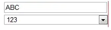
That would do it you think, right? Nope. The select box is 6px shorter in Firefox. See screenshot. screenshot in firefox

Ok so lets edit the code and make two styles.

<style type="text/css">
    input {
        width: 200px;
    }
    select {
        width: 206px;
    }
</style>

Ok that works!

Fixed in Firefox

Oh wait, better test in Chrome...

chrome screenshot

FFFFFFFUUUUUUUUUUUU

Can someone tell me how to line these up in all browsers? Why can't I just do width: 200px on all, why do all the browsers display it differently? Also while we're at it why is the text box and select box different heights? How do we get them to the same height? Have tried height and line-height no no avail.


Solution:

Ok I've found the solution with some help from the answers below. The key is to use the box-sizing: border-box property so when you specify the width that includes the border and padding. See excellent explanation here. Then the browser can't stuff it up.

Code is below, have also set the height of the boxes to the same size and indented the text inside the box so it lines up. You also need to set the border as Chrome has a really weird looking border it uses for select boxes which will throw out the alignment. This will work for HTML5 sites (e.g. supporting IE9, Firefox, Chrome, Safari, Opera etc).

<!DOCTYPE html>
<html>
    <head>
        <style type="text/css">
            input, select {
                width: 200px;
                border: 1px solid #000;
                padding: 0;
                margin: 0;
                height: 22px;
                -moz-box-sizing: border-box;
                -webkit-box-sizing: border-box;
                box-sizing: border-box;
            }
            input {
                text-indent: 4px;
            }
        </style>
    </head>
    <body>
        <input type="text" value="ABC"><br>
        <select>
            <option>123</option>
            <option>123456789 123123123123</option>
            <option>123456789 123123123123 134213721381212</option>
        </select>
    </body>
</html>

Just one final warning you may not want input buttons, checkboxes etc to be included in this styling so use the input:not([type='button']) to not apply it to certain types or use input[type='text'], input[type='password'] to specify ones you do want it to apply to.

zuallauz
  • 4,328
  • 11
  • 43
  • 54

7 Answers7

7

This is because the <input type="text" /> element has a slightly different default style to the <select> element e.g. the border, padding and margin values may be different.

You can observe these default styles through an element inspector such as Firebug for Firefox or the built-in one for Chrome. Futhermore, these default stylesheets differ from browser to browser.

You have two options:

  1. Explicitly set the border, padding and margin values to be the same for both elements
  2. A CSS reset stylesheet to be included before your own CSS stylesheets

I would go with option 1. because option 2. requires a lot of work and you'll end up with tons of unnecessary CSS. But some web developers prefer to start from scratch and have complete control.

Chris Cannon
  • 1,157
  • 5
  • 15
  • 36
  • 2
    CSS is reset is not a bad idea in a case like this. – Remy Apr 03 '12 at 21:15
  • 1
    Lightweight CSS resets do exist, but of course there might be undesired side effects. If you *start* designing with a CSS reset stylesheet, that option becomes a lot more attractive. – Thomas Upton Apr 03 '12 at 21:19
  • I have tried setting explicit `padding:0; margin:0; border:1px solid #000;` which gets the width of the text/select boxes lining up nicely. However if you look at the text inside the two boxes you'll notice that the text in the select box is padded in further. Almost need to add another specific `input { padding-left: 5px; }` style after the first one to fix. Any ideas? I have used a CSS reset in the site I was building before making this basic test code but the issue was still present there. The CSS reset wasn't fixing this specific text/select box width issue apparently. – zuallauz Apr 03 '12 at 22:23
  • 1
    Try `input {text-indent: 5px;}` P.S. the ` – Chris Cannon Apr 03 '12 at 22:36
  • Yeah the text-indent works if you add that additional style... but only for one browser. Then it's indented a different amount in Chrome so off by 2-3 more pixels! Maybe need to reset the indents for the select and text somehow? – zuallauz Apr 04 '12 at 00:21
3

This will get you close, but that level of precision is nearly impossible.

<div style="width: 200px"><input type="text" style="width: 100%; margin: 0; padding: 0" /></div>
<div style="width: 200px">
    <select id="Select1" style="width: 100%; margin: 0; padding: 0">
        <option>1</option>
    </select>
</div>
saluce
  • 13,035
  • 3
  • 50
  • 67
3

Different browsers apply different styles by default. I found that resetting both margin and padding to 0 makes both elements equal widths in both Firefox and Chrome.

<html>
    <head>
        <title>Test</title>
        <style type="text/css">
            input, select {
                margin: 0;
                padding: 0;
                width: 200px;
            }
        </style>
    </head>
    <body>
        <input type="text" value="ABC"><br />
        <select>
            <option>123</option>
        </select>
    </body>
</html>

I personally like to use a minimal CSS reset stylesheet like YUI CSS Reset before attempting to make a design look great in multiple browsers.

Thomas Upton
  • 1,853
  • 12
  • 22
  • 2
    In IE the select is still a couple pixels shorter in length, though. So while there is no perfect solution, we can get pretty close =) – saluce Apr 03 '12 at 21:14
  • 1
    Ah, IE. It almost seems like it relishes being unique. I don't have any IE version to test out, but is it different even in later versions, like 9 or 10? – Thomas Upton Apr 03 '12 at 21:17
  • 1
    I tested with IE9 and it still had a 2px difference in width. – saluce Apr 03 '12 at 21:22
  • If you look at the text inside the two boxes you'll notice that the text in the select box is padded in further. Almost need to add a specific `input { padding-left: 5px; }`. Is that the right way to do it? I have used a CSS reset in the site I was building before making this basic test code but the issue was still present there. The CSS reset wasn't fixing this specific text/select box width issue. – zuallauz Apr 03 '12 at 22:13
  • 1
    Giving left padding to the input is how I would attempt to line up the text in these two elements, if that was the requirement. Don't forget that these elements look different in different operating systems. I'm not sure that attempting to line up the text of `input` and `select` elements is a worthwhile thing to do, all things considered. Getting the outer edges of these elements to line up looks pretty good, aesthetically. – Thomas Upton Apr 04 '12 at 02:41
2

Add a class to both the select and input tags in question ie:

<input class='custom-input'/>
<select class='custom-input'></select>

then modify the css below to fit your design:

.custom-input {
        width:140px;
        border:1px solid #ccc;
        margin:1px;
        padding:3px;
        box-sizing: border-box;
        -moz-box-sizing: border-box;
        -webkit-box-sizing: border-box;
        -ms-box-sizing:content-box;
        -moz-box-sizing:content-box;
        -webkit-box-sizing:content-box;
        box-sizing:content-box;
    }

obvs this is a fix for supporting browsers

Matt Jameson
  • 582
  • 3
  • 16
0

If u use tables 4 inputs u could use the following solution - also compatable with ie7:

<tr style="width:1px;"><td style="width:inherit;position:relative;">
    <select style="width:100%;"> 
    </select> 
</td></tr>
<tr><td>
    <input type="text" style="width:150px;"/>
</td></tr>

That way the table cell width will be fixated to the width of the input,

And that way the select would therefore always take the remaining width and perfectly line up with d input.

Anonymous
  • 4,692
  • 8
  • 61
  • 91
0

Try removing the default borders from both elements:

select, input {
 border:0;
}
Beautifier
  • 74
  • 1
  • 3
0

Yes, extremely frustrating. However, I never had problems with that 'till I put a "<!DOCTYPE html>" tag at the top of my HTML page. My webpage rendered properly on all platforms that I could test until I put that tag at the top of my document.

While that's "genuine spec", it seems to be the source of these alignment problems. FWIW, I'm using HTML5 elements, in-line CSS, etc., all without that tag to specify HTML5. YMMV.