I saw this image on social media:
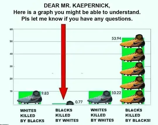
It shows a various values at on an unknown scale for incidences of black on white homocide (9.83), white on black homocide (0.77), white on white homocide (10.22) and black on black homocide (53.94).
What is the source of the data in the graph, what scale is it using, and is it accurate?