84

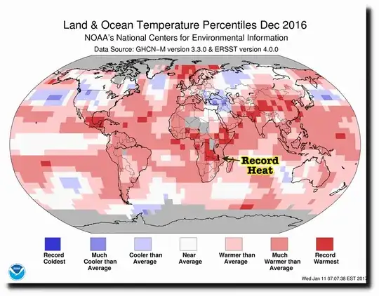
At the Deplorable Climate Science Blog, he claims that this map was published: enter image description here

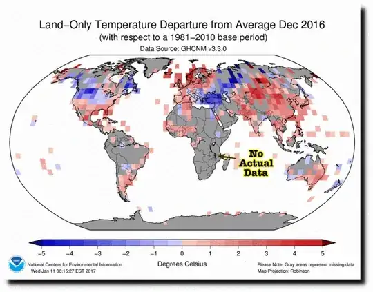
When this is the reality enter image description here

The map above (the first map) is fake. NOAA has almost no temperature data from Africa, and none from central Africa. They simply made up the record temperatures

Is it true? Did NOAA publish a fake map based on information it doesn't have?

3 Answers3

165

This claim is complete and utter bollocks.

Let's start with the obvious. If map A has some data on it, and map B doesn't, that in no way indicates that map A is fake - even if data is marked as 'missing. There might be many reasons the data is not on map B. They might have been compiled from different sources, or have different criteria for inclusion, or require different amounts of data for accuracy. The same is true of datasets in general.

Here is a link to the page where the supposedly fake map is published. On the same page you will see another map, identical to the one that is claimed as evidence of fakery, but with all the supposedly missing data (and also ocean temperatures). There is no missing data.

We can also show clearly that NOAA and the CHCNM dataset DOES have data for central Africa, in the places where the cited map has grey areas. As an example here is the link to the NOAA data for Kigali, Rwanda. You can actually go and look up the temperatures for yourself, and do the analysis yourself. Even if it were not in this dataset it would be easily available. This link will tell you that the temperature in Kigali, Rwanda is 19 degrees C as I write it. (YMMV)

The only evidence that 'Deplorable Climate Science Blog' presents is that "the data in the first map doesn't show up on the second, so it must not exist". That's equivalent to saying "Because data for Washington DC doesn't show up on this map of Alaska, the data on the East Coast map must be fake". We can't give a definite reason why African data is not shown, but there are plenty of potential reasons that don't involve fraud.

DJClayworth
  • 57,419
  • 26
  • 209
  • 195
  • 3
    I would just add this from NOAA: "The Global Historical Climatology Network (GHCN) is an integrated database of climate summaries from land surface stations across the globe that have been subjected to a common suite of quality assurance reviews. The data are obtained from more than 20 sources. Some data are more than 175 years old while others are less than an hour old." And for ERSST: "The Extended Reconstructed Sea Surface Temperature (ERSST) dataset is a global monthly sea surface temperature analysis derived from the International Comprehensive Ocean–Atmosphere Dataset..." – jeffronicus Feb 05 '17 at 22:10
  • 3
    Also, here's the GHCN page for the Kigali, Rwanda station you mention: https://www.ncdc.noaa.gov/cdo-web/datasets/GHCND/stations/GHCND:RWM00064387/detail – jeffronicus Feb 05 '17 at 22:11
  • 37
    When an argument starts off with "obviously wrong" it's immediately worrisome and all statements thereafter are subject to severe skepticism... – ylluminate Feb 06 '17 at 00:43
  • 17
    While I am very confident that this answer is correct, I don't think it really addresses the question as asked. It took me awhile to figure out what the issue was because the article linked in the question is so poorly written and poorly supported. But after some study, I recognized that the second figure in this question indicates that NOAA has no data from most of Africa for December 2016. The first figure indicates that there is a region in south-central Africa which set temperature records in December 2016. So the question is how they came to that conclusion without data. – Mark Feb 06 '17 at 01:46
  • 60
    @yluminate With an obvious exception, which is when the original claim is obviously wrong. – DJClayworth Feb 06 '17 at 02:50
  • 14
    @Mark The second map compares the Dec 2016 data to the 1981-2010 data, so "no data" can mean "no Dec 2016 data" and/or "no (or incomplete) 1981-2010 data". The original claim was that it is "no Dec 2016 data" and this answer shows that it is not "no Dec 2016 data". – Sumyrda - remember Monica Feb 06 '17 at 04:31
  • 15
    @Mark One thing I would note here is that the map is not the data; the maps represent two different products produced using data from one or both of the two time series involved, both of which are published and downloadable. There's an extensive discussion about temperature monitoring and links to additional resources at https://www.ncdc.noaa.gov/monitoring-references/faq/temperature-monitoring.php – jeffronicus Feb 06 '17 at 04:35
  • 5
    These are however actual maps from the NOAA (links are in the blog article), for the same month. It would help to explain what each one shows (link to the description of the individual data products) and to explain why one has data for all tiles while the other only for some tiles. – Szabolcs Feb 06 '17 at 07:45
  • @Szabolcs That would make a good question for [EarthScience.SE]. Note that neither map has data for *all* grid points. Both have the poles and very cloudy regions missing. Perhaps one includes only near-nadir VIS/IR data whereas the other includes further off-nadir parts of the swath and microwave measurements, or is otherwise complemented by analysis. That does raise the question how large the uncertainty is on the pixels marked as record heat, and what the confidence is with which they actually can make that statement. – gerrit Feb 06 '17 at 09:59
  • 3
    @gerrit I think it would make a good answer to *this* question: "Do these two maps have different coverage because one is fake?" -> "No, they have different coverage because X". This answer currently addresses it differently: "Is this one map fake because there is no data it could be drawn with?" -> "No, because the data is available from these sources." The second map is basically ignored. – IMSoP Feb 06 '17 at 13:49
  • 10
    The two maps _literally tell you the difference between them_. Top map: GHCNM + ERSST; bottom map: GHCNM. Astounding. – Jack Aidley Feb 06 '17 at 14:14
  • 1
    @IMSoP My comment is not an answer because I am speculating, and answers on this site need to be backed up by evidence. – gerrit Feb 06 '17 at 14:25
  • @gerrit I was responding to "That would make a good question for Earth Science." I didn't mean that (specifically) *you* should write that answer, but that *someone* should, and that it doesn't require going to a different site. An expanded version of Jack Aidley's last comment spelling out those two acronyms would be a good start to an answer. – IMSoP Feb 06 '17 at 14:26
  • 3
    @JackAidley ERSST is "Extended Reconstructed Sea Surface Temperature", so does not explain the absence of African data. – DJClayworth Feb 06 '17 at 15:54
  • 2
    The map with the "missing data" can be seen here: https://www.ncdc.noaa.gov/temp-and-precip/global-maps/201612?products[]=map-land-sfc-mntp#global-maps-select – ventsyv Feb 06 '17 at 16:53
  • 2
    I don't really follow the reasoning in this answer. How does linking to more maps prove that there is no missing data? Is this link to the Kigali temperature even measuring the same thing? – Nattgew Feb 06 '17 at 17:09
  • 3
    @Nattgew The maps are published by NOAA and show the data that is claimed to be missing. Since it is there and published, it is not missing - it is just not in the data that the map shows. But the really important question is, how does existence of a map that doesn't show the data prove that the data doesn't exist? It's like saying that because there is a map that doesn't show cities, that proves that cities don't exist. – DJClayworth Feb 06 '17 at 17:15
  • 1
    But there is already a map in the question that shows that data. The claim is that the data is faked. – Nattgew Feb 06 '17 at 17:19
  • 1
    Now you're getting it. – DJClayworth Feb 06 '17 at 17:21
  • 1
    It doesn't prove the data doesn't exist, but why would there be a map that leaves out the data? – Nattgew Feb 06 '17 at 17:25
  • 2
    Following the NOAA links, it seems that for Kigali International (the airport), December 2016 had 12 daily maxima and 9 daily minima, leading to 5 days out of 31 with both a maximum and a minimum temperature recorded. I have no idea whether this is enough to give a monthly anomaly for that month. – Henry Feb 06 '17 at 17:33
  • @Nattgew why not? There could be almost infinite reasons for the existence of a map with filtered data. –  Feb 06 '17 at 17:57
  • 3
    @DoritoStyle Absolutely, I'm just saying that it would be a better answer if it could show the reasons. Science should be repeatable, we should be able to reproduce any of the maps with available data. – Nattgew Feb 06 '17 at 18:28
  • 1
    NOAA database server seems to be down. Worked this morning - hopefully it's temporary. – DJClayworth Feb 06 '17 at 22:14
  • 6
    I call BS on this answer. At best, you've given links that show the maps, and to sites that purport to give data for the area in question. I might be missing something, but I don't see the limited map in your second link. The third link isn't even loading for me. A temperature on a Google search could be interpolated for all we know. [IMSoP's answer](http://skeptics.stackexchange.com/a/37147) does a *much* better job of trying to explain why the data looks the way it does. This answer is basically just a rant that assumes the good faith of several sources without actually addressing the claim. – jpmc26 Feb 07 '17 at 00:44
  • 6
    This answer is ridiculous of course ("ridiculous" in the sense that it has no place at all on a skeptics site). The 100+ "upvotes" is unfortunately a "nail in the coffin" for this site. – Fattie Feb 07 '17 at 11:02
  • The server for the dataset is now up and running again. – DJClayworth Feb 07 '17 at 15:26
161

tl;dr: The supposedly fake map is composed of multiple sources of data, averaged over larger areas of the Earth and a longer period of its history. The map labelled as "the reality" shows just one of these sources of data, plotted at relatively high resolution, and only where directly comparable data is available from a specific 30-year period.


Both of the maps shown in the article can be downloaded from the NOAA's website on a page of Global Temperature and Precipitation Maps. I have selected from the form December 2016, and four "products":

  1. the "Global Land Mean Temp Anomaly Map" (labelled on the graph as "Land-Only") is the one being labelled as "the reality"
  2. the "Global Land & Ocean Temp Percentile Map" matches the "real" graph, but fills in the oceans, and also broad smudges of land
  3. the "Global Land Temp Percentile Map" (labelled on the graph as "Land & Ocean") is the one being labelled as "fake"
  4. finally, there is the "Global Z-Score Map"; this has the same coverage as the "fake" map

Maps 2 and 3 are also featured in this report analysing the Dec 2016 data.

On each of these maps, the legend includes two pieces of information which are key to understanding their different coverage.

Firstly, they list their source data:

Secondly, they list the time frame of their comparison: maps 1 and 2 state that they are "with respect to a 1981-2010 base period", while maps 3 and 4 do not. The reason for this, and the base period of the other maps, is explained in this FAQ:

Why do some of the products use different reference periods?
The national maps show temperature anomalies relative to the 1981–2010 base period. This period is used in order to comply with a recommended World Meteorological Organization (WMO) Policy, which suggests using the latest decade for the 30-year average. For the global-scale averages (global land and ocean, land-only, ocean-only, and hemispheric time series), the reference period is adjusted to the 20th Century average for conceptual simplicity (the period is more familiar to more people, and establishes a longer-term average). The adjustment does not change the shape of the time series or affect the trends within it.

So we have two very different types of graph:

  • a graph comparing a single data set in Dec 2016 against available averages within that dataset for the reference period 1981-2010
  • several graphs comparing a combined analysis of two data sets against averages for the period 1901-2000

It would seem an obvious question to ask how an ocean data set can be used to fill in land temperatures. However, the combined data set does more than just overlay the two sets of observations; details of exactly how it is computed are available in these references:

  • Smith, T.M., R.W. Reynolds, T.C. Peterson, and J. Lawrimore, 2008: Improvements to NOAA's historical merged land–ocean surface temperatures analysis (1880–2006); Journal of Climate, 21, 2283–2296, doi:10.1175/2007JCLI2100.1
  • Vose, R.S., D. Arndt, V.F. Banzon, D.R. Easterling, B. Gleason, B. Huang, E. Kearns, J.H. Lawrimore, M.J. Menne, T.C. Peterson, R.W. Reynolds, T.M. Smith, C.N. Williams, Jr., and D.L. Wuertz, 2012: NOAA's merged land-ocean surface temperature analysis. Bulletin of the American Meteorological Society, 93, 1677–1685, doi:10.1175/BAMS-D-11-00241.1

I have not read the full papers, but I think the key is that the combined data set measures relative rather than absolute temperatures, and is therefore able to combine them across much larger regions. (See also question 7 in the FAQ.) This accounts for the low resolution evident in the graphs which have full coverage. The GHCN-M data has not benefited from this "smoothing", so instead shows smaller patches of data; and it contains absolute temperatures, not deviations from average, so can only be plotted where there is enough to form a meaningful comparison.

Similarly, you might question why a dataset would contain enough data for an average across 1901-2000, but not for 1981-2010. The GHCN-M overview page explains that the dataset was first produced in the 1990s, but composed out of existing historical records. So at the relatively high resolution of the data set, a particular grid point might have values for 1900 to 1980, but none since, while a neighbouring grid point has only recent data. The map of station ages on this page shows very few long-established points in Africa, which would be consistent with the theory that map 1 is missing Africa data because of a lack of consistently placed observations to compare.

To be clear, the "missing data" on map 1 does not mean that there are currently no measuring stations in Central Africa (the location map above shows plenty); it also probably does not mean there weren't any in the period 1981-2010 (I would be very surprised if there weren't). What it probably means is that the measuring stations currently in place are different from those that were in place between 1981 and 2010, meaning that comparisons must be made based on larger analysed areas.
IMSoP
  • 8,040
  • 5
  • 38
  • 38
  • 24
    +1 for actually explaining something about the data instead of ranting about the article. – jpmc26 Feb 07 '17 at 00:37
  • 4
    You are kind of saying the guy who printed the fake news article kind of has a point, but may have overstated it some. +1 for honesty –  Feb 07 '17 at 16:48
  • 3
    So NOAA is using interpolation and anomaly base lining rather than actual temperature measurements for Africa. Thanks. the guy who wrote the article has a point. –  Feb 07 '17 at 17:00
  • 72
    @KDog Not really. The difference between "making data up", and "combining data from nearby locations over a large time frame in a statistically rigorous way" is not just "overstating it some". The data is all "real", and the methods for interpreting it are openly published and regularly refined to eliminate confounding factors. If anything, the processed data is *higher quality* than the raw data, because the processing is designed to eliminate noise. **The fact that you don't understand some analysis doesn't make that analysis equivalent to fraud.** – IMSoP Feb 07 '17 at 17:08
  • 61
    @Konstantine The linked article is *accusing the NOAA of fraud*; not just implying it, explicitly stating it. The author refers to the data as "fake", "simply made up", "imaginary", and "obviously bogus". A couple of hours of my non-expert time was all it took to find the source of the data, including comprehensive details of how and why it is analyzed. This guy writes a blog *dedicated to climate science*, and yet somehow never looked for (or deliberately ignored) any background to the two out-of-context images. So no, "the guy who wrote the article" most emphatically does not "have a point". – IMSoP Feb 07 '17 at 18:25
  • 3
    @IMSoP, "kind of has a point" might be wrong, but this answer *does* demonstrate the complexity of the analysis; it's certainly far from obvious how the combined graph is produced, or how to verify its correctness from original sources. – Paul Draper Feb 07 '17 at 20:29
  • 2
    Would you trust busting your economy with that type of underlying data issue? I wouldn't. And my point was he was sort of correct that the data set doesn't exist based upon terrestrial thermometer measurement observations. It's been interpolated. –  Feb 07 '17 at 21:12
  • 3
    @IMSoP: No, a deficiency on the reader's part does not prove fraud, but if the results of the analytic model are labeled as if they were primary data rather than model projections, that would be borderline fraud. Actually, the subtitle does contain an acronym including the word "Reconstructed"... but that's very easy for a non-expert to miss. I think we can all agree it would be clearer if that word had made it into the main title, instead of being hidden behind an acronym. This isn't saying there is zero value in the reconstruction, just that it should be honestly labeled. – Ben Voigt Feb 07 '17 at 21:13
  • 6
    @BenVoigt Where do you see the map labelled as "primary data"? Where in my answer or the NOAA's site do you see evidence that they are "model projections"? There is no dishonesty here. If you just throw data at a map and say "that's pretty", you learn nothing; you have to analyse it *somehow*. If the blogger had written a critique of the analysis, starting with an explanation demonstrating that they actually understood it, you might have a point. They didn't. Apparently, they spent longer e-mailing some poor guy at NASA than reading the website of the organisation they were accusing of fraud. – IMSoP Feb 07 '17 at 21:54
  • 26
    @Konstantine What "underlying data issue"? That we don't have thermometers on every square inch of the planet's surface which have been recording accurate measurements at hourly intervals for the last 150 years? What *would* you trust exactly? As for "not based upon terrestrial thermometer measurement observations", it's certainly *not* true that there are no measuring stations in central Africa, as the map I link at the end shows. The interpolation is only necessary because those measuring stations have not always been in the same place, and we need some way of comparing *across time*. – IMSoP Feb 07 '17 at 22:05
  • 2
    @IMSoP People hear what they want to hear. At least your answer, which is complete and accurate, is the accepted one. – thanby Feb 07 '17 at 22:46
  • 26
    Frustrating, ain't it, when you take the time to write a thorough, detailed rebuttal to a baseless accusation, and people *still* hear what they want to hear? Nice answer. You have my upvote, and my sympathy. – ArtOfCode Feb 08 '17 at 04:20
  • @Konstantine: Would you trust a doctor who advises you to stop smoking when the doctor has (1) an analysis of your health using multiple tests and (2) an analysis of your health using just your performance on a training bike, when that analysis 2 does not show information about the chance of getting cancer but analysis 1 does? – Arne Babenhauserheide Feb 08 '17 at 14:44
  • 1
    http://www.dailymail.co.uk/debate/article-4216180/How-trust-global-warming-scientists-asks-David-Rose.html – ylluminate Feb 12 '17 at 21:39
  • 2
    @ylluminate I could play along and paste random links back at you, but I'm not here to debate the entirety of climate change research with you, only to address the specific question at the top of this page. Feel free to ask a new question regarding that claim, if you can do so within the rules of this site. – IMSoP Feb 12 '17 at 22:54
  • 1
    http://www.bostonglobe.com/metro/2017/02/13/why-weather-forecasters-question-climate-science/h93iEPs3YSwxPLJ58gWCxJ/story.html – ylluminate Feb 14 '17 at 03:21
  • 3
    @ylluminate Please don't turn this comment thread into a paste bin of your favourite climate science stories that have nothing to do with the topic at hand. To remind you, this comment area exists to discuss *ways to improve this particular answer*. – IMSoP Feb 14 '17 at 08:46
  • Oh, this is by no means close to my list of favorite climate science stories, only a few recent perspective balancing developments. Just trying to help would-be interested readers to receive a balanced purview of information. – ylluminate Feb 15 '17 at 14:44
  • 2
    @ylluminate But both links have *absolutely nothing* to do with this answer, or even this question. *This is not a forum*, or an encyclopedia; it's a Q&A site; it doesn't exist to "give readers a balanced purview" of the entirety of climate science. I'm tempted to raise a flag for a moderator to remove those comments as unconstructive. – IMSoP Feb 15 '17 at 14:48
  • For those saying the climate change guy kinda has it right, that is not the case. He is saying they don't have the data. They do, I downloaded it. The second map, uses three datasets that are all valid when compared against themselves. It would like looking at a world map that only has the countries of North America outlines and claiming that we don't know what the out lines for Europe are even though we show you them on another map. – Philip Tinney Mar 16 '17 at 08:48
8

DJ's answer is correct. I spent some time doing some research, to back it up. The GHCN has two datasets, QCU and QCA.

This is the description of the two data files from the readme.

"QCU" files represent the quality controlled unadjusted data, and "QCA" files represent the quality controlled adjusted data.

Looking at this map "NOAA GIS Site (Global Summary)", You can see there are stations in that area and the only hole from the first map corresponds to the lack of stations in the DR of Congo.

It took some work to verify one of the sites in that area. The Lichinga site was very close to the area of no data. Neither file contained it. There were two things that stuck out, when going through the file. First was sites being categorized under the USSR. The second was there were many more entries in the QCU file. The USSR anachronism provided evidence, that they don't update the site names. By looking at the Lat/Long, there was an entry for VILA CABRAL (Only in the QCU file). A quick search confirmed that Lichinga was founded as Vila Cabral.

This all leads me to the conclusion that the "fake" map is using the QCU data and the second map only includes the QCA data, because they can't verify if there were adjustments made to some sites, they don't include that data in the QCA file, in which they do adjustments.

The data to back this up was obtained at ftp://ftp.ncdc.noaa.gov/pub/data/ghcn/v3/

Philip Tinney
  • 189
  • 1
  • 4