Is the dress black and blue in colour?
TL:DR; Colour-Constancy illusion.
The dress in real life
Yes. The original dress is black and blue. The dress has been identified and there are many professional photographs which show its colours unambiguously. See reports referenced below.
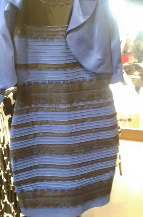
The dress in the photograph
The photograph being circulated is a very poor snapshot which appears to be overexposed and has incorrect colour-balance. The pixel data values are mostly described as predominantly blue and brown. But this is not as relevant as many of us might at first suppose. See references below.
The dress on your computer screen
The hues on your computer screen will vary considerably, more so for the probable majority of people who don't perform regular colour-calibration of their computers and who don't concern themselves with limited gamuts and other technical issues.
However this answer will not take this factor into account, there is evidence of other factors that are probably adequate in themselves to explain what is happening.
The dress in your brain's visual system
The colour perceived by a human visual system depends to a surprisingly large extent on context and in particular about what clues exist concerning ambient lighting, shadows and other circumstances. This is the subject of colour-constancy in human vision
The processing in the brain attempts to maintain colour constancy regardless of the actual frequency of light falling on the retina from an object. In other words, regardless of any actual RGB values of an image on a screen. The human visual system (which is mostly in the brain, not the eye) does not faithfully measure incident RGB values and present those to conscious levels of thought.
Ambiguous context can cause the brain's visual system to "incorrectly" interpret the colour. A better way to express this would be that there are two sets of different real-life physical dresses and lighting conditions that will produce the same photographic (or retinal) image. Your brain has too few contextual cues to disambiguate the situation and therefore settles on an arbitrary interpretation that depends mostly on your viewing circumstances and physiology.
BBC reports
The BBC reproduced the conditions of the photo and interviewed a Professor John Barbur of the Applied Vision Research Centre, City University London. BBC report
Essentially it is claimed that this overexposed photograph represents an edge-case in human visual perception, our visual systems vary considerably from person to person and our brain's interpretation of the image can vary greatly depending on context - background in the photograph, lighting in our viewing position and so on.
Beau Lotto, a professor of neuroscience at University College London, says "the brain has evolved not to see absolutes, but to see the difference between things." Because colours that appear in sunlight look different from those that appear under streetlights, for example, our brains have to focus on the relationship between colours, not the colours themselves. BBC report
Newspaper reports
The Guardian newspaper has a report where Marie Rogers, a PhD student with the Sussex Colour Group discusses colour-constancy.
In our everyday lives, there are many changes in the colour of the light illuminating our surroundings. For example, the yellow glow of an incandescent light bulb versus the blue-ish hue of a fluorescent light. The light that an object reflects to the eye is a combination of both the colour of the object itself and the spectrum of the light source, which may vary. The brain is able to disentangle these two things and decide what colour the object is. Simply put, objects appear the same colour even if the light illuminating them changes – a concept known as colour constancy.
So, how does the brain keep colours constant? One way is by using reference points. For example, say you know your mug is white, but the light being reflected from the mug is slightly red. The brain can then discount a certain amount of red tint from the rest of the scene you are seeing. Other contextual knowledge may come into play, for example you are drinking coffee by the window at dawn. It makes sense for the light to be red-tinted as the illumination source is the sunrise. This is known as top-down processing. All of our perceptual experiences are informed by this kind of processing, resulting from context and previous knowledge.
The New York Times has a report that illustrates this cognitive process with respect to the dress in the photograph. Their sources are given as "Laurence T. Maloney, New York University; Eugene Switkes, U.C. Santa Cruz; Qasim Zaidi, SUNY College of Optometry; Journal of the Optical Society of America A."
Research
Journal of Vision - Surface color perception under two illuminants: The second illuminant reduces color constancy - describes how the presence of two sources of illumination can reduce colour-constancy.
It is likely the troublesome photograph included both ambient lighting and a photographic flashgun. Viewing conditions will vary for people vieing images on the Internet. The image lacks clear/unambiguous colour cues in it's background
Summary
So it's a kind of chromatic visual illusion, in some ways similar to the figure-ground illusion, where the brain struggles to settle on one of two possible interpretations of an image.
Other References