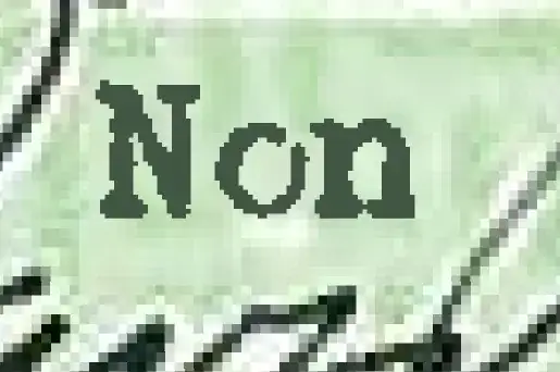
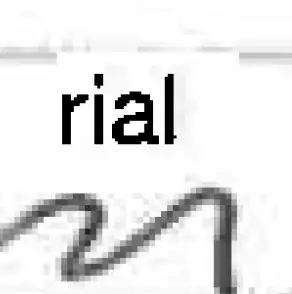
It looks to me like the scanner that was used to make the PDF split the image into several layers during construction of the PDF in order to reduce the file size while maintaining sharp text. If we look side-by-side at some writing that was not separated into a separate layer and some text that was, we can clearly see the effect (note that I have moved the writing around to get a good side-by-side example):

This is a very common feature of scanners that produce PDFs, since your documents tend to look horrible otherwise (or are huge). Here's an example taken from my local copier (again with text moved next to writing that was not recognized as requiring hi-res):

Thus, the existence of multiple layers in no way is evidence that the document is not authentic. This is the standard way for scanners/copiers to handle scanned-document-to-PDF conversions.
Upon review of the document, I can't find an instance of the font "not making sense". Looks like a typewriter to me, and the same one used for the whole document (complete with artifacts that I recall seeing before, like partially shifted caps).
Edit: this site shows all the layers (thanks to geoff for finding it). You can verify them for yourself by loading the PDF into a vector graphics tool like Adobe Illustrator or Inkscape and ungrouping the pieces.
Another edit: This site presents the same conclusion (thanks to fred for finding it), albeit without a clear demonstration, and with some technical inaccuracies.


