37

The following image has been making the rounds on social media:

enter image description here

  1. Is the infographic even accurate?

  2. If so is the conclusion it's pushing backed up by valid statistics? (that there's a clear correlation between the gun problem (as defined by firearm deaths per 100,000 people) and Democratic-party voters? Or is it more of a case of cherry-picking specific areas that fit the desired pattern?

    The infographic's exact claim:

    Most crimes and murders are committed in the cities of America and by the constituency of the Democratic Party

Oddthinking
  • 140,378
  • 46
  • 548
  • 638
user5341
  • 31,075
  • 8
  • 130
  • 178
  • 28
    I somehow doubt that [politifake.org](http://www.politifake.org/) can be considered a notable source. – jwodder Sep 29 '14 at 18:42
  • Also note the off colour selection: In contrast to what one would expect, green does not represent the best value, but a rather bad one. – Wrzlprmft Oct 01 '14 at 13:00
  • 2
    **To the answerers**: please review our policies on [theoretical answers](http://meta.skeptics.stackexchange.com/questions/2929/faq-what-are-theoretical-answers) and [original research](http://meta.skeptics.stackexchange.com/questions/2924/faq-what-constitutes-original-research) before proceeding. – Sklivvz Oct 01 '14 at 23:43
  • 3
    **To interested readers:** The claim is a classic case of ecological fallacy (but I can't explain how because moderators apparently think deleting relevant stuff based on arcane rules somehow makes the site better…) – Relaxed Oct 02 '14 at 00:00
  • 3
    @Relaxed The *picture* does contain a fallacy, but it also makes two clear factual claims: 1. that stats are so and so; 2. that restricting guns in this way would be effective. Showing that there is also a fallacy does not address either claim. In particular, the *question* specifically asks about the first claim and it clearly speaks of *correlation*. – Sklivvz Oct 02 '14 at 07:28
  • The infographic is intended to be tongue-in-cheek. Correlation does not imply causation. There typically is a high rate of poverty and a high crime rate in US inner cities. Many people assume a causal relationship between the latter & the former. The graphic simply points out that there are other things that correlate highly with inner-city crime - in particular an overwhelming affinity for one political party - and makes an equally facile claim about causality based on correlation. (Not enough rep to answer.) – David Oct 04 '14 at 15:43

2 Answers2

48

The info-graphic says there's a problem in "Democrat Inner Cities".

Apparently, inner cities in general are Democratic.

  • Here's a liberal source saying so:

    Democrats are from cities, Republicans are from exurbs

    Princeton's Robert Vanderbei put together a fantastic 3-d map in 2012, which I'd recommend that you take some time to explore, that visualizes the country with blue skyscrapers towering over pink plains, reflecting the heavy concentration of votes in urban areas.

  • Here's an anti-liberal source saying so:

    Violent Crime and Murder in America Blame Democrats!

    That being said- inner cities are not Republican strong holds regardless of the state. Please note that even in red states (Republican states)- the inner cites are voting in high numbers for Democrats. Do you think the residents of Los Angeles, Chicago, Detroit, Cincinnati, New York, Philadelphia are voting for Republicans? They are voting in much higher percentages for Democrats. I am making a blanket statement- but the percentages back this statement. As a result- it is fair to say that most crimes and murder in America are being committed by Democrats - because the percentages of Democrats in these areas far exceed the number of Republicans.

So the correlation is, "Cities (urban voters) are Democratic" and "Inner cities have (gun deaths) violence".

I don't think this is evidence that the (relatively very few) murderers themselves (less than 1% of the population) vote Democratic or Republican; so I don't see a connection between "voting Democratic" and "gun crime", except that both (voting and crime) happen in (all) cities.

ChrisW
  • 26,552
  • 5
  • 108
  • 141
  • 27
    I wonder if there's any evidence to show that murderers even vote. – Gabe Sep 30 '14 at 03:55
  • 5
    @Gabe [Felony Disenfranchisement](http://en.wikipedia.org/wiki/Felony_disenfranchisement#United_States) means they probably couldn't even if they wanted to. – Chuu Sep 30 '14 at 14:37
  • 1
    @Chuu: That's only after they've murdered and been caught. I'm wondering if there's much voter turnout among those who will murder in the future. I'm guessing not. – Gabe Sep 30 '14 at 15:36
  • 3
    I think this answer is avoiding the issue. Yes, inner cities are *generally* democrat. But the infographic points out that there are some *Republican* inner cities that have less gun-violence. The argument that inner cities are generally Democrat is a red herring. – Cory Klein Sep 30 '14 at 16:44
  • 2
    I see 4 'Republican cities' in the info-graphic, i.e. OKC, Jacksonville, Salt Lake City, and Phoenix (not to mention Houston). All four of these cities are 'green, i.e. relatively high violence (ignoring Birmingham as the only, blue, outlier). – ChrisW Sep 30 '14 at 16:54
  • 3
    It should also be noted that high violence and high gun control correlating is frequently the result of the violence rates climbing _first_ and the gun control laws being used as measures to _reduce_ the violence, rather than the causation being the other way around. – Jack Sep 30 '14 at 18:32
  • FYI, the correct adjective is "*Democratic*" and not "*Democrat*". Using "Democrat" as an adjective is a subtly derogative epithet. Yes, I know the graphic uses that language, but its just a more subtle part of it's same disinformation. – RBarryYoung Oct 01 '14 at 21:15
  • @RBarryYoung [I see you're right](http://en.wikipedia.org/wiki/Democrat_Party_(epithet)). Apologies for that, my American language isn't fluent/native. – ChrisW Oct 01 '14 at 21:39
32

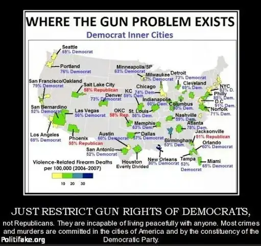
First, the American firearm-deathrate according to this table is 10.1 per 100,000 people, but the yellow swatches in the Infographic are, according to the legend, areas that have less than that rate. Conversely, the entire states of Lousiana, Alabama, Mississippi, Wyoming, Montana... well, actually, 30 entire states ... should be colored in green (indicating above-average deathrates). Alaska, which has a statewide deathrate of 20.4 per 100,000, should be in pale blue.

The infographic may still be true, since it may be that the areas in the infographic are very violent places in an otherwise tranquil sea of peace and love, but the lowest-deathrate states (including the NY/NJ/CT tristate area and Massachusetts, despite the graphics highlighting them) are considered liberal / Democratic. So it doesn't seem all Democrats "are incapable of living peacefully with anyone".

Perhaps the creator of the Infographic was trying to create an argument, not so much about political affiliation, but some other characteristic. I wonder what characteristic a person spewing agitprop about "Democrat inner cities" could mean?

John Lyon
  • 12,791
  • 3
  • 68
  • 70
Larry OBrien
  • 15,105
  • 2
  • 70
  • 97
  • 3
    There is an important difference between death rate and murder/crime rates – atk Sep 30 '14 at 17:20
  • @atk Yes. And a distinction to be made between murder / crime rates and those involving guns. It seems to me such distinctions are better suited to more precisely-stated claims. – Larry OBrien Sep 30 '14 at 17:46
  • The data in the image is gun deaths related to violent crimes (e.g. primarily murder) whereas the link you provided is to *all* gun deaths, many (most?) of which are suicides or accidents. This answer is just wrong. – reirab Oct 01 '14 at 15:27
  • 1
    If you actually compare the inner-city murder statistics to the rest of the states, the graphic is actually quite right that murder rates tend to be much higher in the inner cities. TN, GA, IL, and LA are all good examples of this. Exclude Memphis and Nashville from TN, Chicago from IL, Atlanta from GA, and N.O. from LA and their respective murder rates per capita plummet. And, yes, each of those is a heavily blue district in an otherwise-red state. – reirab Oct 01 '14 at 15:30
  • 2
    @reirab The Infographic's largest letters refer to "the gun problem" -- not anything more specific. Accidents and suicide are, to gun control advocates, very much part of the issue. The topic sentence indicts "Democrats" -- not anything more specific. If you want to create a new claim that inner cities are violent places, I'm confident the statistics would bear you out. – Larry OBrien Oct 01 '14 at 17:19
  • @LarryOBrien The key in the image says "violence-related firearm deaths." Thus, it's not including suicide or accidents. Thus, comparing the numbers given there directly to total firearm death statistics (as you did in your answer) is invalid, regardless of what you consider 'the gun problem' to be. – reirab Oct 01 '14 at 17:50
  • @reirab I'm taking the Infographic on face value. I'm responding to what it says. – Larry OBrien Oct 01 '14 at 18:00
  • 2
    @LarryOBrien No, you aren't. It says "violence-related firearm deaths", not "all firearms deaths." You directly compared it to statistics which were *all* firearm deaths, which is indisputably incorrect. – reirab Oct 01 '14 at 18:15