There is some confusion about the question, so I'll try to answer
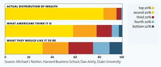
I am slightly skeptical that this is a good measurement of a skewed wealth distribution. In particular, the "what they would like it to be" almost looks paradoxical -- how can the third 20% own the same amount of wealth as the second 20% when by definition the second group earns more income?
Or in other words, Are wealth distribution graphs a good measure for wealth distribution inequality?
Yes, they are wealth distribution graphs, show exactly what you want to look at when you talk about wealth distribution. If you want to know how much wealth does the X percent have, look at the graph. The graph also shows the "ideal" wealth distribution, which is taken from a peer reviewed article:
http://pps.sagepub.com/content/6/1/9.short
The graphs doesn't show that the bottom and second bottom 20% percentiles have the same amount of wealth, but very close amounts of wealth, where the second bottom has slightly more the the bottom.
Beware, Here starts the ranty part of the answer.
With all due respect to wealth inequality, it doesn't give a good picture of a person's status, because it doesn't translate the wealth into commodities or services. People don't need money to live, they need food, shelter, education, medical care, safety and so on. Wealth inequality however doesn't tell us if the people in the bottom have those things or not. For example, Uganda's wealth is more evenly distributed that the USA's, but where are the people of the lowest percentiles better off, in Uganda or the USA?
You can see in the Wikipedia article on income inequality (which is sourced well, and organizes everything in a nice table with several different criterion to choose from) that countries like Ukraine, Belarus, Albania and Afghanistan all have more equal wealth distribution than the USA. The question that should be asked is where are people better off, not where are people more equal.
Wealth distribution doesn't tell us if the poorest have food, shelter, medical care etc. and can't really tell us anything about the quality of life of the people.
In other words, if the poorest people have food, housing, education medical care and opportunities in life, why should anyone care the the richest people are pooping in golden toilets?