2

I've recently set up Nagios for a client and have been wondering about some of the graphs we get out of NagioGrapher.

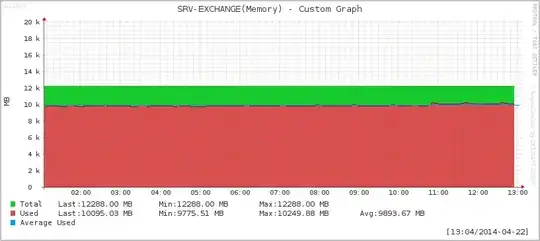
For example, all systems use the same graph configuration for their physical memory "service". Yet, some looks like this:

enter image description here

Others look like this. Which would be closer to the desired outcome. enter image description here

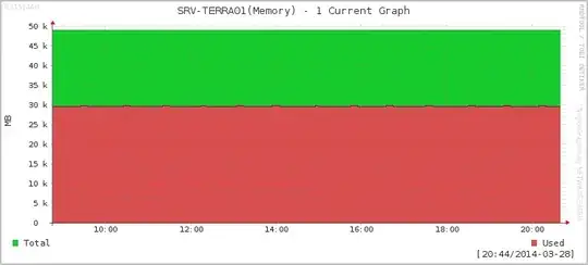
Why does the graph for SRV-EXCHANGE have free space between the 12k and 20k line and the graph for SRV-TERRA01 has the upper limit at the top of the graph? One might assume that there are simply values in that range, which cause the graph to be drawn like that, but the legend shows that the recorded max values are well within the expected range.

I've already set graph_lower_limit 1 in the NagiosGrapher configuration to set the lower bound at 0. From what I understand, you can also set a fixed upper limit for rrdtool through the graph_upper_limit directive. But that would set a fixed value as the upper limit as far as I understand it. But I don't really understand why there are these differences in the first place.

Oliver Salzburg
  • 4,635
  • 17
  • 55
  • 82

3 Answers3

3

Rrdtool graph has some "smarts" about the Y axis to prevent the labels all turning into weird numbers with odd decimals. So it prefers to go up to 2, 5, 10, 20, 50, etc. The docs describe this as "normally the scale is selected from a predefined set of ranges". The upper graph has a max around 12k so that gets rounded up to 20k. There is an option to rrdgraph called --alt-autoscale (and also --alt-autoscale-min and --alt-autoscale-max) which tend to produce tighter graphs, which I generally prefer. See http://oss.oetiker.ch/rrdtool/doc/rrdgraph.en.html for more details.

TvE
  • 131
  • 3
3

RRDTool Automatically selects values by default that would allow multiple graphs that use similar data to look similar to each other. As mentioned in another answer (by TvE), these fall in the 1,2,5 range of values and each of those x10^n (0.1, 0.2, 0.5 / 10, 20, 50 / 100, 200, 500 / 1k, 2k, 5k / etc).

You can alter this behaviour by using --alt-autoscale which will set the minimum and maximum values of the graph based on the data, rather than the presets mentioned above.

You can also set this manually with --upper-limit 'n' and --lower-limit 'n' (where 'n' is a value) along with --rigid. This will make the graph stick to what you set it; ignoring the values of the saved data. This will obviously display neither the values above --upper-limit, nor below --lower-limit.

Note: When using --logarithmic, the --lower-limit value cannot be 0.

Jim
  • 131
  • 2
1

Most likely what's happening is you have (an anomalous) spike in your rrd file but graph's resolution is not granular enough to display it. Consider using some tool to scan your file and remove such spikes.

Mxx
  • 2,362
  • 2
  • 28
  • 40
  • You think the total memory in the machine spiked above the installed amount? – Oliver Salzburg Mar 29 '14 at 12:22
  • @OliverSalzburg I'm not an expert on rrd but from my little understanding it all depends on the way rrd files are setup and the way pollers work. It's something along the lines if one value is 0/null/empty and the next one is normal, it can somehow spike to ridiculous numbers. – Mxx Mar 29 '14 at 16:56