3

Are there any interesting diagrammatic recipe notations out there?

I have found Nassi-Shneiderman diagrams:

Nassi–Shneiderman

used here at Cooking for Engineers.

An activity diagram from here:

Activity Diag

Is there anything interesting in use by anyone?

I mean 'interesting' in two senses

  1. The diagram conveys the structure of the recipe. The user should be able to browse through a recipe book and get an impression what is being done. Similar recipes should have similar diagrams or parts

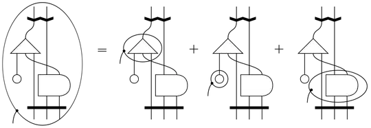
  2. The diagram uses some fancy mathematical notation that in some way reflects some properties of the recipe (that's why I show the Penrose diagram).

Penrose notation

Penrose

Actually I like neither of the two diagrams. The Nassi-Shneiderman is more of a nice tabular form than a diagram, and the activity diagram does not show much of the structure of the recipe. For example it does not convey any idea of time, and if you could not read the text, you had no idea what the recipe is about. The sub-recipes (like making the dough) are not very visible, either.

Glorfindel
  • 768
  • 1
  • 9
  • 22
Dan
  • 41
  • 4
  • 2
    This might answer your question? http://cooking.stackexchange.com/questions/14912/new-takes-on-recipe-format?rq=1 – Cascabel Aug 29 '13 at 05:07
  • This is an interesting question, I think, but the word "interesting" makes it too subjective. What would make a recipe diagramatic notation *interesting* to you? – Flimzy Aug 29 '13 at 05:08
  • @Flimzy The activity diagram isn't actually meant to usefully convey a recipe - that example is from an AI textbook, it appears. And Penrose notation has a specific mathematical meaning; once you turn it into a recipe it's just going to be a flowchart ("activity diagram", sorry) with fancy symbols. So given the examples, it seems like "interesting" means chosen for the sake of the diagram, not for the sake of usefully conveying a recipe... – Cascabel Aug 29 '13 at 05:12
  • I mean 'interesting' in two senses a) the diagram conveys the structure of the recipe. The user should be able to browse through a recipe book and get an impression what is being done. Similar recipes should have similar diagrams or parts b) the diagram uses some fancy mathematical notation that in some way reflects some properties of the recipe (that's why I took the Penrose diagram). I don't like the two examples that I showed, they don't convey much extra information beyond a textual recipe. – Dan Aug 29 '13 at 06:03
  • You might consider editing your question, then, to include what you said in that comment, and perhaps omit the examples, if you don't think they're actually examples of what you want. – Cascabel Aug 29 '13 at 06:17
  • Some baking formulas with multiple steps might fall qualify? – SourDoh Aug 29 '13 at 18:29
  • I'm not at all sure there's a question in there. – Marti Aug 31 '13 at 03:16

2 Answers2

3

Sometimes, when planning a new kitchen, you'd want a motion diagram. With bigger (restaurant/hotel) kitchens, we might pick some of the more complex recipes, and map how the staff would go about making them.

It's basically a diagram of the kitchen with who needs to go where and how often, derived from the recipe. Note that where maps clearly to what the person is doing at the time, so it goes "get stuff from fridge, go to mixing machine, use counter space (to lay out dough), move to ovens etc.

You could add diagrammatic notation for the activity fairly easily, but probably not for the foods themselves. If you do decide to draw up that many diagrammatic icons for foods and cooking activities, let me know and I'll happily use them.

Carmi
  • 10,949
  • 6
  • 36
  • 63
2

It's not exactly a diagram, but it does convey the structure of the recipe and use 'fancy' (baker's) math... This is the formatting guide for formulas used by the Bread Baker's Guild of America. It includes a section for the total recipe, and each step of the recipe has a subsection.

BBGA Formatting Guideline

SourDoh
  • 11,418
  • 1
  • 30
  • 46