0

I am trying to add a simple horizontal line to each bar in a barplot using geom_col() in ggplot2. The horizontal line will represent the mean of the y-axis, and it will be different for each bar.

For example, using the iris dataset:

library(ggplot2)

data(iris)

iris %>%
ggplot(aes(x=Species, y=Sepal.Length, fill=Species) +
geom_col(width=0.5) +
theme_classic()

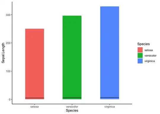
This generate a plot like this:

enter image description here

I know that I can add a horizontal line using geom_hline() but is there a way to do it so that the horizontal line represents the mean for each species bar?

Thank you so much for any help you are able to provide!

stefan
  • 90,330
  • 6
  • 25
  • 51

1 Answers1

0

To draw a line on top your bars I would suggest to have a look at geom_segment instead of geom_hline. To get the mean value per bar the one option would be to create an aggregated data frame or if you want to do that on the fly then you could do so using stat_summary. In either case the "tricky" part is to get the start and end positions for the segments which requires to convert the categorical variable mapped on x into a numeric, then subtract/add the half of the bar width:

Note: At least for the example data I'm not sure whether the plot makes that much sense as the bars show the sum of values and as a consequence the differences in the mean are hardly visible.

library(ggplot2)

width <- .5

ggplot(iris, aes(x = Species, y = Sepal.Length, fill = Species)) +
  geom_col(width = width) +
  stat_summary(
    fun = "mean", geom = "segment",
    aes(
      x = as.numeric(factor(Species)) - width / 2,
      xend = as.numeric(factor(Species)) + width / 2,
      yend = after_stat(y),
      group = Species
    ),
    color = "black"
  ) +
  theme_classic()

stefan
  • 90,330
  • 6
  • 25
  • 51
  • Hi! Thank you SO much for your help. Yes, I didn't realize that the y-axis is the sum of all the Sepal.lengths. How would you do it using geom_bar() instead, with position = "dodge" ? – Kansas Keeton Aug 18 '23 at 15:31
  • For a `geom_bar` it's basically the same. Replace `geom_col` by `geom_bar` and move `y = Sepal.Length` to `stat_summary`. However, that will make things even worse as we now show both a count and mean on the y-axis both of which are measured in different units. `position_dodge` is even more tricky. First, IMHO dodging only makes sense if you add a third variable. And unfortunately dodging does not work well with lines or segments. This would require some additional calculations to do the dodging manually. And in that case I would do the calculations outside of `ggplot()`. – stefan Aug 18 '23 at 15:41