0

I have 4 plots which I have merged/wrapped into 2x2 plots using facet_wrap(). But I am unable to fix the labels of the plots. Here are my codings.

labelp = c('0.6' = expression(paste(phi, ""[0], " = 0.60")),
           '0.7' = expression(paste(phi, ""[0], " = 0.70")),
           '0.8' = expression(paste(phi, ""[0], " = 0.80")),
           '0.9' = expression(paste(phi, ""[0], " = 0.90")))

ggplot(data,aes("x" = N, "y" = alpha))+
  geom_ribbon(aes(ymin = low, ymax = upp), fill = "grey")+
  geom_point()+
  facet_wrap(~p, nrow = 2, labeller = as_labeller(labelp))+
  labs("y" = "Type I error rates")

My figure is given below: Figure 1

I would like to change label for each plots. Meaning, instead of $0.6$, I want $\phi_0 = 0.60$ and so on. How should I edit my labeller for facet_wrap()?

I read about label_parsed so I have tried using that. Here is my code.

labelp = as_labeller(c('0.6' = "Phi[0] = 0.60", '0.7' = "Phi[0] = 0.70",
                       '0.8' = "Phi[0] = 0.80",'0.9' = "Phi[0] = 0.90"),
                          default = label_parsed)

ggplot(data,aes("x" = N, "y" = alpha))+
  geom_ribbon(aes(ymin = low, ymax = upp), fill = "lightblue")+
  geom_point()+
  geom_hline(yintercept = 0.05, linetype = "dashed")+
  facet_wrap(~p, nrow = 2, labeller = labelp)+
  labs("y" = "Type I error rates")

This codes resulted in this figure: Figure 2
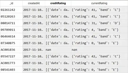
Both are not what I want. Any clues how to fix this?
RRMT
  • 137
  • 5

1 Answers1

1

First I created some fake data. You could use the function glue to create these labels. With {} you assign the greek symbols to each value of your specific column in this case "p". You can use the following code:

data <- data.frame(N = runif(20, 200, 600),
                   alpha = runif(20, 0.03, 0.06),
                   low = runif(20, 0.03, 0.04),
                   upp = runif(20, 0.04, 0.05),
                   p = rep(c(0.6, 0.7, 0.8, 0.9), 5))

library(ggplot2)
library(glue)

ggplot(data,aes("x" = N, "y" = alpha))+
  geom_ribbon(aes(ymin = low, ymax = upp), fill = "lightblue")+
  geom_point()+
  geom_hline(yintercept = 0.05, linetype = "dashed")+
  facet_wrap(~glue('Phi[0]*" = {p}"'), nrow = 2, labeller = label_parsed)+
  labs("y" = "Type I error rates")

Created on 2022-08-25 with reprex v2.0.2

Quinten
  • 35,235
  • 5
  • 20
  • 53
  • 1
    Thank you very much, @Quinten. I managed to get exactly what I wanted. – RRMT Aug 25 '22 at 09:01
  • I did another figure similar to this, and the values for $\alpha = 0.02, 0.04, 0.06, 0.08, 0.10, 0.12$. However, the 0.10 is shown as 0.1. Same like the codes for figure above. The above one does not matter because all have one decimal place. But this new one has 5 two decimal places, 1 one decimal place. The plot shows all 5 with two decimal places, but the 0.10 is shown as 0.1. Any idea to tweak the codes? – RRMT Aug 25 '22 at 09:35
  • Hi @RRMT, This seems not very easy, but maybe this [links](https://github.com/tidyverse/glue/pull/55) helps you. Otherwise, I would advise you to create a new question for adding decimals like what you mentioned. – Quinten Aug 25 '22 at 09:40