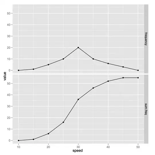
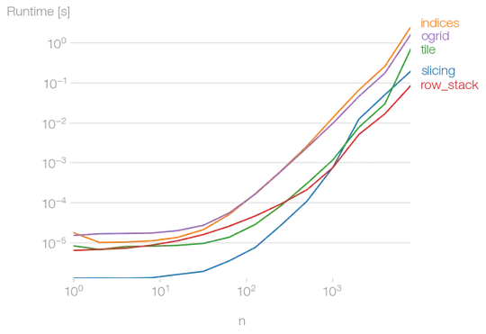
I am using python version of ggplot with the following code and have the image attached but the colors are not enough for coloring all the categories. I am wondering what the ways are to get a palettes with more colors but still retain the relation that lower number has a lighter color while higher number gets a darker one.
pretty = p9.ggplot(data=s2_test3, mapping = p9.aes(x='index', y='value', colour = "equity_as_number"))+ p9.geom_point(alpha = 0.02)
pretty = pretty + p9.facet_grid("gender~outcome")
pretty + p9.geom_smooth(method = 'loess') + p9.scale_color_brewer(type ='seq')


