0

I didn't know what stack exchange site to put this on, so I put it here. I am trying to determine if there is a correlation between the size of a school and the major that the school specializes in.

In order to do this, I programatically collected and analyzed data. In order to make my report, I need to make a few graphs in excel, but I have no clue how to do this.

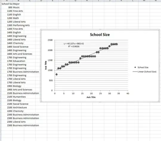
What I'm looking for is a scatter plot, with quantitative values on the Y-Axis (the school size) and qualitative values on the X-Axis, I would like there to be every major listed out (kinda like a bar graph). From there, I want to plot a point above the major that a school specializes in; and have that point be as high as its student size.

Any help?

Edit:

Here is my sample data set. I want it to have categories that are to the right of the data, and points on the graph that correspond. enter image description here

Brendan Lesniak
  • 2,271
  • 4
  • 24
  • 48
  • It would be better to post/move this to http://stats.stackexchange.com/ - I don't think what you've done so far works; all you've done is sorted the school size in ascending order and plotted. It's a bit like numbering the alphabet 1-26 and plotting number vs position in the alphabet. Perhaps a [Boxplot](http://en.wikipedia.org/wiki/Boxplot) is a better way of presenting the size of your categories? –  May 08 '11 at 17:21
  • Well I made an adjacent text file in my project that gives the ordering of majors, and I just assigned each a number 1-NumOfMajors, then just put that number in for the majors – Brendan Lesniak May 08 '11 at 17:30
  • Also, did not know about stats.stackexchange.com – Brendan Lesniak May 08 '11 at 17:30

1 Answers1

1

When you say "correlation" between X and Y, I think regression.

I would recommend doing an X-Y scatter plot and asking Excel to add a trend line. Not only will you get a least squares fit for the "best" line for your data, you'll get the correlation coefficient that tells you whether or not there's a relationship. The correlation coefficient ranges from -1 to +1; the closer your correlation coefficient is to 1.0, the better the relationship.

duffymo
  • 305,152
  • 44
  • 369
  • 561
  • That was what I was planning on doing, but then wouldn't the ordering of the majors determine the regression of the line (I am comparing a quantitative element to a qualitative element). Essentially, I'm creating a frequency plot. – Brendan Lesniak May 08 '11 at 15:09
  • It's a function of y versus x. Of course x has to be ordered so it's monotonically increasing. Looks like very good correlation to me. – duffymo May 08 '11 at 16:16
  • But all that graph is doing is plotting (Row #, size of school). I'm trying to categorize each data point into one of the groups on the right. There are multiple groups, some repated. If they are repeated each item gets the same x - axis but the y is dependent on the size of the school – Brendan Lesniak May 08 '11 at 16:30