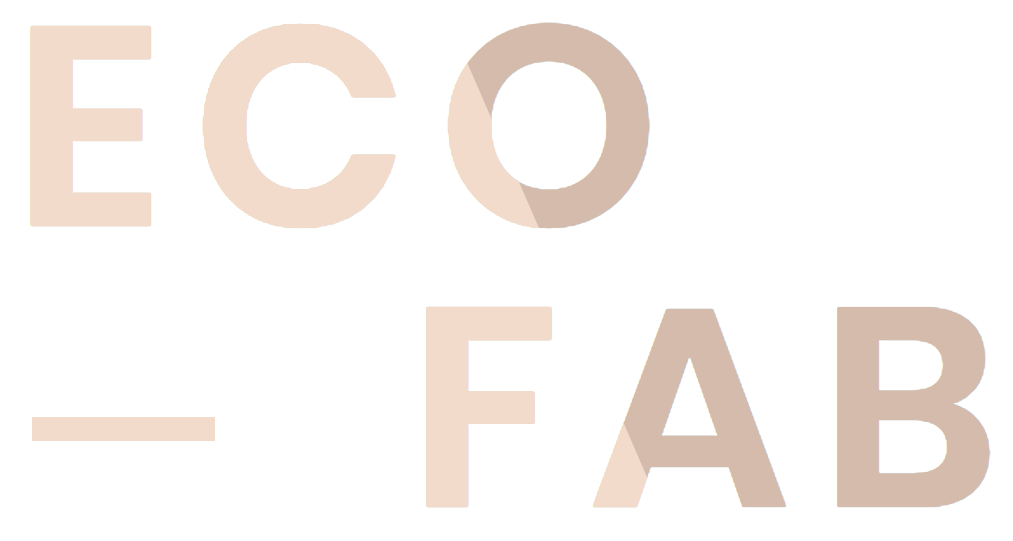
 I wanted to recreate the text colour overlay clip-path effect from this site http://fleurmoreau.fr/
I made a version here https://codepen.io/Kerrys7777/pen/eYOrwbV. It seems to work OK, but hovering some areas seems to cause a bubbling effect? What can I change to make it smooth and functional?
I was following the tutorial https://www.youtube.com/watch?v=l_ahowxmqzg but using pure JavaScript.

I think the 'mouseout' function/method is causing this (bubbling) issue?
<!DOCTYPE html>
<html lang="en">
<head>
    <meta charset="UTF-8">
    <meta name="viewport" content="width=device-width, initial-scale=1.0">
    <meta http-equiv="X-UA-Compatible" content="ie=edge">
    <title>Document</title>
    <link rel="stylesheet" href="css/normalize.css" type="text/css" media="all">

<style>
@import url('https://fonts.googleapis.com/css?family=Cormorant+Garamond:300,700|Titillium+Web:200,400,400i,700&display=swap');

:root {
    --maskX: 0;
    --maskY: 50;
}


*,*:before,*:after {
    box-sizing: border-box;
}

body {
    font-family: 'Titillium Web', sans-serif;
    font-size: 18px;
    line-height: 1.4;
    color: #161B1E;
}

h1,
h2,
h3,
h4
{
    font-family: 'Cormorant Garamond', serif;
    margin: 0;
}

h1 {
    font-size: 15vw;
}

#titleContainer {
    position: relative;
    margin: 100px 0 0 50px;
    display: inline-block;
}

p {
    margin-left: 80px;
    font-size: 1em;
}


.titleWrapper {
    cursor: pointer;
    color: #D4BBAB;
    padding: 30px;
    /*--maskX: 0;
    --maskY: 50;*/
}

.cloneWrapper {
    position: absolute;
    top: 0;
    left: 0;
    color:#f2dcca;
    /*clip-path: polygon(0 0, calc(var(--maskX) * 1%) 0, calc(var(--maskY) * 1%) 100%, 0% 100%);*/
    transition: all 0.8s cubic-bezier(0.165,0.84,0.44,1);
    clip-path: polygon(0 0,calc(var(--maskX) * 1% + (var(--maskY) - 50) * .4%) 0,calc(var(--maskX) * 1% + (var(--maskY) - 50) * -.4%) 100%,0 100%)
}

</style>

</head>
<body>
    <section id="titleContainer">
        <div class="titleWrapper">
            <h1>Text Effect</h1>
        </div>
        <div class="titleWrapper cloneWrapper">
            <h1>Text Effect</h1>
        </div>
    </section>

<p>Mouse over the rectangle above, and get the coordinates of your mouse pointer.</p>

<p id="demo"></p>

<script>

//GET MOUSE POSITION RELATIVE TO THIS ELEMENT
var titleContainerBox = document.getElementById("titleContainer");

//ADD EVENT (MOUSEMOVE) LISTENER
titleContainerBox.addEventListener("mousemove", function(event) {
    mousePosMove(event);
});

//ADD EVENT (RESIZE) LISTENER
titleContainerBox.addEventListener("resize", function(event) {
    mousePosMove(event);
});

/*['mousemove','resize'].forEach( evt =>
    titleContainerBox.addEventListener(evt, mousePosMove(event), false)
);*/


function mousePosMove(e) {

    //GET CONTAINER DIMENSIONS
    var rect = titleContainerBox.getBoundingClientRect();
    var width = titleContainerBox.clientWidth;
    var height = titleContainerBox.clientHeight;

    //MOUSE POSITION PX INSIDE titleContainer
    var x = e.clientX - rect.left;
    var y = e.clientY - rect.top;

    //MOUSE POSITION PERCENTAGE INSIDE titleContainer
    var oX = Math.floor((x/width) * 100);
    var oY = Math.floor((y/height) * 100);

    //UPDATE CSS VARIABLES
    titleContainerBox.style.setProperty('--maskX', oX);
    titleContainerBox.style.setProperty('--maskY', oY);

    //SHOW INFO IN PAGE
    var mouseCoordinates = "Coordinates: (" + x + ", " + y + ")" + "<br>" + " Dimensions: (" + width + ", " + height + ")" + "<br>" + " Percentage relative position: (" + oX + ", " + oY + ")";
    document.getElementById("demo").innerHTML = mouseCoordinates;
}


//ADD EVENT (MOUSEOUT) LISTENER TO REMOVE EFFECT
titleContainerBox.addEventListener("mouseout", function(event) {
    mousePosOut(event);
});

function mousePosOut(e) {
    //SET CSS VARIABLES TO ZERO (REMOVE EFFECT)
    setTimeout(function() {
        titleContainerBox.style.setProperty('--maskX', 0); //-16 VALUE TO CORRECT CORNER ISSUE
        titleContainerBox.style.setProperty('--maskY', 0);
    }, 1000);
}

</script>

</body>
</html>
BTW where has the live example code setup window gone here at SO?