I am trying to color clusters in a scatter plot and I managed with two different methods.
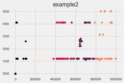
In the first I plot iteratively each cluster, in the second I plot all the data at once and colour the clusters according to their labels [0, 1, 2, 3 ,4].
I am happy with the result I get in example1 and example3 but I don't understand why the coloring changes so dramatically when coloring the clusters according to the labels instead of iteratively plotting each cluster.
Additionally, why the second cluster (despite having always label "1") has a different color in example1 and example3?
import matplotlib.pyplot as plt
plt.style.use('fivethirtyeight') #irrelevant here, but coherent with the examples=)

fig, ax = plt.subplots(figsize=(6,4))
for clust in range(kmeans.n_clusters):
    ax.scatter(X[kmeans.labels_==clust],Y[kmeans.labels_==clust])
    ax.set_title("example1")`
and
plt.figure(figsize = (6, 4))
plt.scatter(X,Y,c=kmeans.labels_.astype(float))
plt.title("example2")
(I know I can explicitly define a colormap for the second method but I couldn't find any that reproduces the results in example 1)
Here is a minimal working example
import matplotlib.pyplot as plt
import pandas as pd
plt.style.use('fivethirtyeight') #irrelevant here, but coherent with the examples=)
X=pd.Series([1, 2, 3, 4, 5, 11, 12, 13, 14, 15])
Y=pd.Series([1,1,1,1,1,2,2,2,2,2])
clusters=pd.Series([0,0,0,0,0,1,1,1,1,1])


fig, ax = plt.subplots(figsize=(6,4))
for clust in range(2):
ax.scatter(X[clusters==clust],Y[clusters==clust])
ax.set_title("example3")
plt.figure(figsize = (6, 4))
plt.scatter(X,Y, c=clusters)
plt.title("example4")


