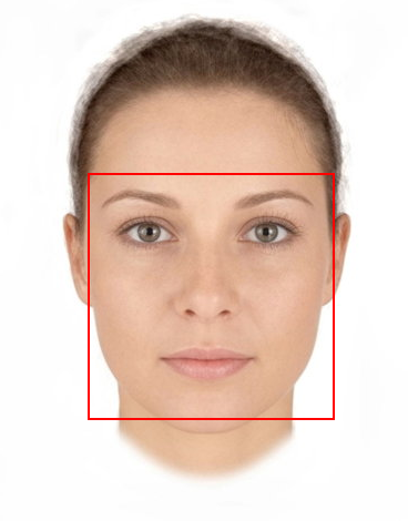
I'm working on a face recognition webapp, but I'm encountering some problems trying to "fix" the bounding box on the image making it responsive. If the screen is in full size that's the (correct) result:
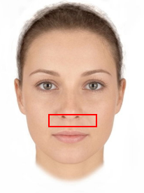
But as soon as I try to resize the window browser, making it smaller, the box lose its position like this:
.image-container {
  position: relative;
  display: inline-block;
  img {
    display: block;
    max-width: 100%;
    height: auto;
    margin-left: auto;
    margin-right: auto;
  }
}

.box {
  display: flex;
  flex-wrap: wrap;
  justify-content: center;
  position: absolute;
  border: 2px solid red;
}
      <div>
        {this.setRecognitionType()}
        <div className={styles["image-container"]}>
          {this.state.box ? (
            <div
              className={styles.box}
              style={{
                top: this.state.box.top,
                right: this.state.box.right,
                bottom: this.state.box.bottom,
                left: this.state.box.left
              }}
            />
          ) : null}
          <img id="image" src={this.props.imageUrl} alt="" />
        </div>
      </div>
EDIT Box's proptery in this case:
top: 192px;

right: 85px;

bottom: 118px;

left: 92px;
EDIT: SOLUTION As already answered, the only way seems to be using percentage instead of px.
The way I sorted out:
left: (coords.left / imageWidth) * 100,
top: (coords.top / imageHeight) * 100,
right: ((width - coords.right) / imageWidth) * 100,
bottom: ((height - coords.bottom) / imageHeight) * 100
"imageHeight" and "imageWidth" are the original picture's sizes and coords are the coordinates in pixels.