I have data about a thing which periodically happens, and it either succeeds or fails.
I would like to visualise this in a bar, so for example it may pass at 11am, then fail at 2pm, then pass again at 3pm. I'd like this in a single horizontal bar, with red for failing and green for passing... I cannot think quite where to start with this!
So far I've got this but it really just isn't at all close:
tm1 <- as.POSIXct("2018-03-24 11:00:00")
tm2 <- as.POSIXct("2018-03-24 14:00:00")
tm3 <- as.POSIXct("2018-03-24 15:00:00")

testData <- data.frame(
  time = c(tm1, tm2, tm3),
  status = c("pass", "fail", "pass"),
  thing = c("a", "a", "a"),
  timeSinceLast = c(0, tm2-tm1, tm3-tm2)
  )

ggplot(testData, aes(x = timeSinceLast, y = thing, fill=status)) + geom_bar(stat = "identity")
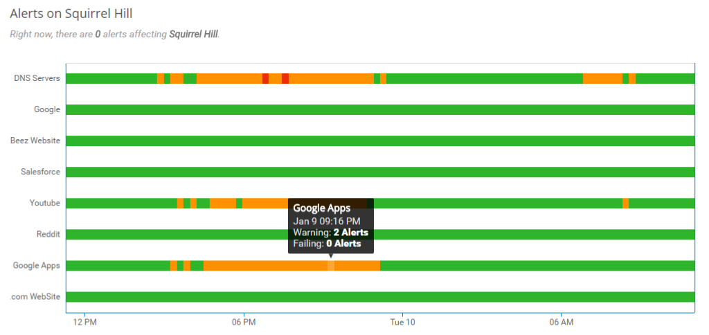
And I'd like it to look a bit like this, but with only red and green and only one row: https://netbeez.net/wp-content/uploads/2017/01/pub_dash_screenshot_alert_lane_graph.png
