I'm using Twitter Bootstrap 3 with jQuery Validate plugin, but for some reason when the validation error message pops up it STRETCHES my Input Group-Addon box and the icon.
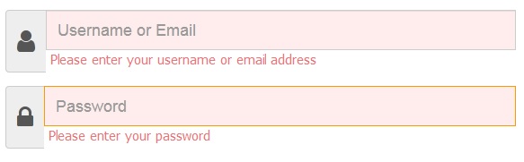
NORMAL [NO VALIDATION]

WITH VALIDATION
Here's my Fiddle in case you want to solve the problem: My Fiddle
I've tried multiple solutions on the web such as
GitHub Issue of Input Addon and Input Addon issue on Stack Overflow
But I can't seem to fix the problem, no matter what I try.
Please let me know what do I have to do to prevent the INPUT GROUP-ADDON from stretching when the validation errors appear. Thank you!
My main code is provided below:
jQuery
$('.login-form').validate ({
        // validation rules for registration form
    errorClass: "error-class",
    validClass: "valid-class",
    onError : function(){
        $('.input-group.error-class').find('.help-block.form-error').each(function() {
          $(this).closest('.form-group').addClass('error-class').append($(this));
        });
    },

        rules: {
            username: {
                required: true,
                minlength: 3,
                maxlength: 40
            },

          password: {
                required: true,
                minlength: 7,
                maxlength: 20
            }
            },

        messages: {
            username: {
                required: "Please enter your username or email address",
                minlength: "Usernames can't be shorter than three characters",
                maxlength: "Usernames or emails must be shorter than forty characters."
            },
                       password: {
                required: "Please enter your password",
                minlength: "Passwords can't be shorter than seven characters",
                maxlength: "Passwords must be shorter than forty characters."
            },

                highlight: function(element, errorClass) {
        $(element).removeClass(errorClass);
    }
        },

  submitHandler: function() {
            $('#noenter').show();

        }
    });
HTML
<!-- Modal -->
<div class="modal fade" id="myModal" tabindex="-1" role="dialog" aria-labelledby="myModalLabel">
<form class="login-form" action="login" method="post" action="../PHP/ValidateForm.php">
<div class="modal-dialog" role="document">
<div class="modal-content">
<div class="modal-header">
<button type="button" class="close" data-dismiss="modal" aria-label="Close"><span aria-hidden="true">×</span></button>
<h4 class="modal-title" style="color:red;" id="myModalLabel">TITLE</h4>
</div>
<div class="modal-body">
<!-- Text input-->
<div class="form-group">
<div class="input-group">
<span class="input-group-addon"><i class="fa fa-2x fa-user"></i></span>
<input required id="username" name="username" placeholder="Username or Email" class="inputfield form-control" type="text">
</div>
</div>
<!-- Text input-->
<div class="form-group">
<div class="input-group">
<span class="input-group-addon"><i class="fa fa-2x fa-lock"></i></span>
<input required id="password" name="password" placeholder="Password" class="form-control" type="password">
</div>
</div>
<div class="error">
</div>
<input title="Log In" name="submit" value="Log In" type="submit" class="loginbtn btn btn-lg btn-block">
</div>
<p class="text-muted"><strong>Need an account? <a href="#">Join </a></strong>
</p>
</div>
</div>
</form>
</div>
CSS
.form-control {
  color: #000 !important;
}

form label.error-class {
  font: 15px Tahoma, sans-serif;
  color: #ED7476;
  margin-left: 5px;
  position: relative;
}

form input.error-class,
form input.error-class:hover,
form input.error:focus,
form select.error-class,
form textarea.error-class {
  background: #FFEDED;
}

.error-class {
  color: red;
  z-index: 0;
  position: relative;
  display: inline-block;
}

.valid-class {
  color: black;
}
