6

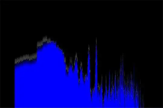
So, I've been working on a little visualizer for sound files, just for fun. I basically wanted to imitate the "Scope" and "Ocean Mist" visualizers in Windows Media Player. Scope was easy enough, but I'm having problems with Ocean Mist. I'm pretty sure that it is some kind of frequency spectrum, but when I do an FFT on my waveform data, I'm not getting the data that corresponds to what Ocean Mist displays. The spectrum actually looks correct, so I knew there was nothing wrong with the FFT. I'm assuming that the visualizer runs the spectrum through some kind of filter, but I have no idea what it might be. Any ideas?

EDIT2: I posted an edited version of my code here (editor's note: link doesn't work anymore). By edited, I mean that I removed all the experimental comments everywhere, and left only the active code. I also added some descriptive comments. The visualizer now looks like this.

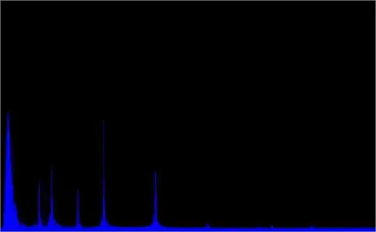
EDIT: Here are images. The first is my visualizer, and the second is Ocean Mist.
my visualizer

ocean mist

Glorfindel
  • 21,988
  • 13
  • 81
  • 109
Bevin
  • 952
  • 6
  • 19
  • 35
  • It might help if you posted a link to a screenshot of what you're trying to achieve (e.g., an example of the ocean mist visualization) for the lazy\non WMP users. – davidtbernal Mar 17 '10 at 21:58
  • @Bevin - I made some changes to your code. THEY ARE UNTESTED so I can't guarantee syntax, but I hope the spirit of them make sense. I'm about to head out for a while, but will check for updates later. Also, it would be helpful if you could post the documentation for the FFT you're using. – mtrw Mar 18 '10 at 19:20
  • Well, you should have copied the link in the address bar after saving, because pastebin doesn't actually change the existing code, it makes a new "pad". I can wait :) – Bevin Mar 18 '10 at 19:45
  • Well, getting late for me. Anyway, here's the place where I got the FFT. It isn't as big as say, FFTW, but it seems to work. The original page can't be reached, so here is a Google cache page. http://74.125.77.132/search?hl=en&q=cache:http://www.librow.com/articles/article-10&sourceid=navclient-ff&rlz=1B3GGGL_enSE346SE347&ie=UTF-8 – Bevin Mar 18 '10 at 22:39
  • @Bevin - that was very silly of me, sorry. Anyway, I reconstructed the changes. See http://pastebin.com/8WgaaAMY. Make sure that when you pass a sine wave in, you get something like the green line in the loglog graph I posted earlier. Yours should be smoother due to no random noise, but the spike should be about the same width and at roughly the same horizontal place. – mtrw Mar 19 '10 at 01:36
  • I made the changes that you specified, and it turned out like this: http://i43.tinypic.com/25ahroz.jpg It seems quite noisy. The sine wave test worked just fine, it was a straight line in the same place as yours. – Bevin Mar 19 '10 at 13:09
  • Also, I suppose I should somehow create "fake" lines in between, to fill the gaps. – Bevin Mar 19 '10 at 13:12
  • Well, after a bit of tinkering, it looks like this: http://i44.tinypic.com/2jacft0.jpg I'm content. I tried using a e^output to enlarge the taller spikes, and it seems to be working. Just needs a bit of tweaking, and it should be great. Thanks! – Bevin Mar 19 '10 at 18:37
  • @Bevin - Glad it worked out. If you're doing e^output, that's essentially undoing the log in the calculation of the y-coordinate, so maybe just change that line to make y proportional to output. – mtrw Mar 19 '10 at 18:46
  • You sure? I thought e^ was the inverse of ln, not log. – Bevin Mar 19 '10 at 20:01
  • @Bevin - two things: 1. when you want to draw someone's attention to a comment, put @their username in your comment (see http://meta.stackoverflow.com/questions/1093/make-recent-activity-and-responses-show-new-comments-on-questions-answers-i-have/1210). 2. ln and log are proportional to each other. If 10^x = b, x = log(b). But you could also write ln(10^x) = ln(b) -> x*ln(10) = ln(b) -> x = ln(b)/ln(10). So, log(b) = ln(b)/ln(10). Since you're not displaying absolute numbers, this proportionality should be good enough for your purposes. – mtrw Mar 19 '10 at 21:32

4 Answers4

6

Here's some Octave code that shows what I think should happen. I hope the syntax is self-explanatory:

%# First generate some test data
%# make a time domain waveform of sin + low level noise
N = 1024;
x = sin(2*pi*200.5*((0:1:(N-1))')/N) + 0.01*randn(N,1);

%# Now do the processing the way the visualizer should
%# first apply Hann window = 0.5*(1+cos)
xw = x.*hann(N, 'periodic');
%# Calculate FFT.  Octave returns double sided spectrum
Sw = fft(xw);
%# Calculate the magnitude of the first half of the spectrum
Sw = abs(Sw(1:(1+N/2))); %# abs is sqrt(real^2 + imag^2)

%# For comparison, also calculate the unwindowed spectrum
Sx = fft(x)
Sx = abs(Sx(1:(1+N/2)));

subplot(2,1,1);
plot([Sx Sw]); %# linear axes, blue is unwindowed version
subplot(2,1,2);
loglog([Sx Sw]); %# both axes logarithmic

which results in the following graph: top: regular spectral plot, bottom: loglog spectral plot (blue is unwindowed) http://img710.imageshack.us/img710/3994/spectralplots.png

I'm letting Octave handle the scaling from linear to log x and y axes. Do you get something similar for a simple waveform like a sine wave?

OLD ANSWER

I'm not familiar with the visualizer you mention, but in general:

  • Spectra are often displayed using a log y-axis (or colormap for spectrograms).
  • Your FFT might be returning a double-sided spectrum, but you probably want to use only the first half (looks like you're doing already).
  • Applying a window function to your time data makes the spectral peaks narrower by reducing leakage (looks like you're doing this too).
  • You might need to divide by the transform blocksize if you're concerned with absolute magnitudes (I guess not important in your case).
  • It looks like the Ocean Mist visualizer is using a log x-axis too. It might also be smoothing adjacent frequency bins in sets or something.
mtrw
  • 34,200
  • 7
  • 63
  • 71
  • I assume you mean log y-axis there, or is there a distinction? How would I implement it? – Bevin Mar 17 '10 at 22:33
  • +1 for noting that both the x and y axis are logarithmic. The log-x aspect explains why the first narrow peak in the top plot is stretched to about 1/3 of the view in the lower plot. The log-y scaling explains why the variation between the peaks and the average values are compressed in the lower plot. – the_mandrill Mar 17 '10 at 23:00
  • @Bevin - Both axes are logarithmic. I usually use Octave (a Matlab clone) for graphing, so I have to confess I'm not that good at mapping data to pixels myself. If you have a plotting library, look for `loglog` plotting (see http://en.wikipedia.org/wiki/Logarithmic_scale#Log-log_plots). If you're doing it yourself, make the display height proportional to log(spectrum amplitude), as @Paul R suggested. Then make display width proportional to log(freq/FMin), where FMin is the lowest frequency you want to display. I suggest 20 Hz to start with, but a higher number might look better. – mtrw Mar 17 '10 at 23:52
  • @mtrw - Well, I (think I) implemented what you said, and it ended up like this: http://i41.tinypic.com/28jslj.jpg Not really what I expected. I might have screwed up though. – Bevin Mar 18 '10 at 17:38
  • @Bevin - that definitely doesn't look right. Give me a few minutes, I'll make some graphs of what I think should happen. – mtrw Mar 18 '10 at 17:50
  • Well, there's a clear difference between your graph and mine. Perhaps I can post my code and you can take a look? Not the FFT or anything, just the code that does the actual calculations and plotting. – Bevin Mar 18 '10 at 18:30
  • @Bevin, sure go ahead. I'm going to be off-line for a couple of hours, but if you don't mind the delay I'd be happy to take a look, or maybe someone else will spot the issue. – mtrw Mar 18 '10 at 18:50
  • Well, I posted it. The link is in the post at the top. – Bevin Mar 18 '10 at 19:04
3

Normally for this kind of thing you want to convert your FFT output to a power spectrum, usually with a log (dB) amplitude scale, e.g. for a given output bin:

p = 10.0 * log10 (re * re + im * im);

Paul R
  • 208,748
  • 37
  • 389
  • 560
  • Do I have to normalize this "p"? Like, dividing it by n/2 afterward? – Bevin Mar 17 '10 at 22:11
  • It's a dB value - you can add or subtract a suitable dB offset to get it into whatever range you want. You can then convert this dB value to screen coordinates or pixel intensity or whatever is appropriate for your visualizer. – Paul R Mar 17 '10 at 22:32
  • Well, I tried using your formula, and it came across as kind of noisy. Here, take a look: http://i39.tinypic.com/15eig3s.jpg – Bevin Mar 17 '10 at 22:40
  • In order to test your implementation you want to start with a simple signal with a known spectrum. Start with e.g. a single pure tone (sine wave) at say 1 kHz and see what that looks like - you should just get a single large peak. If not then you're doing something wrong with your FFT and/or plotting code. – Paul R Mar 17 '10 at 23:08
  • 1
    @Bevin - @Paul R's suggestion for taking the log of the squared amplitude is right on. Looking at your second picture, it looks like you need to add a window. Multiply your time domain data by a function of the form 0.5*(1 - cos(2*pi*n/N)), where N is your transform blocksize. See http://en.wikipedia.org/wiki/Window_function for background. – mtrw Mar 18 '10 at 00:33
1

It definitely looks like the ocean mist Y-Axis is logarithmic.

AShelly
  • 34,686
  • 15
  • 91
  • 152
  • So, how would I implement a Y-log scale? Use the log(absolute magnitude) as the y-value? – Bevin Mar 17 '10 at 22:21
1

It seems to that not only the y axis, but the x axis also is logarithmic. The distance between peaks seems to lower at higher frequencies.

Giuseppe Guerrini
  • 4,274
  • 17
  • 32