The simple answer
Maybe the Slider Widget provided by Flutter could achieve that nice behaviour you are wishing for.
With this widget you can
- define minimum value = -50
- define maximum value = 50
- set starting point at 0
- customize the color of the bar.
I wrote a simple yet complete sample for you that might provide you with a good starting point:
import 'package:flutter/material.dart';

void main() {
  runApp(const MyApp());
}

class MyApp extends StatelessWidget {
  const MyApp({super.key});

  @override
  Widget build(BuildContext context) {
    return MaterialApp(
      title: 'Flutter Demo',
      theme: ThemeData(
        primarySwatch: Colors.blue,
      ),
      home: const MyHomePage(title: 'Flutter Demo Home Page'),
    );
  }
}

class MyHomePage extends StatefulWidget {
  const MyHomePage({super.key, required this.title});

  final String title;

  @override
  State<MyHomePage> createState() => _MyHomePageState();
}

class _MyHomePageState extends State<MyHomePage> {
  void _restartSlider() {
    setState(() {
      _sliderValue=0;
    });
  }

  double _sliderValue = 0;

  @override
  Widget build(BuildContext context) {
    return Scaffold(
      appBar: AppBar(
        title: Text(widget.title),
      ),
      body: Center(
        child: Column(
          mainAxisAlignment: MainAxisAlignment.spaceEvenly,
          children: [
            Text("Slider value is: $_sliderValue",),
            Slider(
              value: _sliderValue,
              activeColor: Colors.red,
              inactiveColor: Colors.green,
              thumbColor: _sliderValue == 0 ? Colors.grey : _sliderValue > 0 ? Colors.green : Colors.red,
              min: -50, max: 50,
              divisions: 100,
              label: _sliderValue.toString(),
              onChanged: (double newValue) {
                setState(() {
                  _sliderValue = newValue;
                });
              },
            ),
          ],
        ),
      ),
      floatingActionButton: FloatingActionButton(
        onPressed: _restartSlider,
        tooltip: 'Restart',
        child: const Icon(Icons.restart_alt),
      ),
    );
  }
}
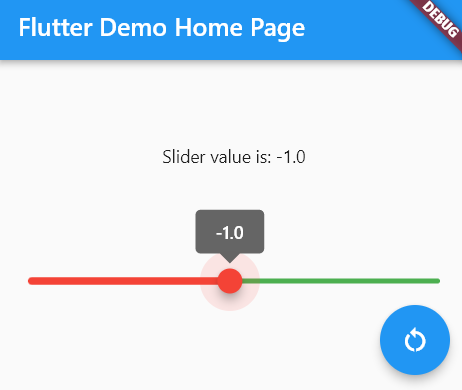
That code will create a slider "which starts from middle, and goes left (negative) and right (positive)". The result is like this (click the floating button to return the slider thumb to 0):

The elaborated answer
Using Stack widget you can draw a bar that looks exactly as what you showed in your pictures.
Basically you just need to set the Slider's bar color to transparent and draw a Container below that have the colors you want.
A complete, working example would be as follows:
import 'package:flutter/material.dart';

void main() {
  runApp(const MyApp());
}

class MyApp extends StatelessWidget {
  const MyApp({super.key});

  @override
  Widget build(BuildContext context) {
    return MaterialApp(
      title: 'Flutter Demo',
      theme: ThemeData(
        primarySwatch: Colors.blue,
      ),
      home: const MyHomePage(title: 'Flutter Demo Home Page'),
    );
  }
}

class MyHomePage extends StatefulWidget {
  const MyHomePage({super.key, required this.title});

  final String title;

  @override
  State<MyHomePage> createState() => _MyHomePageState();
}

class _MyHomePageState extends State<MyHomePage> {
  void _restartSlider() {
    setState(() {
      _sliderValue=0;
    });
  }

  double _sliderValue = 0;

  @override
  Widget build(BuildContext context) {
    return Scaffold(
      appBar: AppBar(
        title: Text(widget.title),
      ),
      body: Center(
        child: Column(
          mainAxisAlignment: MainAxisAlignment.spaceEvenly,
          children: [
            Text("Temperature is: $_sliderValue °C",),
            Stack(alignment: AlignmentDirectional.center,

              children: [
                Padding(
                  padding: const EdgeInsets.all(16.0),
                  child: Row(
                    children: [
                      Expanded(
                        child: Container(
                          height: 7,
                          color: _sliderValue < 0 ? Colors.red : Colors.grey,
                        ),
                      ),
                      Expanded(
                        child: Container(
                          height: 7,
                          color: _sliderValue > 0 ? Colors.green : Colors.grey,
                        ),
                      ),
                    ],
                  ),
                ),
                Slider(
                  value: _sliderValue,
                  activeColor: Colors.transparent,
                  inactiveColor: Colors.transparent,
                  thumbColor: _sliderValue == 0 ? Colors.grey : _sliderValue > 0 ? Colors.green : Colors.red,
                  min: -50, max: 50,
                  divisions: 100,
                  label: _sliderValue.toString(),
                  onChanged: (double newValue) {
                    setState(() {
                      _sliderValue = newValue;
                    });
                  },
                ),
              ],
            ),
          ],
        ),
      ),
      floatingActionButton: FloatingActionButton(
        onPressed: _restartSlider,
        tooltip: 'Restart',
        child: const Icon(Icons.restart_alt),
      ),
    );
  }
}
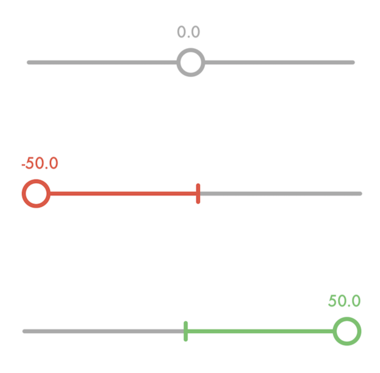
Which would produce a slider as in the following pictures:
Case Temperature is 0:

Case Temperature is -50 °C:

Case Temperature is 50 °C:

If only that part of the slider until the thumb should be coloured you can use LinearProcessIndicator instead to dinamically only colour a part of the bar. This is done as in the code below:
import 'package:flutter/material.dart';

void main() {
  runApp(const MyApp());
}

class MyApp extends StatelessWidget {
  const MyApp({super.key});

  @override
  Widget build(BuildContext context) {
    return MaterialApp(
      title: 'Flutter Demo',
      theme: ThemeData(
        primarySwatch: Colors.blue,
      ),
      home: const MyHomePage(title: 'Flutter Demo Home Page'),
    );
  }
}

class MyHomePage extends StatefulWidget {
  const MyHomePage({super.key, required this.title});

  final String title;

  @override
  State<MyHomePage> createState() => _MyHomePageState();
}

class _MyHomePageState extends State<MyHomePage> {
  void _restartSlider() {
    setState(() {
      _sliderValue=0;
    });
  }

  double _sliderValue = 0;

  double _min = -60;
  double _max = 80;

  @override
  Widget build(BuildContext context) {
    return Scaffold(
      appBar: AppBar(
        title: Text(widget.title),
      ),
      body: Center(
        child: Column(
          mainAxisAlignment: MainAxisAlignment.spaceEvenly,
          children: [
            Text("Temperature is: $_sliderValue °C",),
            Stack(alignment: AlignmentDirectional.center,
              children: [
                Padding(
                  padding: const EdgeInsets.all(16.0),
                  child: Row(
                    children: [
                      Expanded(
                        child: LinearProgressIndicator(
                          value: 1-_sliderValue/_min,
                          color: Colors.grey,
                          backgroundColor: Colors.red,
                        ),
                        flex:_min.abs().round(),
                      ),
                      Expanded(
                        child: LinearProgressIndicator(
                          value: _sliderValue/_max,
                          color: Colors.green,
                          backgroundColor: Colors.grey,
                        ),
                        flex:_max.abs().round(),
                      ),
                    ],
                  ),
                ),
                Slider(
                  value: _sliderValue,
                  activeColor: Colors.transparent,
                  inactiveColor: Colors.transparent,
                  thumbColor: _sliderValue == 0 ? Colors.grey : _sliderValue > 0 ? Colors.green : Colors.red,
                  min: _min, max: _max,
                  divisions: (_min.abs() + _max.abs()).round(),
                  label: _sliderValue.toString(),
                  onChanged: (double newValue) {
                    setState(() {
                      _sliderValue = newValue;
                    });
                  },
                ),
              ],
            ),
          ],
        ),
      ),
      floatingActionButton: FloatingActionButton(
        onPressed: _restartSlider,
        tooltip: 'Restart',
        child: const Icon(Icons.restart_alt),
      ),
    );
  }
}
which gives the following result:


