233

I have the following element:

<div class="modal" tabindex="-1" role="dialog" aria-labelledby="myModalLabel" aria-hidden="true"> 
    <div class="modal-dialog" style="overflow-y: scroll; max-height:85%;  margin-top: 50px; margin-bottom:50px;" > 
        <div class="modal-content"> 
            <div class="modal-header"> 
                <h3 class="modal-title"></h3> 
            </div> 
            <div class="modal-body"></div> 
            <div class="modal-footer"></div> 
        </div> 
    </div> 
</div> 

It shows modal dialog something like this, basically, it puts scroll bar around entire modal-dialog and not modal-body that contains the content I am trying to display.

The image looks something like this:

enter image description here

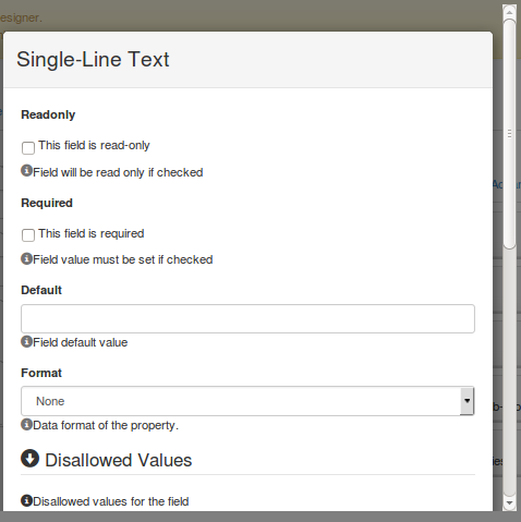
How do I get a scroll bar around modal-body only?

I have tried assigning style="overflow-y: scroll; max-height:85%; margin-top: 50px; margin-bottom:50px;" to modal-body but it didn't work.

Alexander Abakumov
  • 13,617
  • 16
  • 88
  • 129
Subodh Nijsure
  • 3,305
  • 5
  • 26
  • 45
  • 1
    Please give a working sample to give you better help, you can use http://www.bootply.com/new to do it. – Carlos Calla Sep 16 '14 at 17:02
  • Next, allow optional fluid header and footer blocks inside modal so that just the body scrolls: https://stackoverflow.com/questions/49173969/calculate-modal-scrollable-body-height-base-on-fluid-modal-header-and-footer-hei – leontalbot Mar 08 '18 at 13:29

16 Answers16

409

You have to set the height of the .modal-body in and give it overflow-y: auto. Also reset .modal-dialog overflow value to initial.

See the working sample:

http://www.bootply.com/T0yF2ZNTUd

.modal{
    display: block !important; /* I added this to see the modal, you don't need this */
}

/* Important part */
.modal-dialog{
    overflow-y: initial !important
}
.modal-body{
    height: 80vh;
    overflow-y: auto;
}
Ross Rogers
  • 23,523
  • 27
  • 108
  • 164
Carlos Calla
  • 6,556
  • 2
  • 16
  • 23
  • Thanks for this. It works great. May be something is not clear to me in css. I tried assigning modal-body max-height:65% that doesn't work. The solution you provided works only if I assign fixed height to modal-body. Is there no way to say modal-dialog takes 85% of window and modal-body should occupy say 90% of modal-dialog? But again solution you provided works for me, for now. Thanks! – Subodh Nijsure Sep 16 '14 at 17:47
  • 5
    @SubodhNijsure Sorry for the late response. You can't set the height in % because that will mean a % of its parent, in this case the parent is .modal-content and its height depends on its children. That's why it won't work unless you set one of them heights. Either you set .modal-content height or set .modal-body height. If you set .modal-content height then you will be able to set the height of .modal-body in % and it will be a % of its parent so you if you set it less than 100% there will be blank space at the bottom, since you are not filling all .modal-content 's height. – Carlos Calla Aug 18 '15 at 19:57
  • Keep in mind that CSS's `initial` keyword does not work for Internet Explorer, though it does work for Edge. – trysis Aug 01 '16 at 15:15
  • @trysis Yes, you are right. For IE you have to manually set the initial value. – Carlos Calla Aug 01 '16 at 15:28
  • 30
    just a little pointer: instead of "height 250px" which could look ugly on some phones that are only 230px height, or less with navbar in landscape: just use `max-height: 80vh;` that is 80% of total viewport height and only for max height, not if it is a small popup – Toskan Nov 02 '16 at 00:33
  • 1
    works fine, but after closing the modal, the links on the 'parent' window aren't clickable anymore... solved with following code: .modal .modal-body { max-height: 420px; overflow-y: auto; } – cwhisperer Dec 23 '16 at 09:38
  • How do you make the scroll return to the top after each use? I reuse the modal and dynamically load the title and body. But, if I scroll to the bottom, close the modal, open the modal with different content, the modal is scrolled down instead of starting at the top. – Connie DeCinko Aug 02 '17 at 22:01
  • no need of .modal{ display: block !important; /* I added this to see the modal, you don't need this */ } It directly worked for me. – MADHUR GUPTA Aug 14 '19 at 15:07
  • JFYI: I fixed my height-problem with `max-height: calc(100vh - 164px)`. – Matthias Burger Nov 19 '19 at 14:14
  • Hi, calc() won’t work for all browsers. Make sure you are covering the browsers you target and you will be fine. – Carlos Calla Nov 19 '19 at 14:17
  • Your solution shakes modal. It doesn't look good. When scroll bar appears the modal shrinks a little in width – Green Nov 20 '19 at 13:47
  • The sample web site overflows my screen and isn't usable. – Jonny Feb 05 '21 at 00:18
137

If you're only supporting IE 9 or higher, you can use this CSS that will smoothly scale to the size of the window. You may need to tweak the "200px" though, depending on the height of your header or footer.

.modal-body{
    max-height: calc(100vh - 200px);
    overflow-y: auto;
}
Jonathan Marston
  • 1,389
  • 1
  • 8
  • 5
  • According to [1] and [2] this is supported by Chrome, Firefox and Safari as well. [1] https://developer.mozilla.org/en-US/docs/Web/CSS/calc#Browser_compatibility [2] https://developer.mozilla.org/en-US/docs/Web/CSS/length#Browser_compatibility – ctron Nov 23 '15 at 09:07
  • Note : This solution makes the popover appears under header or footer depending of the option selected either top or bottom See this fiddle I created : https://jsfiddle.net/2qeo99k3/4/ Without the css hack it works just fine just remove it in the fiddle to see it works – Marc Roussel Aug 14 '17 at 02:04
  • A workaround for the popover can be found here : https://stackoverflow.com/questions/45666828/bootstrap-modal-modal-body-with-overflow-popover-pops-under-header-or-foorter/45666846#45666846 – Marc Roussel Aug 14 '17 at 03:07
51

For Bootstrap versions >= 4.3

Bootstrap 4.3 added new built-in scroll feature to modals. This makes only the modal-body content scroll if the size of the content would otherwise make the page scroll. To use it, just add the class modal-dialog-scrollable to the same div that has the modal-dialog class.

Here is an example:

<script src="https://cdnjs.cloudflare.com/ajax/libs/jquery/3.3.1/jquery.min.js"></script>
<script src="https://stackpath.bootstrapcdn.com/bootstrap/4.3.1/js/bootstrap.bundle.min.js"></script>
<link href="https://stackpath.bootstrapcdn.com/bootstrap/4.3.1/css/bootstrap.min.css" rel="stylesheet"/>
<!-- Button trigger modal -->
<button type="button" class="btn btn-primary" data-toggle="modal" data-target="#exampleModalScrollable">
  Launch demo modal
</button>

<!-- Modal -->
<div class="modal fade" id="exampleModalScrollable" tabindex="-1" role="dialog" aria-labelledby="exampleModalScrollableTitle" aria-hidden="true">
  <div class="modal-dialog modal-dialog-scrollable" role="document">
    <div class="modal-content">
      <div class="modal-header">
        <h5 class="modal-title" id="exampleModalScrollableTitle">Modal title</h5>
        <button type="button" class="close" data-dismiss="modal" aria-label="Close">
          <span aria-hidden="true">&times;</span>
        </button>
      </div>
      <div class="modal-body">
        the<br>quick<br>brown<br>fox<br>
        the<br>quick<br>brown<br>fox<br>
        the<br>quick<br>brown<br>fox<br>
        the<br>quick<br>brown<br>fox<br>
        the<br>quick<br>brown<br>fox<br>
        the<br>quick<br>brown<br>fox<br>
        the<br>quick<br>brown<br>fox<br>
        the<br>quick<br>brown<br>fox<br>
        the<br>quick<br>brown<br>fox<br>
        the<br>quick<br>brown<br>fox<br>
      </div>
      <div class="modal-footer">
        <button type="button" class="btn btn-secondary" data-dismiss="modal">Close</button>
        <button type="button" class="btn btn-primary">Save changes</button>
      </div>
    </div>
  </div>
</div>
Cave Johnson
  • 6,499
  • 5
  • 38
  • 57
47

Problem solved with combine solution @carlos calla and @jonathan marston.

    /* Important part */
.modal-dialog{
    overflow-y: initial !important
}
.modal-body{
    max-height: calc(100vh - 200px);
    overflow-y: auto;
}
16

Adding on to Carlos Calla's great answer.

The height of .modal-body must be set, BUT you can use media queries to make sure it's appropriate for the screen size.

.modal-body{
    height: 250px;
    overflow-y: auto;
}

@media (min-height: 500px) {
    .modal-body { height: 400px; }
}

@media (min-height: 800px) {
    .modal-body { height: 600px; }
}
Community
  • 1
  • 1
laurak
  • 363
  • 3
  • 9
  • Having an assumption that the height will be 400px or greater on a mobile device is faulty. Using width to determine height is not a feasible solution at all. There are too many use cases that would cause this to break. – Strawberry Aug 05 '15 at 03:19
  • 2
    @Strawberry he actually used min-height (not min-width) and made sure the height given is less than the min-height in the media-query. In addition, he is only giving an example to his idea because the media query can vary a lot depending on what the OP wants to achieve. – Carlos Calla Aug 18 '15 at 19:47
13

Optional: If you don't want the modal to exceed the window height and use a scrollbar in the .modal-body, you can use this responsive solution. See a working demo here: http://codepen.io/dimbslmh/full/mKfCc/

function setModalMaxHeight(element) {
  this.$element     = $(element);
  this.$content     = this.$element.find('.modal-content');
  var borderWidth   = this.$content.outerHeight() - this.$content.innerHeight();
  var dialogMargin  = $(window).width() > 767 ? 60 : 20;
  var contentHeight = $(window).height() - (dialogMargin + borderWidth);
  var headerHeight  = this.$element.find('.modal-header').outerHeight() || 0;
  var footerHeight  = this.$element.find('.modal-footer').outerHeight() || 0;
  var maxHeight     = contentHeight - (headerHeight + footerHeight);

  this.$content.css({
      'overflow': 'hidden'
  });

  this.$element
    .find('.modal-body').css({
      'max-height': maxHeight,
      'overflow-y': 'auto'
  });
}

$('.modal').on('show.bs.modal', function() {
  $(this).show();
  setModalMaxHeight(this);
});

$(window).resize(function() {
  if ($('.modal.in').length != 0) {
    setModalMaxHeight($('.modal.in'));
  }
});
dimbslmh
  • 1,801
  • 1
  • 12
  • 8
9

In latest bootstrap version there is a class to make modal body scrollable.

.modal-dialog-scrollable to .modal-dialog.

Bootstrap modal link for modal body scrollable content

<!-- Scrollable modal -->
<div class="modal-dialog modal-dialog-scrollable">
  ...
</div>
Msk Satheesh
  • 1,398
  • 1
  • 6
  • 7
7

I know this is an old topic but this may help someone else.

I was able to make the body scroll by making the modal-dialog element position fixed. And since I would never know the exact height of the browser window, I took the information I was sure about, the height of the header and the footer. I was then able to make the modal-body element's top and bottom margins match those heights. This then produced the result I was looking for. I threw together a fiddle to show my work.

also, if you want a full screen dialog just un-comment the width:auto; inside the .modal-dialog.full-screen section.

https://jsfiddle.net/lot224/znrktLej/

And here is the css that I used to modify the bootstrap dialog.

.modal-dialog.full-screen {
    position:fixed;
    //width:auto;  // uncomment to make the width based on the left/right attributes.
    margin:auto;                        
    left:0px;
    right:0px;
    top:0px;
    bottom:0px;
}

.modal-dialog.full-screen .modal-content {
      position:absolute;
      left:10px;
      right:10px;
      top:10px;
      bottom:10px;
}

.modal-dialog.full-screen .modal-content .modal-header {
        height:55px;  // adjust as needed.
}

.modal-dialog.full-screen .modal-content .modal-body {
        overflow-y: auto;
          position: absolute;
          top: 0;
          bottom: 0;
        left:0;
        right:0;
          margin-top: 55px; // .modal-header height
          margin-bottom: 80px;  // .modal-footer height
}

.modal-dialog.full-screen .modal-content .modal-footer {
        height:80px;  // adjust as needed.
        position:absolute;
        bottom:0;
        left:0;
        right:0;
}
Bogus Hawtsauce
  • 363
  • 3
  • 10
7

Or simpler you can put between your tags first, then to the css class.

<div style="height: 35px;overflow-y: auto;"> Some text o othre div scroll </div>
user7695590
  • 181
  • 2
  • 7
4
#scroll-wrap {
    max-height: 50vh;
    overflow-y: auto;
}

Using max-height with vh as the unit on the modal-body or a wrapper div inside of the modal-body. This will resize the height of modal-body or the wrapping div(in this example) automatically when a user resize the window.

vh is length unit representing 1% of the viewport size for viewport height.

Browser compatibility chart for vh unit.

Example: https://jsfiddle.net/q3xwr53f/

Steven
  • 2,258
  • 1
  • 22
  • 22
4

In your modal body you have to set a height, it can be % vh or calc:

modal-body {
    height: 80vh;
    overflow-x: auto;
}

or

modal-body {
    height: calc(100vh - 5em);
    overflow-x: auto;
}

In my case look like: enter image description here

Elias Bobadilla
  • 131
  • 1
  • 2
1

What worked for me is setting the height to 100% the having the overflow on auto hope this will help

   <div style="height: 100%;overflow-y: auto;"> Some text o othre div scroll </div>
Stephen Ngethe
  • 1,034
  • 13
  • 24
0

A simple js solution to set modal height proportional to body's height :

$(document).ready(function () {
    $('head').append('<style type="text/css">.modal .modal-body {max-height: ' + ($('body').height() * .8) + 'px;overflow-y: auto;}.modal-open .modal{overflow-y: hidden !important;}</style>');
});

body's height has to be 100% :

html, body {
    height: 100%;
    min-height: 100%;
}

I set modal body height to 80% of body, this can be of course customized.

Hope it helps.

migli
  • 2,692
  • 27
  • 32
0

This is the full Sass rewrite on my website (still building, will add here once it's ready)

It's 100% mobile responsive and fit-to-screen (only when the content is large enough, otherwise the width and height will be fit-to-content, so yes, it's flexible):

  • 1.75rem of spacing (equally on 4 sides) on screens larger than 576px (sm)
  • 0.5rem of spacing on screens smaller than 576px

For flexible and scrollable modal-body, the lines commented with required are the minimum codes you need.

.modal-header,
.modal-footer {
  border: none !important;
}

.modal-dialog {
  height: 100% !important; // required
  margin: 0 0.5rem !important;
  padding: 0.5rem 0 !important;
  overflow-y: initial !important; // required

  @media (min-width: $sm) {
    margin: 0 auto !important;
    padding: 1.75rem 0 !important;
    max-width: initial !important; // overwrite default max-width
    width: fit-content !important; // flexible width
    min-width: 500px !important; // makes it fat enough by default
  }
}

.modal-content {
  max-height: 100% !important; // required
}

.modal-body {
  padding-top: 0 !important;
  overflow-y: auto !important; // required
}
yewyewXD
  • 1
  • 1
0

If you are using boostrap, you can past the tag at the div: class="dataTables_scrollBody" style="position: relative; overflow: auto; max-height: 500px;"

  • Your answer could be improved with additional supporting information. Please [edit] to add further details, such as citations or documentation, so that others can confirm that your answer is correct. You can find more information on how to write good answers [in the help center](/help/how-to-answer). – Community Apr 18 '23 at 13:58
-1

add class modal-dialog-scrollable if you are using bootstrap 4.5 or higher

else

.modal-body{
    height :100%;
    over-flow-y:auto;
}
Ashique T
  • 11
  • 1