13

I am looking to create a mini-drawer menu like in google example:

mini-drawer menu

I have tried to create a layout that always stays there on ParentLeft, and the menu to overflow it when it opens, but it does not look natural. Does anyone know how do I do it?


Update

I have tried another way. To listen to menu sliding, and to catch when it is closed enough, then I can set menu size, and keep icons visible, but text to be gone.

@Override
        public void onDrawerSlide(float v, int i) {
            Log.d("onDrawerSlide", "v=" + v + " i=" + i);
            if (i<previewsI && decreasingCount > 3) {
                // check if menu is closed enough
                if (i <100 && i > 50) {
                    // change menu size, and force menu to keep opened
                    mDrawer.setMenuSize(Utils.dpToPx(70, getApplicationContext()));
                    mDrawer.openMenu();
                    // TODO: hide menu items title, and let only icons to be visible

                }
            }
            else if (i < previewsI)
                // make sure the menu is closing
                    decreasingCount++;

            previewsI = i;
        }

It works, but not as smooth as I wish. Now I'd have to mess with smoothly opening it again. Anyway, I don't think this is an elegant solution. I am sure there must be a better one out there.

Filip Luchianenco
  • 6,912
  • 9
  • 41
  • 63
  • Please describe me accurately what you already have and what you think is wrong with it. Showing us the layout and the code which opens and closes it along with a description of the problem would be a start. – Xaver Kapeller Jul 01 '15 at 07:16
  • I have updated the question, please have a look. – Filip Luchianenco Jul 01 '15 at 07:42
  • So you are using the `NavigationDrawer` to implement this? I doubt this will work, at least if you want to match the picture above. The `NavigationDrawer` does not implement the mini-drawer feature just yet - at least to my knowledge. Personally I would prefer a completely custom implementation. – Xaver Kapeller Jul 01 '15 at 08:12
  • I would prefer too, but it would take me a week only to implement the menu. Thank you anyway. – Filip Luchianenco Jul 01 '15 at 08:14
  • It really doesn't take that long. If you don't care about a general solution which you could put in a library you can easily implement this in half an hour to an hour. – Xaver Kapeller Jul 01 '15 at 08:17
  • 2
    It's basically just a `RecyclerView` or `ListView` with simple rows which contain an icon and text and two animations which collapse and expand `RecyclerView` or `ListView` and at the same time move it over the `Toolbar` or below it. Nothing complicated at all. – Xaver Kapeller Jul 01 '15 at 08:27
  • If you want to dim the content behind the drawer when it opens you can simply use a `FrameLayout` and its foreground `Drawable` to draw a transparent black color over its content. – Xaver Kapeller Jul 01 '15 at 08:30
  • @XaverKapeller so I would make the menu by myself right? That sounds like the best solution for now. Sum it up in an answer, and I'll accept it as the best solution. Thank you. – Filip Luchianenco Jul 01 '15 at 12:09
  • @FilipLuch I also need to implement the same, Did you get this done. If yes then please help. – AndyN Aug 14 '15 at 12:36

2 Answers2

12

I know this is a very old question, and i'm not sure if you are willing to use a library. But the MaterialDrawer library would offer a MiniDrawer implementation including the transformation to a normal drawer.

MaterialDrawer

As shown in the screenshot the MiniDrawer also supports badges, and it also comes with an AccountSwitcher. Also with everything else.

The MiniDrawer uses the Crossfader library which allows the crossfade effect. The sample application of the Crossfader library also shows how to implement this with the MaterialDrawer

Here's the code which creates the shown sample (You can also find it over at the repository on GitHub):

DrawerBuilder builder = new DrawerBuilder()
        .withActivity(this)
        .withToolbar(toolbar)
        .withInnerShadow(true)
        .addDrawerItems(
                //.. add some items ..
        ) // add the items we want to use with our Drawer
        .withOnDrawerItemClickListener(new Drawer.OnDrawerItemClickListener() {
            @Override
            public boolean onItemClick(View view, int position, IDrawerItem drawerItem) {
                //some actions inside the listener

                return miniResult.onItemClick(drawerItem);
            }
        })
        .withSavedInstance(savedInstanceState);

// build the main drawer
result = builder.buildView();
// build the miniDrawer
miniResult = new MiniDrawer().withDrawer(result).withInnerShadow(true).withAccountHeader(headerResult);

//define the width of the normal drawer, and the minidrawer
int first = (int) UIUtils.convertDpToPixel(300, this);
int second = (int) UIUtils.convertDpToPixel(72, this);

//create the Crossfader used to hook the MiniDrawer and the normal drawer together. This also handles the crossfade effect.
crossFader = new Crossfader()
        .withContent(findViewById(R.id.crossfade_content))
        .withFirst(result.getSlider(), first)
        .withSecond(miniResult.build(this), second)
        .withSavedInstance(savedInstanceState)
        .build();

// inform the MiniDrawer about the crossfader.
miniResult.withCrossFader(new CrossfadeWrapper(crossFader));
mikepenz
  • 12,708
  • 14
  • 77
  • 117
  • i know about this library but i don't know how to implant a mini-drawer since there is nothing about this documentation. so thanks :) – hadi Nov 25 '15 at 14:51
  • I've added the link to the Crossfader library which is used to do the crossfade effect https://github.com/mikepenz/Crossfader – mikepenz Nov 26 '15 at 05:52
  • Is it possible to put label/title under of each icon drawer? – KikX Aug 23 '19 at 03:04
6

I figured out a way to implement the mini navigation drawer using the SlidingPaneLayout.

Create a layout resource file and set SlidingPaneLayout as your parent view. SlidingPaneLayout requires two child views: a master view and a detail view. The master view will contain a list of all our menu options and the detail view will contain the content.

<?xml version="1.0" encoding="utf-8"?>
<android.support.v4.widget.SlidingPaneLayout
    xmlns:android="http://schemas.android.com/apk/res/android"
    android:layout_width="match_parent"
    android:layout_height="match_parent">

    <!--Master fragment-->
    <fragment
        android:name="com.ng.anthony.mininavigationdrawer.MasterFragment"
        android:layout_width="220dp"
        android:layout_height="match_parent"
        android:id="@+id/fragment_master">
    </fragment>

    <!--Detail layout -->
    <FrameLayout
        android:layout_width="1000dp"
        android:layout_height="match_parent"
        android:layout_marginLeft="56dp">
    </FrameLayout>
</android.support.v4.widget.SlidingPaneLayout>

Create a master fragment class. Inside your master fragment you should have a list view with all your menu options.

public class MasterFragment extends ListFragment {

    public View onCreateView (LayoutInflater inflater, ViewGroup container, Bundle savedInstanceState) {
        View view = inflater.inflate(R.layout.fragment_master, container);

        setListAdapter(new MenuListAdapter(R.layout.row_menu_action_item, getActivity(), MenuActionItem.values()));
        return view;
    }
}

Add the master fragment layout to your layout resources folder

<?xml version="1.0" encoding="utf-8"?>
<LinearLayout xmlns:android="http://schemas.android.com/apk/res/android"
    android:orientation="vertical" android:layout_width="match_parent"
    android:layout_height="match_parent">

    <ListView
        android:id="@android:id/list"
        android:layout_width="match_parent"
        android:layout_height="match_parent"
        android:background="@android:color/darker_gray"
        android:divider="@null">
    </ListView>

</LinearLayout>

The master fragment contains a list view and uses an enumeration of menu options to populate the list.

public enum MenuActionItem {
    ITEM1,
    ITEM2,
    ITEM3,
    ITEM4,
    ITEM5
}

The master fragment also contains a custom array adapter that displays the list of menu options. The custom array adapter inflates a row layout for each menu option.

import android.app.Activity;
import android.view.MenuItem;
import android.view.View;
import android.view.ViewGroup;
import android.widget.ArrayAdapter;
import android.widget.ImageView;
import android.widget.TextView;

import java.util.ArrayList;

/**
 * Created by Anthony on 16-01-25.
 */
public class MenuListAdapter extends ArrayAdapter<MenuActionItem> {

    int resource;
    Activity activity;

    public MenuListAdapter(int resource, Activity activity, MenuActionItem[] items) {
        super(activity, resource, items);

        this.resource = resource;
        this.activity = activity;
    }

    public View getView (int position, View convertView, ViewGroup parent) {
        View rowView = convertView;

        if(rowView == null) {
            rowView = activity.getLayoutInflater().inflate(resource, null);

            MenuItemViewHolder viewHolder = new MenuItemViewHolder();

            viewHolder.menuItemImageView = (ImageView)rowView.findViewById(R.id.menu_item_image_view);
            viewHolder.menuItemTextView = (TextView)rowView.findViewById(R.id.menu_item_text_view);

            rowView.setTag(viewHolder);
        }

        MenuItemViewHolder holder = (MenuItemViewHolder)rowView.getTag();

        if(position == MenuActionItem.ITEM1.ordinal()) {
            holder.menuItemImageView.setImageDrawable(activity.getDrawable(R.drawable.ic_payment_white_24dp));
            holder.menuItemTextView.setText(activity.getResources().getString(R.string.item1));
        }
        else if(position == MenuActionItem.ITEM2.ordinal()) {
            holder.menuItemImageView.setImageDrawable(activity.getDrawable(R.drawable.ic_pets_white_24dp));
            holder.menuItemTextView.setText(activity.getResources().getString(R.string.item2));
        }
        else if(position == MenuActionItem.ITEM3.ordinal()) {
            holder.menuItemImageView.setImageDrawable(activity.getDrawable(R.drawable.ic_receipt_white_24dp));
            holder.menuItemTextView.setText(activity.getResources().getString(R.string.item3));
        }
        else if(position == MenuActionItem.ITEM4.ordinal()) {
            holder.menuItemImageView.setImageDrawable(activity.getDrawable(R.drawable.ic_shopping_cart_white_24dp));
            holder.menuItemTextView.setText(activity.getResources().getString(R.string.item4));
        }
        else if(position == MenuActionItem.ITEM5.ordinal()) {
            holder.menuItemImageView.setImageDrawable(activity.getDrawable(R.drawable.ic_work_white_24dp));
            holder.menuItemTextView.setText(activity.getResources().getString(R.string.item5));
        }

        return rowView;
    }

    private static class MenuItemViewHolder {
        public ImageView menuItemImageView;
        public TextView menuItemTextView;
    }
}

Add the row layout

<?xml version="1.0" encoding="utf-8"?>
<LinearLayout xmlns:android="http://schemas.android.com/apk/res/android"
    android:orientation="horizontal" android:layout_width="match_parent"
    android:layout_height="match_parent"
    android:padding="16dp"
    android:gravity="center_vertical">

    <ImageView
        android:id="@+id/menu_item_image_view"
        android:layout_width="24dp"
        android:layout_height="24dp"
        android:layout_marginRight="16dp"/>

    <TextView
        android:id="@+id/menu_item_text_view"
        android:layout_width="wrap_content"
        android:layout_height="wrap_content"
        android:textSize="16sp"
        android:textColor="@android:color/white"/>

</LinearLayout>

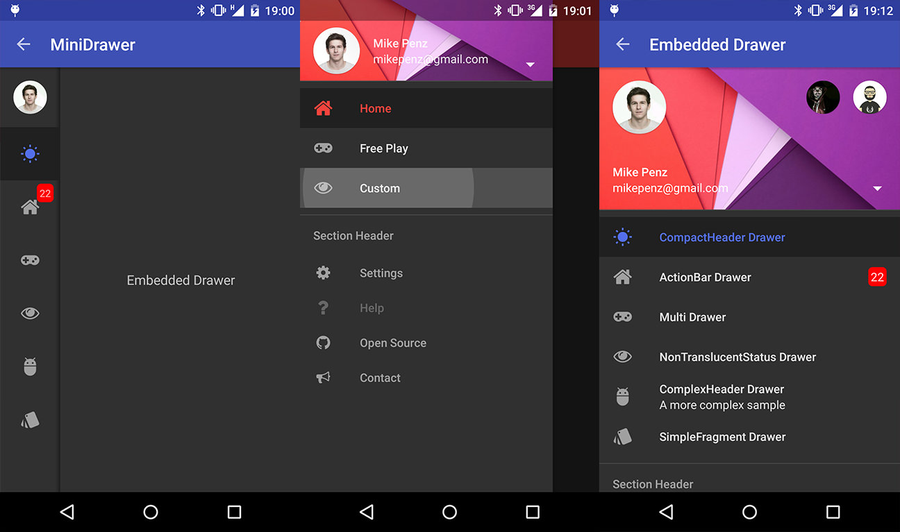
In the end you should see something like this

Mini navigation drawer

You can download the sample project here: https://github.com/nganthony/MiniNavigationDrawer

Floern
  • 33,559
  • 24
  • 104
  • 119
Anthony Ng
  • 61
  • 1
  • 3